
A great formula does not sell itself. Someone has to pick the bottle up first.
That single moment is what hair product branding is for. Below are real hair care brands I have built identities, labels, packaging, and product visuals for. Each one arrived with a different problem to solve. Look at what each had to get right before it could go to market.
TL;DR
- Hair product branding is the full visual and verbal system a hair care company uses to be recognized and trusted: logo, color, typography, packaging, labels, product visuals, and messaging working as one set of rules.
- Shoppers give any single product on a shelf roughly 0.6 seconds of visual attention, and 72% of US adults say package design influences what they buy.
- Start with positioning and audience, not with a logo. The logo is the output of those decisions, not the starting point.
- A launch-ready hair care identity usually needs six things: a primary mark, a color system, a type system, a label and packaging structure, product visuals, and written usage rules.
- Branding packages for hair product startups commonly range from $5,000 to $12,000+ depending on scope. Logo concepts created from scratch typically start around $2,000.
The hair care category is crowded and getting more crowded. Global hair care is projected to reach $93.6 billion in 2026 and grow at a 7.0% compound rate through 2033, with the online channel expanding faster than retail at 8.2%. That growth is why new founders keep entering. It is also why hair product branding has stopped being a nice-to-have and started being the thing that decides whether anyone picks your bottle up.
I design brand identities, packaging, labels, and product visuals for hair care founders. What follows is how I approach the work, two real projects, and direct answers to the questions founders ask me before they hire anyone.
Below are examples of projects I created for hair business clients.
What Is Hair Product Branding?
Hair product branding is the complete visual and verbal system that makes a hair care company recognizable and credible across every place a customer encounters it.
That includes the logo, the color palette, the typography, the label layout, the packaging structure, the product photography or renders, the tone of the copy, and the written rules that keep all of it consistent.
A logo is one piece of that system. An important piece. But one piece.
This distinction matters more in hair care than in most categories, because a hair product is judged in a small physical space. A 4-inch label has to communicate the brand, the product name, the benefit, the ingredient story, and the usage direction, all at once, at arm's length.
If the only thing that was designed is the logo, the label ends up assembled rather than designed, and it reads that way on a shelf.
A peer-reviewed review of 221 studies on packaging found that color, typography, and structural design operate together rather than in isolation. That is the practical argument for treating identity as a system: the elements only work because of how they relate to each other.
The First Sketch Ideas


Photograph courtesy of @tymobeauty
What Are the Best Strategies for Creating Strong Hair Product Branding?
The best strategy for strong hair product branding is to define your audience and market position first, then design every visual element to serve that position. Everything below follows from that one decision.
Here is the sequence I use and recommend.
1. Define who the product is actually for, specifically.
Not "women who care about their hair."
A woman in her late 30s managing postpartum shedding, a person with 4C hair looking for a wash-day product that does not strip, and a barber buying professional-size product are three different buyers with three different visual expectations. The tighter the audience definition, the easier every later decision becomes.
2. Choose a position you can hold.
Clinical. Natural. Salon-professional. Heritage. Scalp-first. Luxury. You cannot be several of these at once and stay legible.
Euromonitor's beauty research found that premium is now tied to clinical evidence and demonstrated results rather than prestige signaling alone, which changes what a "premium" hair brand should look like compared to five years ago.
3. Build the mark around a real idea, not a trend.
A hair care logo that leans on whatever style is popular this year will look dated by your second production run. Anchor it in something structural about the brand: what it does, who it serves, or the belief behind it.
4. Design the color system for the label, not for the screen.
Green looks one way on a monitor and another way printed on a matte pouch. I test color in the application it will actually live in before I lock it.
5. Set the typography hierarchy at label scale.
Product name, benefit, size, ingredient callout, directions. Decide the order of importance before you decide the fonts, because the hierarchy is what a shopper reads in the seconds they give you.
6. Write down the rules.
A brand guide covering typefaces, color codes, logo clear space, background usage, and application notes is what keeps the brand consistent when you hand assets to a printer, a photographer, or a social media manager. One study of over 200 organizations associated consistent branding with up to a 33% revenue increase, and found that 81% of companies struggle with off-brand content. Consistency is a discipline problem more than a design problem, and guidelines are how you solve it.
7. Design for AI discovery, not only for shelves.
A recent survey of 8,000 global consumers found that 41% had purchased a product an AI recommended within six months. That means your product name, ingredient claims, category language, and benefit statements need to be clear and consistent in text, not just attractive in layout. A brand that describes itself the same way on the label, the site, and the retailer listing is easier for an assistant to summarize correctly.


How Do You Create a Strong Brand Identity for a New Hair Care Line?
You create a strong brand identity for a new hair care line by running discovery first, exploring composition through rough sketches, testing structure in grayscale, and only then committing to color and application. Skipping to color is the most common way founders end up with something that looks fine and means nothing.
Here is how a project actually runs on my end.
Discovery. After an agreement is signed and a deposit is paid, I hold a discovery call. I ask about the target audience's age range, psychographics and demographics, why you are starting now, your vision, any existing concept or tagline, the assets and collateral you need, and the industry context you are working in. If you do not have a concept yet, I build one with you.
Research and inspiration. I use what came out of discovery to research the category and build inspiration boards before I draw anything. This is where market position becomes visual direction.
Rough sketches. I usually present six to nine hand-drawn rough compositions. The point is not to show finished ideas. The point is to test structures and find out what you respond to. Sketches move an abstract idea into visual form fast, so you can react to a direction and push it further before anyone opens a polished file.
Grayscale prototyping. I move the strongest directions into grayscale before color. If a mark does not hold up in black and white, color will not save it, and you will find that out later on an embossed cap or a single-color print run.
Color and application. Color comes last, tested against the surfaces the brand will actually live on: label stock, pouch material, bottle silhouette, web, social.
Identity system and guidelines. The logo becomes the basis for the broader identity where a full branding package is selected: color system, typography, label structure, and a brand guide with typeface names, color codes, logo-use guidance, background guidance, and application notes.
I do not dictate this process. It runs on a feedback loop of conversations, visual options, revisions, and professional guidance until you have a direction you feel confident choosing.
The Final Brand Logo Design
After several rounds of revisions and refinements, the client selected the final brand logo design.


Case Study: Deeper Than Roots, a Scalp Care Brand Built From the Root Up
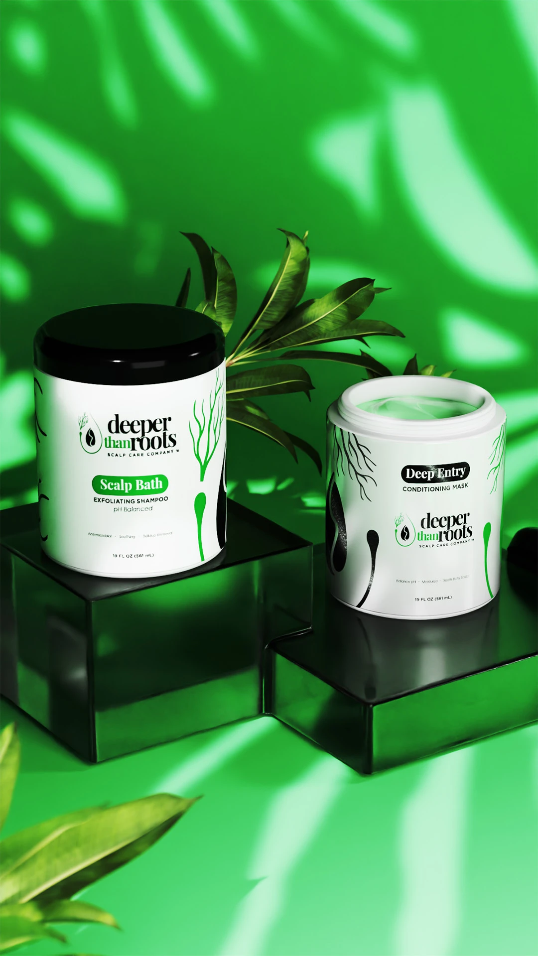
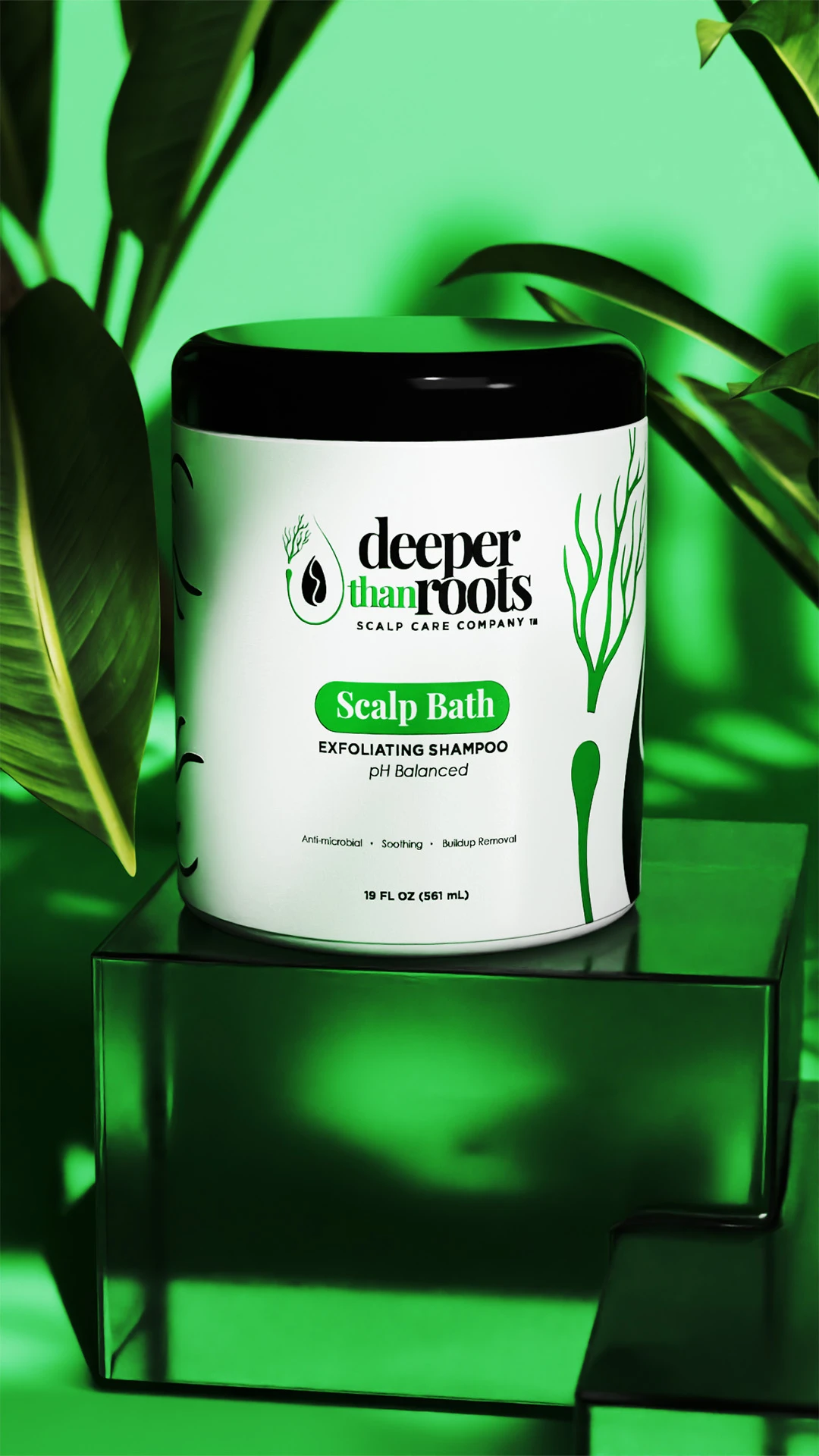
Deeper Than Roots is a Virginia hair care brand led by entrepreneur and CEO Angel, focused on premium, eco-conscious scalp care. Angel was referred to me by a chemist after losing contact with a prior designer, which is a situation I see often enough that I have a specific way of handling it: reset the project with transparent communication, run real discovery, and rebuild trust through collaboration rather than by moving fast.
The challenge. The brand needed an identity that could carry both sides of the line at once, the scientific and the natural, without tipping into either a lab aesthetic or a generic botanical look. It also needed to feel modern to health-conscious buyers who read labels closely. That instinct was well aimed: 58% of shoppers now read product labels all or most of the time, and 42% are actively choosing natural or clean beauty products.
The mark. I refined the logo direction with a more classic but edgy serif, replacing a literal side portrait with an abstract seed symbol surrounded by forms that suggest roots, or hair roots, flowing upward. Playfair Display Bold paired with Gotham Bold gave the wordmark a grounded, considered feel rather than a decorative one.
Angel already had a preference for green, so I kept green and offered refined green tones instead of arguing the color. Sometimes the right call is to sharpen a client's instinct rather than replace it.
The system. The identity extended into product labels, packaging kept clean and uncluttered with generous white space, and trade show banners and booth designs built to hold attention in a busy event environment. The tagline "The Birthplace of the Hair is the Scalp" anchored the message and kept the focus on scalp health.
That positioning turned out to sit right on top of where the category is moving. Grand View Research documents a broader scalp-first shift, with scalp health treated as foundational rather than cosmetic, and the hair loss and thinning segment growing at 8.6% annually.
The visuals. I created 3D product renders for pre-launch promotion and pre-orders, plus an animation highlighting product features and benefits with rotation sequences and sound design. Renders meant the brand could promote and take pre-orders before physical inventory existed.
The result. The brand launched at a convention with the updated identity, collateral, and product visuals in place.
What Features Should a Hair Product Brand Identity Include?
A complete hair product brand identity should include six elements: a primary logo with variations, a defined color system, a typography system, label and packaging structure, product visuals, and written usage guidelines. Anything less and you will be improvising decisions later, usually under deadline pressure.
| Element | What it covers | Why it matters for hair care |
|---|---|---|
| Primary mark and variations | Full logo, icon or symbol, horizontal lockup, single-color version | Bottle caps, jar lids, and embossed surfaces need a mark that works small and in one color |
| Color system | Primary, secondary, and neutral colors with print and digital codes | Color drifts between screen and print stock. Codes prevent your second production run from looking different from your first |
| Typography system | Display face, body face, and the hierarchy between them | A label carries five levels of information in a few square inches. Hierarchy is what makes it readable |
| Label and packaging structure | Layout system, panel organization, ingredient and directions treatment | Regulatory and ingredient copy has to fit without wrecking the design. Plan the structure, not just the front panel |
| Product visuals | Photography direction, 3D renders, mockups, lifestyle imagery | Online buyers judge a hair product entirely from images. The visual is the product until it arrives |
| Written guidelines | Clear space, backgrounds, misuse examples, application notes | This is what protects the identity once other people start using it |
For a full breakdown of how these fit together, see my brand identity design page.
A Variety of Branding Assets: Hair Brand Designs


What Packaging Design Strategies Work for Luxury Hair Products?
Luxury hair product packaging works through restraint, material honesty, and a single confident focal point, not through adding more. Premium reads as fewer decisions executed better, and the current definition of premium has shifted toward evidence and substance over ornamentation.
Six strategies I apply to premium hair care packaging:
Commit to one idea per panel. The front of a luxury bottle should carry the brand, the product, and one benefit. Everything else moves to the side or back panel. Crowding is the fastest way to make an expensive product look cheap.
Let material do the work. Matte versus gloss, uncoated stock, soft-touch lamination, and foil placement all communicate before a word is read. In the Ipsos survey, 67% of adults said packaging materials influence their choices, separately from design.
Use white space as a signal. On the Deeper Than Roots packaging I kept the layout clean and uncluttered, using white space to let the mark and the key product information speak. Empty space on a package reads as confidence. Crowded space reads as a brand trying to convince you.
Design the ingredient story into the hierarchy, not around it. Since more than half of shoppers read labels regularly, and 59% of clean beauty shoppers do, the ingredient callout is not fine print. Give it a designed position rather than squeezing it in at the end.
Treat sustainability as a design decision, not a sticker. Euromonitor found that 46% of shoppers select products with at least one sustainable attribute. If eco-conscious materials are part of your product, the structure and finish should express that rather than a badge announcing it.
Prove it in 3D before you print. I build 3D packaging rendering so a client can see dielines, print finishes, and proportions as finished packaging before ordering a print run. Catching a proportion problem on screen costs a revision. Catching it on 5,000 printed pouches costs a print run.
More detail on the category-specific work lives on my hair product packaging page, and the broader service is on my packaging design page.


Product Label Design Created for the Haircare Branding


Client Praise & Testimonial
Hair Care Products with Company Logo — Communicating Clearly at Every Touchpoint
Your logo needs to say the right thing at a glance. If you are searching for a logo designer for hire, find someone who genuinely understands your brand's essence and can translate it into a mark that sticks.
Whether you are building hair care brand product logos from scratch or refining an existing mark, the goal is always the same: create something that your customers recognize, remember, and trust. Hair care products with a strong company logo build that loyalty faster.
Case Study: Hair Loss Heroines, Designing for an Audience in a Vulnerable Moment


Hair Loss Heroines is a brand built to support women navigating hair loss through quality hair care products and a community grounded in strength and solidarity. The audience is far larger than most people assume: more than 50% of women experience hair loss at some point, and roughly 30 million US women are affected by female pattern hair loss.
The challenge.
The identity had to communicate compassion and confidence at the same time, for women reaching for a product during a genuinely difficult experience. Get the tone wrong in either direction and it either feels clinical and cold or overly soft and unserious.
The mark.
A modern script for "Heroines" paired with a clean sans-serif for "Hair Loss" reflects the brand's dual focus on beauty and resilience. The mark incorporates a swooping hair strand, a form that holds both the challenge and the renewal the brand offers its community.
The color system.
Teal and coral. Teal signals trust and calm. Coral brings warmth and energy. Together they create a balance that matches the brand's mission without either color carrying the whole emotional load. That system runs consistently across every asset, from packaging to event materials.
The packaging.
A teal-to-coral gradient runs through the packaging, evoking calm and optimism. The design stays clean and minimal, with the logo placed prominently alongside key product benefits.
Event materials.
For the "Empower Women 24" self-care summit, promotional materials were designed to feel welcoming and informative. Banners feature imagery of diverse women who represent the brand's community, and every piece carries the same color system and logo so the identity holds in a setting where a lot of brands are competing for the same attention.
Building a Comprehensive Branding Package

A complete branding package is one of the most important investments a hair care brand can make.
It should cover your hair product logos, packaging design, brand messaging, and visual identity guidelines — all working as one cohesive system.
At Branding Design Pro, I build custom branding packages designed around the specific needs of hair care brands.
Whether you are focused on hair care brand logos or a broader hair product branding strategy, a well-rounded package gives you something solid to build on.
Whether you are launching or rebranding, investing in a branding package creates consistency across every touchpoint — and saves you from costly corrections later.
It also gives you a clear foundation for your marketing, so every campaign starts from a position of strength.
With consistent hair brand logos across all materials, your brand presence becomes unified, recognizable, and ready to grow.
How Do You Make a Hair Product Stand Out on a Crowded Shelf?
You make a hair product stand out by designing for a single glance, because that is all you get. Eye-tracking research using mobile devices found that a shopper's total fixation on any given product averages 0.6 seconds, roughly 1.4 fixations, and that around 70% of brand purchase decisions happen after the shopper is already in the store.
Six tenths of a second is not enough time to read a paragraph. It is enough time to register a shape, a color block, and one word.
That has direct design consequences:
- One dominant visual element, not three. If the mark, the illustration, and the benefit callout are all fighting for first position, none of them wins.
- Color block before detail. Shoppers find your product by color and silhouette from several feet away, then read once they are close. Design the far view first.
- The product name larger than you think it needs to be. Founders consistently under-size the one word they want remembered.
- Contrast at the shelf, not at the desk. A palette that looks refined on a white monitor can disappear against a wall of competitors in the same tonal range. Look at the shelf you are going onto.
- Test the render against real conditions. I use 3D product renderings to place packaging in context and check how it holds at distance and at angle before anything goes to print.
The same logic applies online, where the category is growing fastest. Your listing thumbnail is the shelf. It is a small square, viewed quickly, next to competitors.

What Are the Most Common Hair Care Branding Mistakes?
The most common hair care branding mistake is buying a logo and assuming the brand is done. A logo by itself is a signature with nothing to sign.
The other four I see repeatedly:
Starting with the logo instead of the positioning. The look of a brand should be the outcome of decisions about audience and market position, not the starting point. When founders lead with visual preference, the identity ends up reflecting their taste rather than their customer's expectations.
Using an AI-generated or improvised mark as a foundation. AI is a useful production tool and capable designers should adapt to it. Used without design experience behind it, the output tends to look generic or cheap, and it rarely survives contact with a real label layout. When a client comes to me with a mark like this, I generally recommend starting the concept process fresh rather than patching it.
Buying the cheapest option and paying for it twice. Low-cost design can save money upfront and cost more later through weak communication, generic results, unclear ownership, and work resold to other businesses. I have seen reused ad creative sold to competing businesses, which is an ethics problem as much as a quality problem, because it confuses customers and erases the differentiation you paid for.
Designing the front panel and forgetting everything else. Ingredient lists, directions, net weight, and warnings all have to live somewhere. If they were not planned into the layout system, they get crammed in at the end and the whole package reads as amateur.
Skipping the brand guide. Many owners know they need a logo but do not know how to apply it: what backgrounds work, how colors carry emotion, how it translates to a banner or a social template. Guidelines prevent the slow erosion of an identity by well-meaning people using it wrong.
Client Testimonial
What Does Hair Product Branding Cost?
Branding packages commonly range from $5,000 to $12,000+ depending on the deliverables and the size of the scope, with logo concepts created from scratch typically starting around $2,000. Refining a composition or concept you already have may begin around $1,000.
| Service | Investment |
|---|---|
| Logo concept created from scratch | Typically starts around $2,000 |
| Refining a client-supplied concept | May begin around $1,000 |
| Branding package | Commonly $5,000 to $12,000+ for larger scopes |
| Website design (standalone) | Starts at $3,000 |
| 3D product animation | $2,000 to $10,000+ |
Every project is quoted individually after a scope discussion, so you receive a clear proposal before work begins.
For reference on what the upper end includes: the Blessed Hands CBD project was a $12,000 engagement covering gummy packaging design, social media post templates, a product animation advertisement, and website design. That project exceeded a typical branding-package range because it combined website design with packaging, social assets, and animation.
Every project is quoted individually after a scope discussion, so you get a clear proposal before work begins rather than a surprise later. I also offer unlimited revisions and work toward a design outcome you are satisfied with, and you receive access to the applicable editable project files, such as AI, PSD, and PDF files, after completion.
Where Can You Buy Branding Packages for Hair Product Startups?
You can buy a branding package for a hair product startup directly from an independent design studio that works with product brands, which is what I do at Branding Design Pro. I work one-on-one with founders rather than through a crowdsourced concept marketplace where many designers compete on the same idea.
That distinction matters for a product brand specifically. A hair care launch is not a single deliverable. It is a logo, a label system, packaging, product visuals, social assets, and often a site, and those pieces have to be designed by someone who is holding the whole system in view. Handing each piece to a different person, or picking a winner from a pile of speculative concepts, is how brands end up with elements that technically match and still do not feel like one brand.
What I build for hair care founders:
- Original logo design and visual identity systems
- Product label design and packaging design
- 3D product renders and mockups for pre-launch promotion, e-commerce listings, and pre-orders
- Product animation for launches and social placements
- Social media templates and printed collateral
- Website design where the launch calls for it
- Brand guides covering typefaces, color codes, logo use, backgrounds, and application
I do not believe in a universal package. A therapist, an automotive shop, and a hair care product line need different assets, different constraints, and different implementation decisions. I identify what your launch actually needs through consultation, then scope to that.
You can see the structure of a full engagement on my custom branding packages page, or review general branding packages if you are earlier in the process.
How I Work With Hair Care Founders
I am Kenal Louis. I run Branding Design Pro as a solo studio out of Omaha, Nebraska, working with clients nationally. I have 15 years of experience designing for business clients and more than 25 years of drawing and visual art behind that. I started Branding Design Pro in 2018 and take on roughly four to six clients per month, which is deliberate. It is how I stay involved in every project personally instead of delegating the work.
The way a project runs:
- Consultation call. You tell me about your product line, your audience, your launch timeline, and I tell you what assets the launch actually requires.
- Agreement and discovery. After the agreement and deposit, I run the discovery call covering audience, positioning, vision, existing concepts, and industry context.
- Concept development. Research, inspiration boards, six to nine rough sketches, grayscale prototyping, then color.
- Application and delivery. Labels, packaging, product visuals, collateral, and a brand guide, with unlimited revisions along the way.
A few things I do that are not standard: I keep project files and will resend them without a fee if you lose them or a device fails years later. If you are pursuing trademark registration with an IP attorney and a design adjustment is needed, such as a name change, I generally make that adjustment at no additional charge. I am a designer, not an attorney, so I do not provide legal advice or trademark clearance, but I will support the design side of that process.
You can review past work on my design portfolio, or read more about my approach to original logo design.
Frequently Asked Questions About Hair Product Branding
Brand your hair product line by defining your audience and market position first, then building a logo, color system, typography, label structure, and packaging that all serve that position. Work in that order. Founders who start with the logo usually end up redesigning it once the label and packaging force decisions the logo cannot support. My brand identity design process is built to run in that sequence.
A good hair care logo is legible at label size, works in a single color, and carries an idea specific to the brand rather than a category cliché. Test it small and in black and white before you fall in love with it in color at full screen size. Bottle caps, embossed jars, and single-color print runs are where weak marks fall apart.
Timeline depends on scope, the number of deliverables, and how quickly feedback comes back. I set a realistic, defined deadline at the start of every project, which matters most when you already have an audience waiting on a launch. Without a schedule, projects drag, lose momentum, and get harder to finish.
That is a legal question for an attorney, not a designer, and I do not provide trademark clearance or legal advice. What I can tell you from the design side is that if you are working with an IP attorney and a design change becomes necessary, such as a name change, I generally handle that adjustment at no additional charge.
The logo comes first, because the packaging system is built from it. The logo establishes the color palette, the typographic voice, and the visual idea that the label and packaging then apply. Designing packaging before the mark exists means redoing the packaging once it does. You can see how the two connect on my hair product packaging page.
You receive access to the applicable editable project files, such as AI, PSD, and PDF files, after completion. Delivery is handled digitally. I also keep project files on my end and will resend them without a fee if you lose them or a device fails years later.
Yes. If you have a mark you love and it is working, I will build the identity around it rather than pressure you to replace it. That is what I did on the Blessed Hands CBD project: the founder already had a logo she loved, so I designed the gummy packaging, promotional animations, 3D renders, and photorealistic product mockups around it. Where a mark was improvised, AI-generated, or made by a friend and is holding the brand back, I will tell you that directly and generally recommend a fresh concept process.
I offer unlimited revisions and work toward a design outcome you are satisfied with. The process runs as a feedback loop of conversations, visual options, and refinements rather than a fixed number of rounds you have to ration.
Yes. Label design is part of most hair care engagements, including layout systems for front and back panels, ingredient and directions treatment, and print-ready files. On the Deeper Than Roots project, product labels were developed alongside the identity and the packaging design so the whole system was designed together rather than in pieces.
You do not need them, but they solve two real problems. First, they let you see packaging proportions, dielines, and print finishes as finished product before you commit to a print run. Second, they let you promote and take pre-orders before physical inventory exists, which is exactly how the Deeper Than Roots renders were used ahead of that launch. See examples of 3D product renderings built for launches like that one.
Yes. I am based in Omaha and work with clients nationally, including fully remote engagements. Deeper Than Roots is a Virginia brand, and I have worked with clients across Florida, California, Georgia, and elsewhere. Client work and delivery are handled digitally, with communication through phone, text, Zoom, Google Meet, and screen sharing depending on what works for you.
That happens more than people realize, and it is how the Deeper Than Roots project started. I reset the project with transparent communication, run discovery from the beginning, and keep clear accountability throughout. I can work under an NDA when needed, and in some situations I have provided a notarized signed release confirming that the client owns the design after payment and that I retain no ownership stake.
Branding packages commonly range from $5,000 to $12,000 or more depending on the deliverables and the size of the scope. Logo concepts created from scratch typically start around $2,000, and refining a composition you already have may begin around $1,000. Standalone website design starts at $3,000, and 3D product animation ranges from $2,000 to $10,000 or more. Every project is quoted individually after a scope discussion, so you get a clear proposal before work begins. See what a full engagement covers on my custom branding packages page.
Genuine Branding Reviews From
Business Owners I've Helped
Time - 4:55 minutes
Time - 1:05 minutes
Time - 1:41 minutes
Time - 42 seconds
Ready to Build a Hair Product Brand That Earns Its Place?
Your brand is the first thing a customer meets, and in a category this crowded that first impression is doing most of the work before anyone reads a claim.
If you are launching a hair care line or rebranding one that is not holding its own, book a call. You will walk me through your product and your audience, I will tell you what the launch actually needs, and you will get a clear proposal before any work begins.


