
Branding Created for Various Industries (Industry Design Works)
Two businesses can need the same list of deliverables and still need completely different design decisions. A logo. A color system. A package. A website. Same list on paper. The industry decides almost everything about how those actually get built, and that is the whole idea behind industry design.
It is also the part most business owners find out about late. A haircare founder learns that the beautiful mark she approved on a screen turns to mush at label size. A restaurant owner learns that the sign reads fine from the parking lot and disappears from the sidewalk. A contractor learns that the logo his nephew made cannot be embroidered on a hat without losing half of it.
None of that is a taste problem. It is a category problem, and it gets solved before the design starts, during discovery, when I ask where this brand has to live and what it has to survive.
Restaurant and Food Branding

TL;DR
- Industry design is brand design shaped by the category a business competes in, not a house style applied to whatever walks in the door.
- I design branding across 16 industries, from haircare and restaurants to automotive, healthcare, jewelry, and gaming.
- What changes from one industry to the next is not taste. It is the surfaces: a 4-inch label, a menu read across a table, a truck door, an app icon, an engraved clasp.
- Every project is quoted individually after a scope conversation. Project quotes only, no hourly billing and no retainers.
- One designer handles discovery through final files. Branding Design Pro is a solo studio led by Kenal Louis, working with clients nationwide.
Branding Design Pro is a solo design studio in Omaha, Nebraska, led by designer Kenal Louis, providing industry design and brand identity work for businesses nationwide across 16 categories.
I have 15 years of client design work behind me and 25 years of drawing before that. Every project is designed by me, from the first call to the final files.
What Is Industry Design?
Industry design is brand design built around the specific category a business competes in, so the identity, packaging, and digital presence are shaped by how customers in that category actually shop, compare, and decide.
It is worth separating from a term it gets confused with. Industrial design engineers the physical product: the form, the materials, the ergonomics, the way a thing is manufactured.
Industry design builds the brand that product or service carries into the market. Different discipline, different deliverables. If you came here looking for product engineering, that is not what I do.

The Bureau of Labor Statistics describes what designers do plainly: graphic designers create visual concepts to “communicate ideas that inspire, inform, and captivate consumers.” True, and incomplete. The interesting question is always who is being communicated to, and where they are standing when it happens.
The scale of the field explains why category fit matters. The US graphic design industry was worth $19.5 billion in 2025. That is a lot of people who can make something look good. Far fewer will ask what your label has to say before anyone picks it up, or what your sign has to do at street distance.
Here is the distinction I keep coming back to. Art is expressive, personal, and driven by the artist's own style. Design is technical, calculated, and built around somebody else's business intent. I do both, and I keep them in separate hats. In branding work, the creative decision always has to serve a defined business purpose, and in this brand industry that purpose changes the moment the category does.

Why Does Brand Design Change From One Industry to the Next?
Brand design changes by industry because the surfaces change. A haircare brand lives on a 4-inch label. A restaurant lives on a sign and a menu. An automotive shop lives on a building and a set of bay doors. Each of those imposes different rules on type, color, and detail, and a mark that ignores those rules fails in public.
Think about the distances involved. A product label is read at arm's length, where a customer can study small type and fine linework. A restaurant sign is read from across a street, where anything below a certain weight vanishes. A truck door is read at 40 miles an hour by someone who will never look twice. Same logo, three completely different demands, and only one of them is solved by making the file bigger.
Materials add a second layer. Vinyl does not hold a hairline. Embroidery does not hold a gradient. A transparent film window changes what the printed color underneath it does. Foil on a jewelry box behaves nothing like foil on a folding carton. These are not details you discover at the end. They are constraints you design against from the first sketch.
Fitness Brand Identity and Design


This is why I do not start with a visual style. After the agreement and deposit, I run a discovery call and ask about the archetype, the personality, the niche, the audience age range, demographics, psychographics, affinities, business purpose, and market position. Only then do I build inspiration boards and start drawing. Strategic positioning comes first, and the look comes out of it.
There is also no universal package, which surprises people. A therapist, an automotive business, and a CBD product brand need different assets, different constraints, and different implementation decisions. Selling all three the same bundle would be easier for me and worse for them.
If you want the numbers on why this is worth doing properly, McKinsey tracked 300 publicly listed companies over five years and found that top-quartile design performers saw 32 percentage points higher revenue growth than industry counterparts, and that the pattern held across medical technology, consumer goods, and retail banking.
That is a correlation across large companies, not a promise about any one project, and those graphic design industry statistics say nothing about what your specific business will earn. What they do suggest is that design is treated as a business input by the companies that take it seriously.
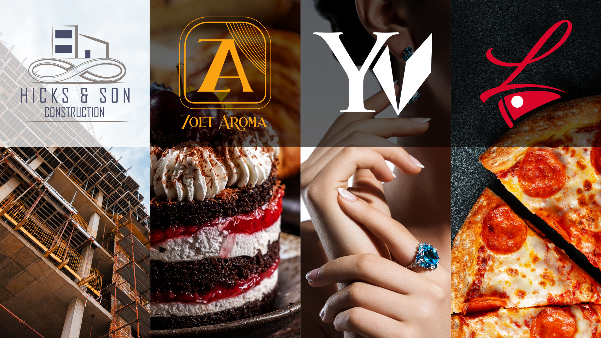
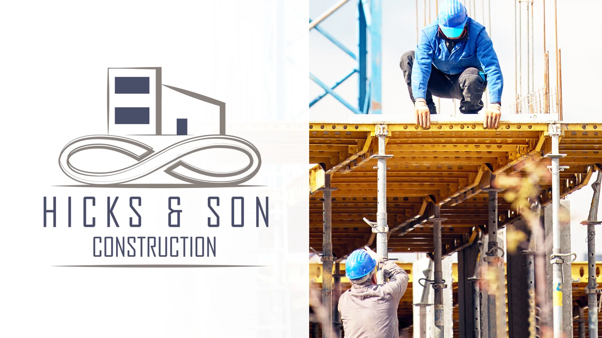
Hicks and Son Construction industry logo design
Which Industries Do I Design Branding For?
I design branding across 16 industries: haircare, wellness, real estate, skincare, restaurant, beauty, cosmetic, jewelry, podcast, beverage, automotive, healthcare, fragrance, food, gaming, and construction.
Half of the categories below are really packaging problems wearing a logo. Most Americans say packaging design often influences their purchase decisions, 72% of them, which means the box or the bottle is doing more selling than anything else the business owns.
The other half are service categories where the brand shows up on a vehicle, a storefront, a uniform, or a screen. Each one below is a graphic design industry example from my own work or my own process, and you can see more of it in my design portfolio.
Hair Care Branding
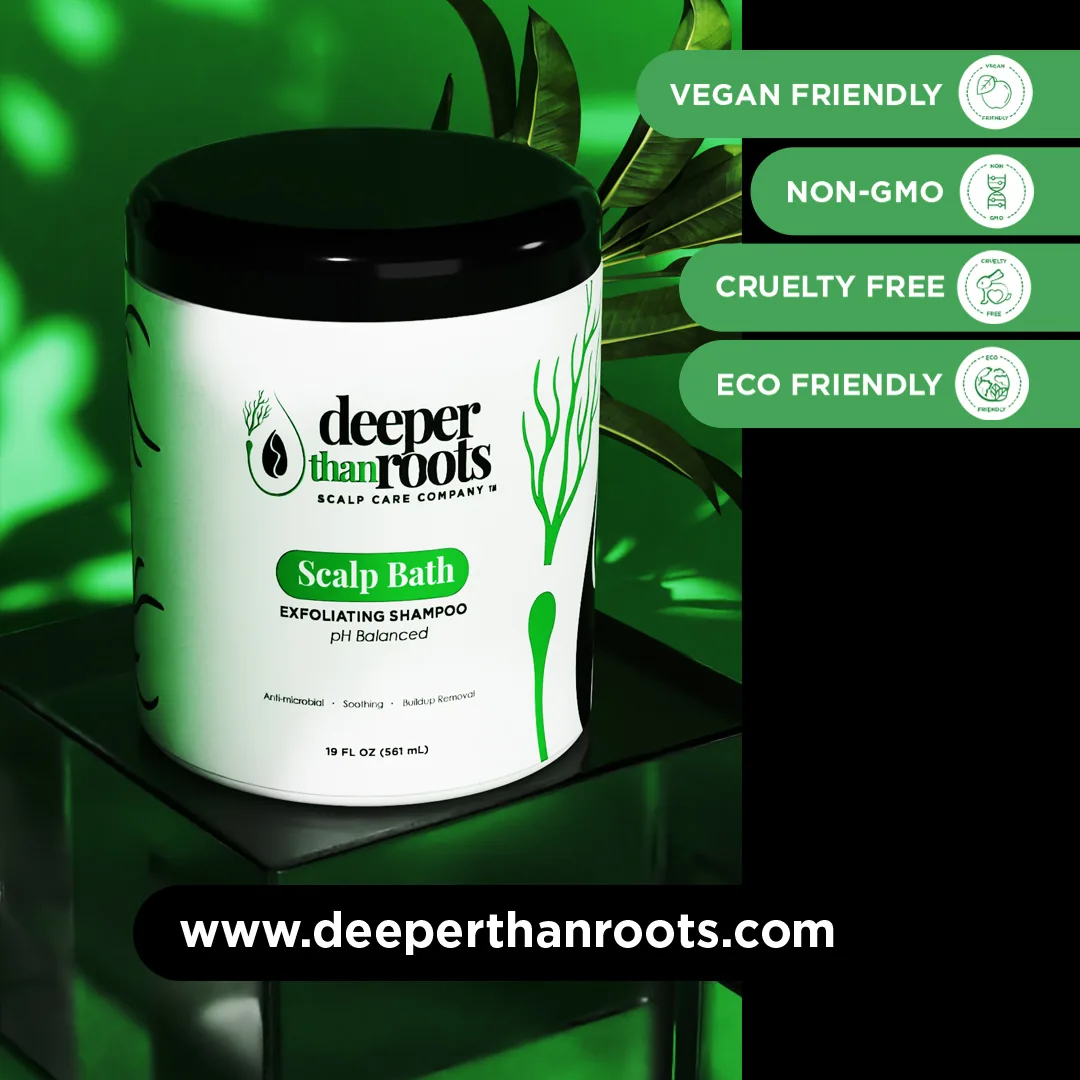
A haircare label is the hardest small surface in beauty. Brand, benefit, ingredient list, and directions all have to fit, stay legible, and still look considered on a shelf next to 30 competitors. For Deeper Than Roots, a Virginia haircare brand, I refined the identity toward a classic serif with an edge, then replaced a literal side portrait with an abstract seed symbol surrounded by forms that read as roots flowing upward.
I kept the founder's green and offered refined tones of it, designed the product labels, and built 3D product visualization for pre-launch promotion and pre-orders. The brand launched at a convention with the full set. US prestige hair sales reached $2.3 billion in the first half of 2025, so the shelf is only getting more crowded.
Real Estate Branding
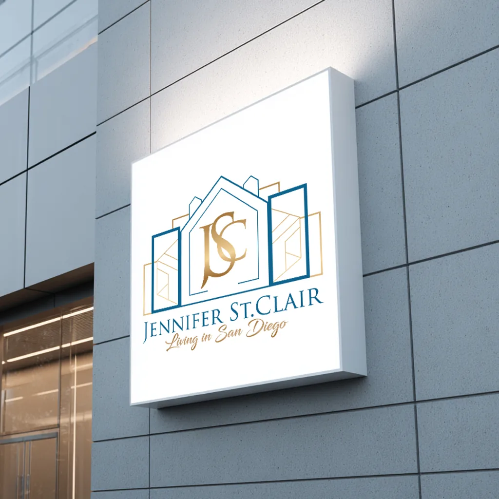
Real estate is a personal brand problem more than a company brand problem. The mark has to sit next to the agent's own photography, work inside the brokerage's rules, and still feel like a specific person rather than a template. Jennifer St. Clair, an agent with eXp Realty of California, came to me with an AI-generated logo that felt like a sticker instead of an identity. Partway through, her brand photoshoot came together and the whole direction changed.
I worked through the pivot rather than defending the original concept, and the final mark came out of the new direction. She left a detailed 5/5 Google review. With 88% of buyers using an agent and for-sale-by-owner at an all-time low of 5%, agents are competing against each other, not against the alternative. See my real estate branding page for more.
Wellness Branding
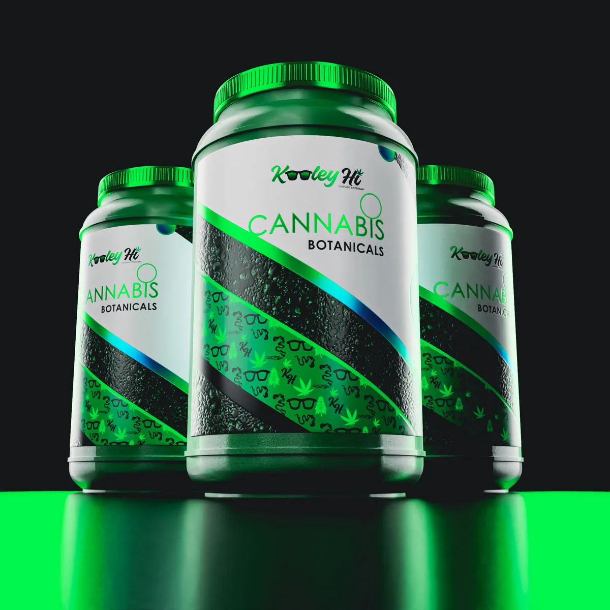
Wellness branding has to look calm and credible at once, and it has to manage that while the copy stays inside what the business can actually stand behind.
The constraint shapes the design: quieter palettes, more white space, typography that reads as settled instead of loud, and a claim hierarchy decided before layout.
Packaging carries most of the weight, from the primary label to the carton to the product photography or 3D renders that stand in before inventory exists.
Wellness buyers study a label closely before they trust it, so the back panel gets designed with the same care as the front.
Skincare Branding
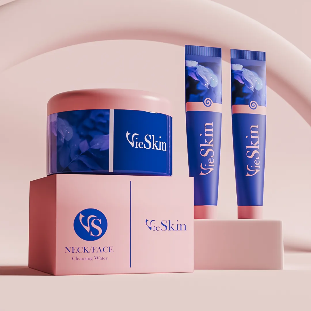
Skincare buyers read the back of the bottle before they trust the front. That makes the back panel a design surface, not an afterthought: ingredient lists, claim hierarchy, usage steps, and batch codes all competing for space on a 2-ounce container that also has to look premium at arm's length.
The decisions that matter here are typographic. How small can the ingredient deck go and stay honest. Which claim earns the top line.
Whether the cap, the bottle, and the carton read as one product or three. I design the label and the carton together, because a customer never sees only one of them.
Restaurant Branding
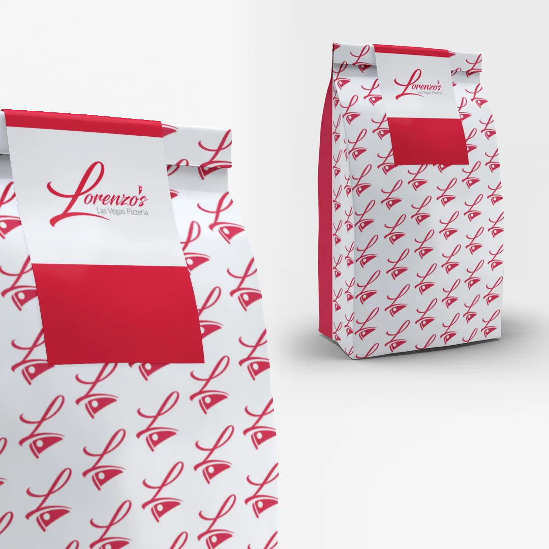
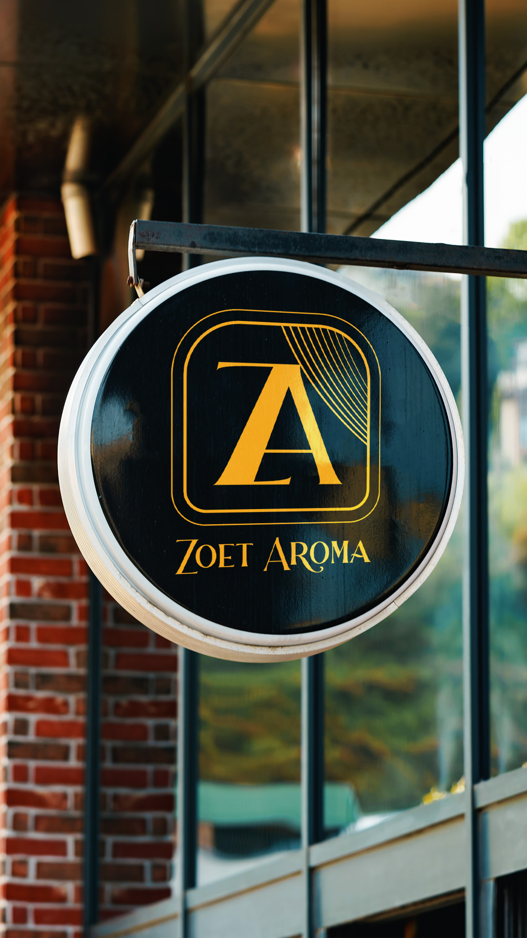
Restaurant branding is read at three distances and you have to design for all three. The sign works from the sidewalk. The menu works at a table, in whatever light the room has. The takeout bag works on a car seat and in a photo somebody posts later.
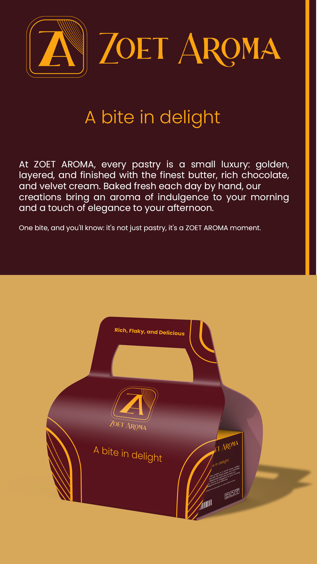
Miss any one of them and the brand has a hole in it. Signage, menus, packaging, aprons, cups, and social templates all come from the same system, and the system has to be simple enough that a busy operator can actually keep using it.
Branding in the hospitality industry carries real weight right now, with restaurant and foodservice sales forecast to reach $1.55 trillion in 2026.
Beauty Branding
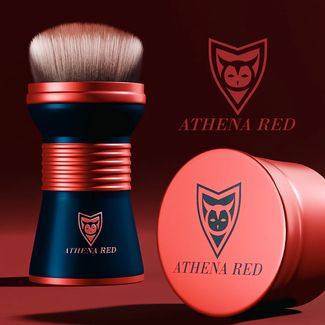
A beauty mark has to survive two environments that want opposite things. On a shelf it competes with color and gloss, so it needs weight and contrast.
On a phone screen it appears at thumbnail size inside a grid of other thumbnails, so it needs a shape that is recognizable before the name is readable.
Most beauty logos are designed for one of those and then quietly fail at the other. I test marks at both sizes early, in grayscale first, before color gets involved and starts hiding structural problems.
Cosmetic Branding
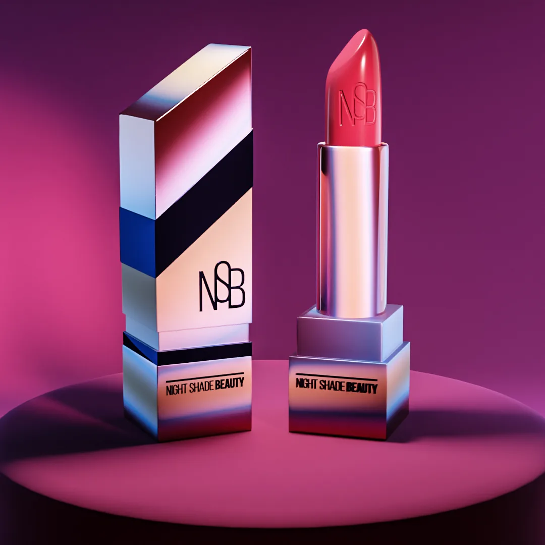
Cosmetic branding lives or dies on the system, not the logo. Shade names, shade families, palette layouts, and component printing all have to hold together across products that get added for years after launch.
If the naming convention is not decided up front, the tenth shade breaks it. Component printing adds its own limits: the printable area on a lipstick tube, a compact lid, or a pump collar is small, curved, and unforgiving.
I design the identity with those surfaces on the table so the brand extends cleanly instead of being redrawn every time the line grows.
Jewelry Branding
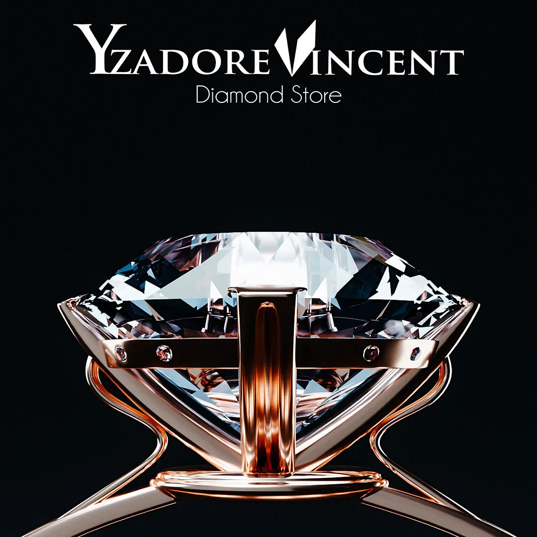
If a jewelry mark does not read at engraving size, it is not finished. That is the whole test. The same mark has to work stamped into metal, foiled on a box, embossed on a pouch, and set against product photography that is deliberately the most beautiful thing in the frame.
That last one is why restraint matters more here than almost anywhere else: the branding is not the hero, the piece is. One idea, committed, with nothing decorative fighting the product.
Then a packaging system quiet enough to make the unboxing feel like the point.
Podcast Branding
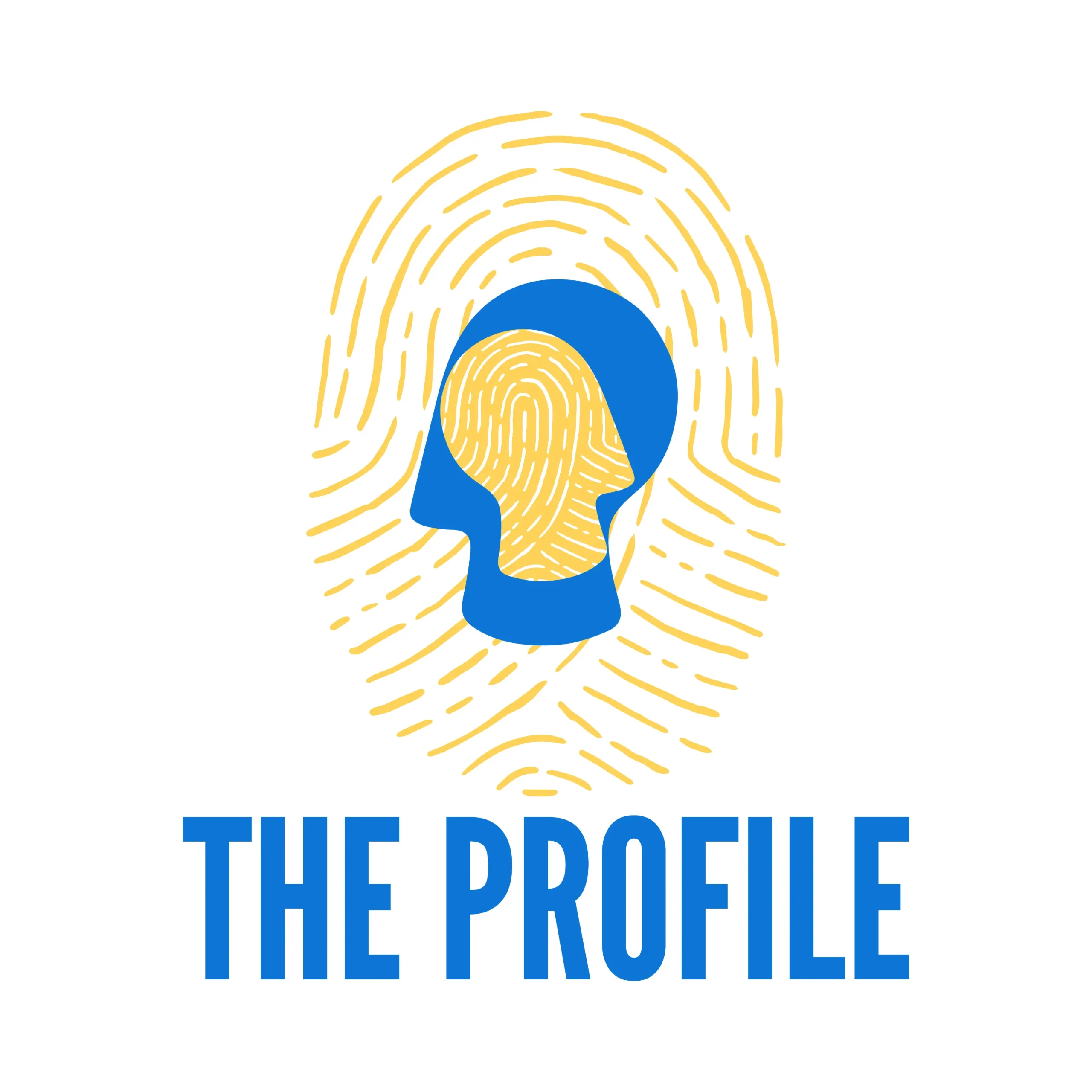
Podcast cover art competes as a thumbnail, at roughly the size of a postage stamp, inside a list of other thumbnails. Three or four words is usually the ceiling.
A face or a single strong shape usually beats a clever illustration, because the clever illustration turns to noise at that size. When I built Jennifer St. Clair's identity, it covered her YouTube channel alongside her real estate brand, so the same system had to work as a channel identity, a thumbnail, and a personal mark.
Podcasting is no longer a small audience: 80% of Americans 12 and older have listened to or watched a podcast, and monthly podcast listening among people 55 and older jumped from 38% to 58% in a single year.

Healthcare Branding

Healthcare branding is where restraint becomes the strategy. The identity has to feel settled and trustworthy, and anything that looks like it is trying to be clever works against the practice.
For Irvin Psychology I built a personal-brand identity around an icon paired with a traditional serif, using deep emerald green and black, set in Goudy Old Style. It was designed for real applications: letterhead, marketing materials, event materials, stress-relief devices, and a website refresh after the logo was finished. The client brought the industry knowledge and I brought the design judgment, which is the right split in a sensitive professional field. I design brand materials. I do not provide regulatory, privacy, or compliance review of any kind.
Beverage Branding
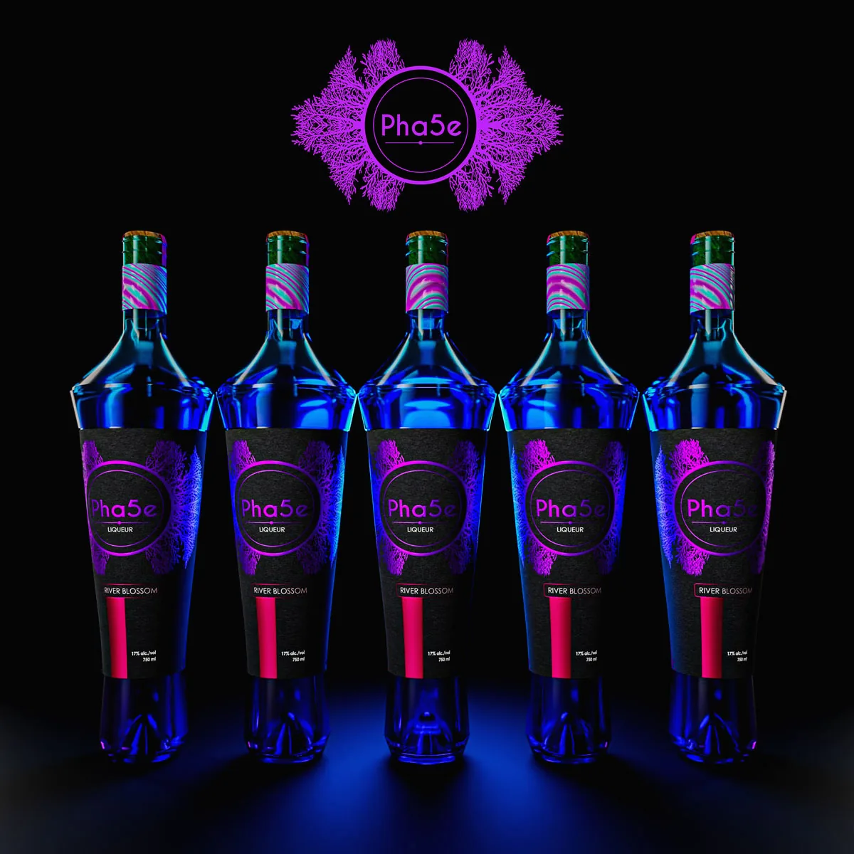
A beverage brand is one object, not three designs. The bottle shape, the label, and the case have to work together on a shelf where the customer sees the front panel and nothing else until they pick it up. Label stock changes the color.
A clear bottle means the liquid is part of the palette whether you planned it or not. The case has to identify itself in a stockroom from six feet away.
I design the label with the case and the shelf set in mind, because a beautiful label on a box nobody can find in a warehouse is a problem you only discover after the print run.
Automotive Branding

Automotive identities have to survive weather, vinyl, embroidery, and a building. Mad Hatter Auto, with locations in Omaha and Council Bluffs, had acquired a franchise carrying an identity that may have dated to the 1960s or 1970s.
The owners wanted something unconventional but still professional, matching the themed customer experience they had built. I developed a purple, gold, white, and gray direction that carried through the logo, the website, employee polos, hats, mechanic shirts, a large exterior banner, the bay doors, the building colors, and the safety-post accents.
The result is a shop that looks like nothing else on the street, which was the entire point.
Fragrance Branding
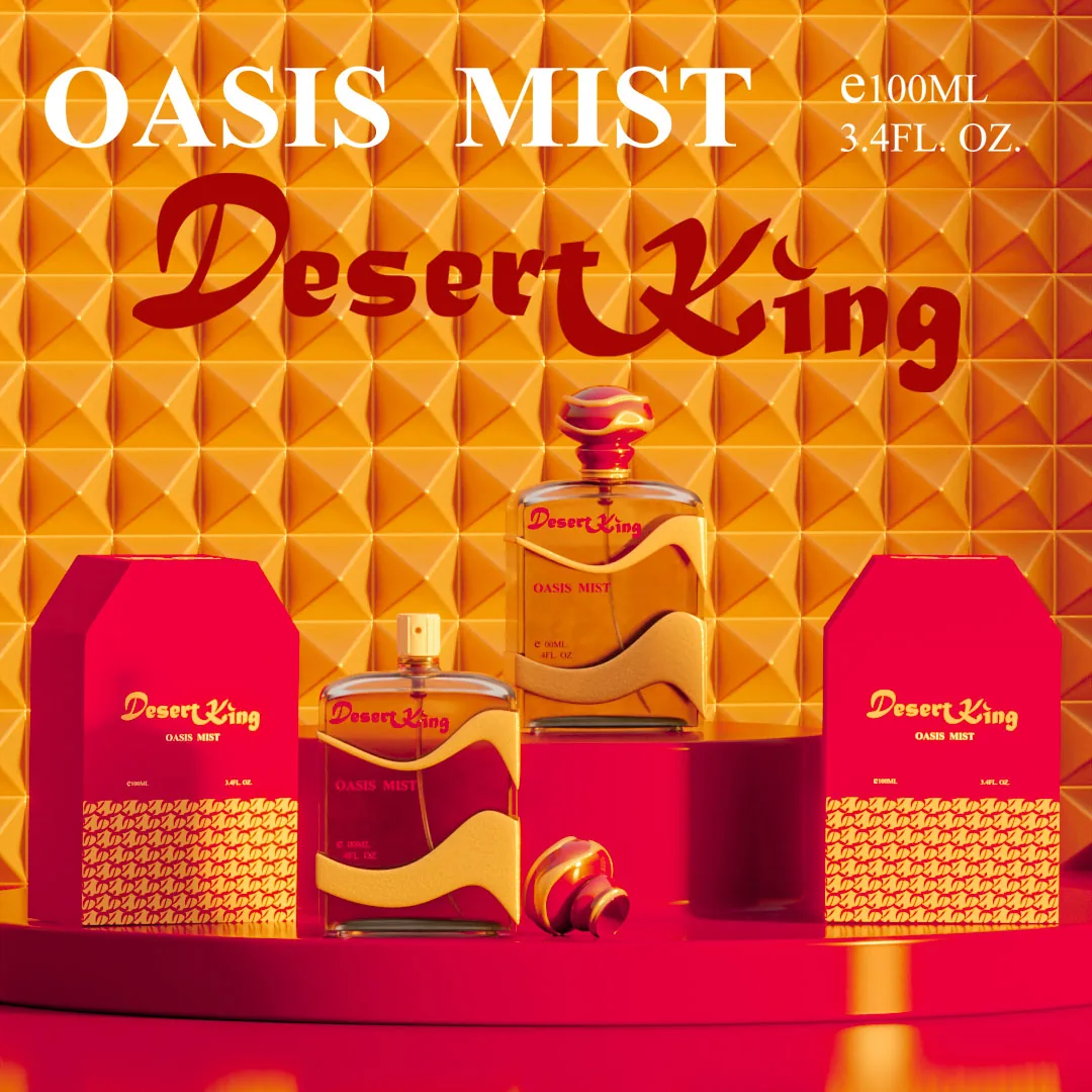
In fragrance, the bottle is the brand and the outer carton is the sales surface. Those are two different jobs.
The carton has to stop someone in an aisle or a search result, so it carries the contrast and the type. The bottle has to look right sitting on a dresser for a year, so it carries restraint and material quality.
Foil, emboss, soft-touch coating, and clear varnish all behave differently on a small carton than they do in a mockup, and the difference shows up in the proof, not on the screen. US mass fragrance dollar sales rose 17% in the first half of 2025, so this shelf is getting louder.
Fitness Branding

Fitness branding has to work on a body, on a wall, and on a phone.
The same mark ends up screen printed on a shirt that stretches, painted at ten feet across a gym wall, cut down to an app icon, and dropped into a class schedule graphic somebody on staff rebuilds every week.
That last one decides how the system gets designed: if the templates are not simple enough for a non-designer to keep using, the brand drifts inside a month.
I design the mark for the garment and the wall first, since those are the least forgiving surfaces, then build the digital templates around them.
Waste Management Branding
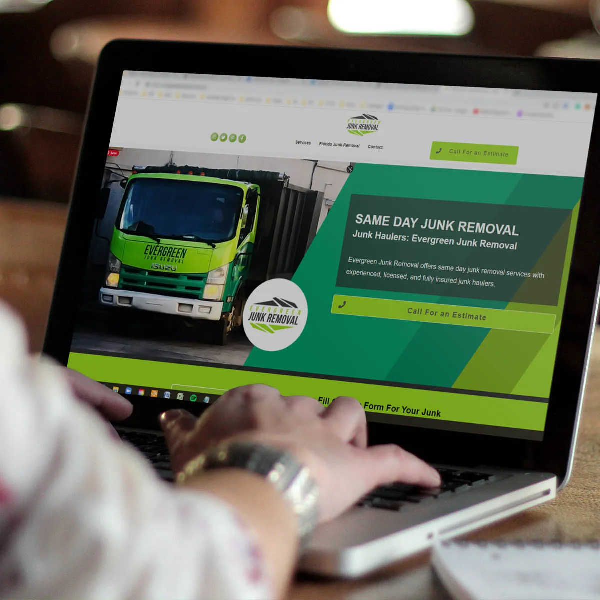
Waste management branding lives on a truck first and a website second. The truck is the largest sign the business owns, and it gets read at speed, from behind, in traffic, which means simple shapes, strong contrast, and a version that still holds at distance.
Once the mark survives that, the same system carries into decal wraps, printed and digital flyers, social and advertising graphics, webpage graphics, and infographics.
The test I use is simple: if a past customer can describe your truck from memory a year later, the identity did its job. Most service-business logos fail that test.

Sports Branding
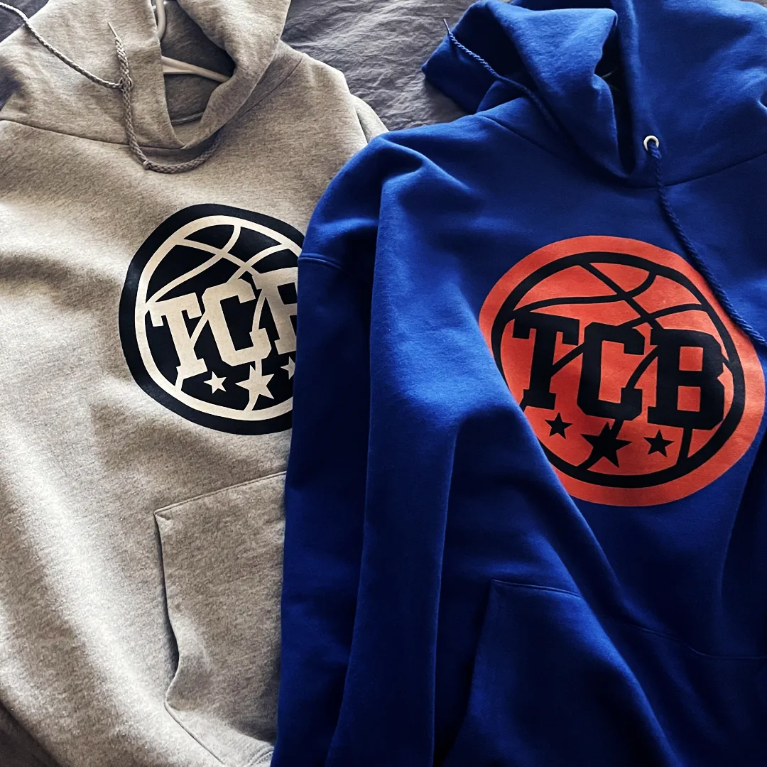
Sports branding gets judged in motion, at distance, and on a small screen, which is three tests most logos never face.
A team mark has to survive sublimation across a curved jersey panel, screen printing on heavy fleece, embroidery on a cap, and a camera where it appears for two seconds. That rules out fine linework and close-value color pairs early.
I design the primary mark, the secondary marks, and the numbering and typography system together, then test them on the actual garment surfaces before anything reaches a printer. Kit graphics also have to work cropped, because a jersey is almost never photographed whole.
Transportation Branding
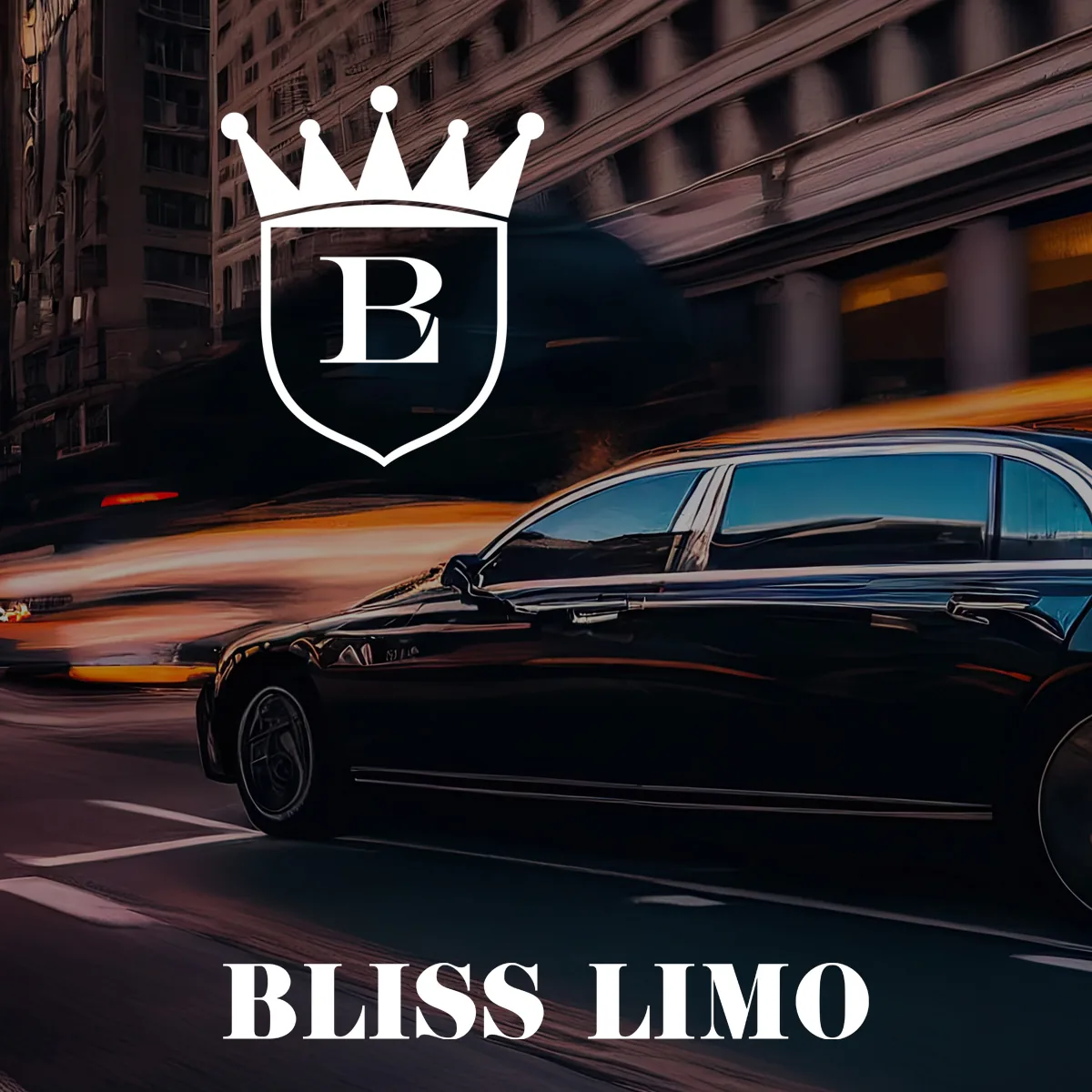
Transportation branding has to signal the price of the service before anyone gets in the vehicle.
A luxury operator with a plain informational site has a gap the customer feels immediately: the site carries the phone number and nothing about why the ride costs what it costs.
So positioning comes before layout. I run discovery on the audience and market position first, then build the site structure, page layouts, imagery, and creative direction from those decisions, alongside the logo suite and brand patterns that carry the identity across every screen.
Vehicle graphics, signage, and driver-facing materials come from the same system.
Construction Branding
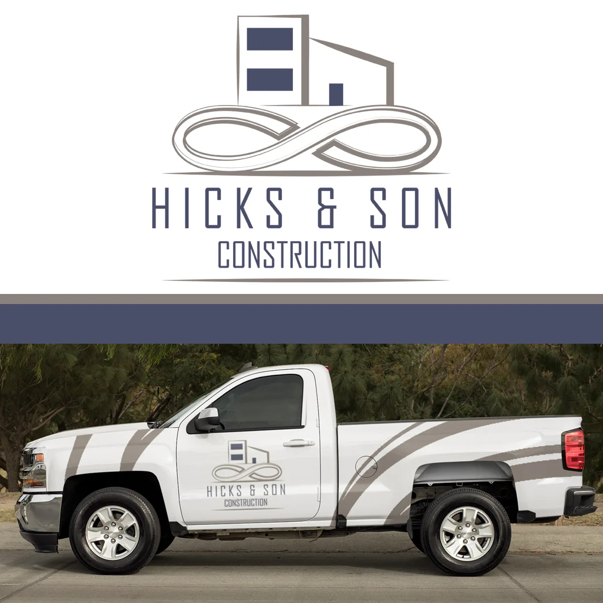
Construction brands get seen on trucks, jobsite signs, hard hats, and embroidered shirts long before anyone visits a website. That order matters, because it means the mark has to survive vinyl, weather, and thread first, and look good on a screen second.
Simple shapes, strong contrast, and a version that still reads at small size are not stylistic preferences here, they are requirements.
I built the website for Noah's Ark Construction, a construction and real estate development company, covering site structure, page layouts, and creative direction for how the business presents itself online.
Industries Beyond These
These are the categories I work in most, not a fence. I have designed the icon, packaging, catalog, in-store banners, and campaign creative for Johnny Jiggs, a fishing tackle shop in Pompano Beach, Florida, working with them since 2020.
I have also designed cover art and personal branding for musicians. If your category is not on the list above, the process does not change. These branding industry examples all started the same way, with a conversation about where the brand has to live.
Scroll the table sideways to see every column.
| Layer | What it covers | Categories that lean on it most |
|---|---|---|
| Core identity | Logo suite, color system, typography, usage rules, brand guide | All 16 |
| Packaging and labels | Primary labels, cartons, pouches, structural concepts, finishes | Haircare, skincare, beauty, cosmetic, fragrance, food, beverage, wellness |
| Environment and applications | Signage, menus, vehicle graphics, uniforms, jobsite materials, interiors | Restaurant, automotive, construction, healthcare |
| Product visuals | 3D models, photorealistic renders, mockups, product animation | Product categories, especially before inventory exists |
| Digital | Website structure, page layouts, social templates, channel and app graphics | All 16, and it is the whole brand for podcast and gaming |
What Does an Industry Branding Project Include?
An industry branding project includes the identity itself plus only the assets that category actually uses, which is why the deliverable list for a restaurant and the deliverable list for a jewelry brand do not match.
Scroll the table sideways to see every column.
| Provider type | What you get | The trade-off | Who it fits |
|---|---|---|---|
| Large agency | Teams, account management, capacity for simultaneous workstreams | Higher cost, layers between you and the designer, longer timelines | Multi-location rollouts, established companies with internal marketing |
| Specialist studio | Deep familiarity with one category's constraints and suppliers | Can arrive with a signature look you inherit | Brands in a highly technical category |
| Solo studio | Direct access, one set of decisions across every asset, continuity for years | Limited capacity, and you are hiring one person's judgment | Owners and founders who want consistency and a real conversation |
| Crowdsourced concept marketplace | Many quick options, low upfront cost | Speculative work, unclear ownership, no discovery, no accountability | Rarely a good fit for a brand you intend to keep |
The core is always the same, and it is the part that gets skipped most often. A logo on its own is a signature with nothing to sign. What makes it usable is the brand identity around it: the color system, the typefaces, the rules for backgrounds and clear space, and a guide that tells whoever touches the brand next what they can and cannot do. Every project starts with logo design and the system that holds it up.
From there, the assets are chosen by category. A product brand usually needs packaging and labels before it needs anything else. A service brand usually needs the vehicle, the uniform, and the sign. Nobody needs all of it, and I would rather tell you which four things matter than sell you 20.
On the digital side, brand industry services and web development overlap more than people expect. Visual judgments about a web page form in roughly 50 milliseconds, which is faster than anyone reads a headline, so the look of the page is doing work before the copy gets a chance. That is why positioning comes before layout on every site I build.
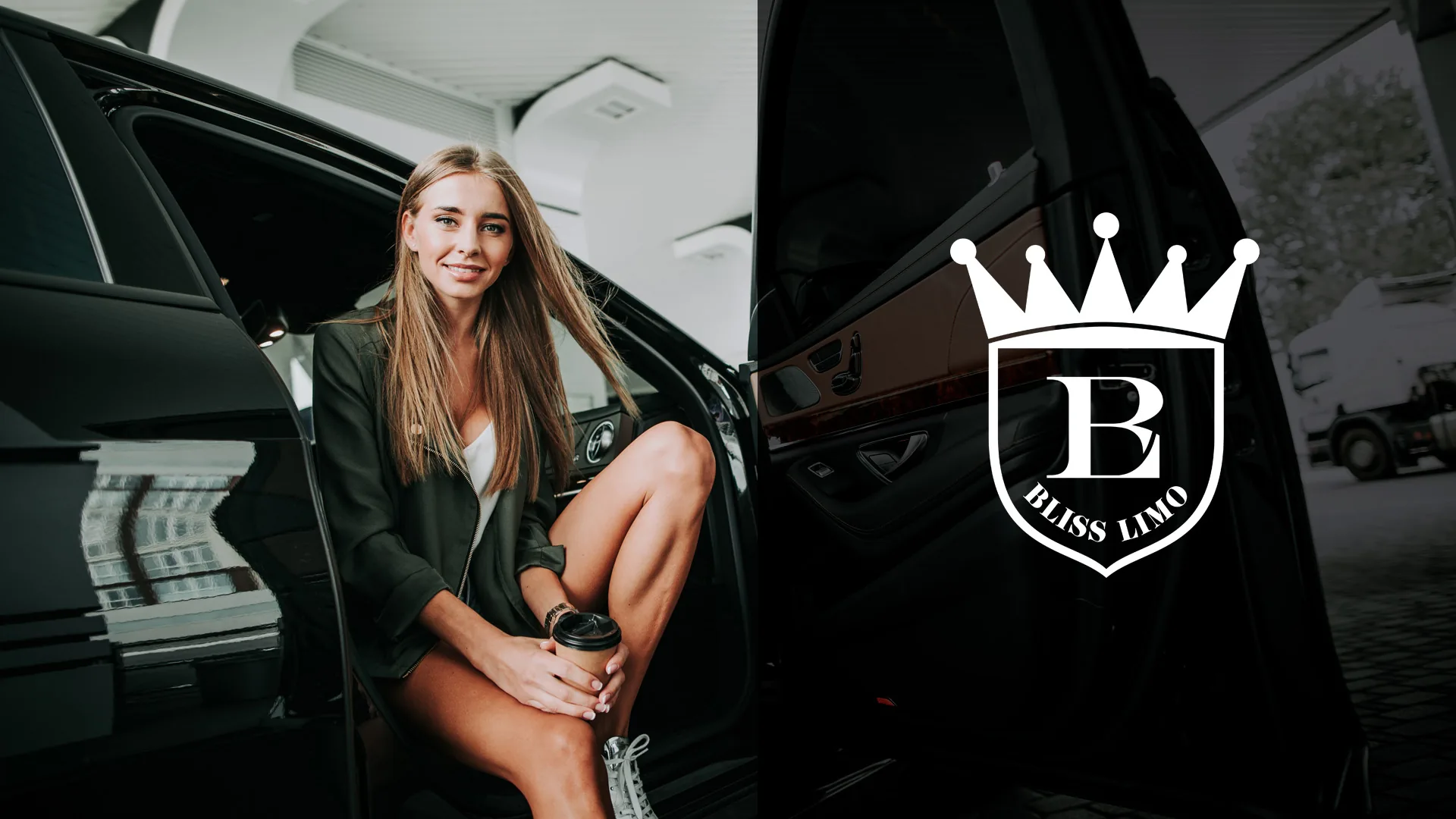
On the Bliss Limo project, the creative direction came out of discovery about the audience and the market position, and only then did the pages get designed. If a site is part of your scope, the details are on my website design page.
Digital transformation is a large phrase for something fairly concrete in this context: the brand has to work in places that did not exist when most visual identities were designed. A square app icon. A vertical video frame. A dark-mode background. I design for those the same way I design for a bay door, by knowing the surface before drawing for it.
On delivery, the practical terms: I create original concepts and do not intentionally copy another brand's design. I offer unlimited revisions and work toward a design outcome the client is satisfied with. Clients receive access to the applicable editable project files, including AI, PSD, and PDF files, after completion, and all work and delivery is handled digitally. I keep project files, so if a past client loses theirs or a device fails, I resend them at no charge.
How Do You Choose an Industry Design Firm for a New Project?
Choose an industry design firm by asking four questions: who personally does the design work, whether you see original concepts before anything is refined, how revisions actually work, and who owns the final files once the invoice is paid.

On category experience, be careful what you ask for. A designer who has worked in your industry knows its constraints, which is genuinely valuable, and it is why the sections above are written around constraints rather than looks. The risk is that experience turns into a house style, where every brand in a category ends up with the same palette and the same rounded typeface. Knowing a category should make a designer more specific, not more repetitive.
Cheap design carries costs that show up later. Weak communication. Generic results. Unclear ownership. Work sold to more than one business. I have seen ad creative resold to competing companies, which confuses customers and undoes the differentiation the business paid for in the first place. I provide a one-on-one custom design process rather than a crowdsourced concept marketplace, and the difference is not only the output, it is who is accountable for it.
Some clients arrive after a designer went quiet and left them with incomplete assets and no confidence. I reset those projects with transparent communication, real discovery, and clear accountability. I can work under an NDA when a project calls for it, and in some situations I have provided a notarized signed release confirming that the client owns the design after payment and that I retain no ownership stake. That is a trust-building practice I offer, not a universal legal guarantee, and it is worth asking any firm in the brand design industry what their equivalent is.
What Are the Best Companies Offering Industry Design Services?
There is no single best company for industry design, because the right fit depends on scope. Large agencies suit multi-market rollouts with many stakeholders. Specialist studios suit one deep category. Solo studios suit owners who want the person doing the work to be the person on the call.
The solo option is not a fallback, it is a normal way this industry works. About 20% of graphic designers are self-employed, and a good portion of the branding industry runs on independent studios working directly with owners.
Here is what I am, stated plainly so you can compare it against the table. Branding Design Pro is a one-person design studio led by Kenal Louis, based in Omaha, Nebraska, serving clients nationwide, taking roughly four to six clients a month. I do discovery, concepts, refinement, application, and final files myself. There is no account manager, no handoff, and no junior designer executing someone else's direction.
The honest version of what that is worth: working across brand design, packaging, websites, and product visuals is an advantage only when it has been earned. It takes years of client work, trial and error, continuing education, software training, and study of design principles before someone can move between those disciplines without the quality dropping. Being multifaceted should never mean being unfocused. If a provider claims six disciplines, ask them how long they have been doing the fifth one.
How Is an Industry Design Project Quoted?
Every industry design project is quoted individually after a scope conversation, with a written proposal before any work begins. Project quotes only. No hourly billing and no retainers, because I do not provide ongoing marketing execution.
What moves the number is scope, not category. For branding work, it is the number of assets and how complex each one is: logo development, identity system, packaging and label count, collateral, product visuals, and animation. For website work, the factors are page count and site structure, e-commerce or catalog complexity, custom functionality, database-driven development, integrations, copywriting and content creation, animation and motion assets, licensed stock photography, stock video or footage, and any premium plugins, software, or paid resources the build requires.
There is no fixed number of stock images, stock footage assets, or plugins included in every project. Those needs get identified during scoping and communicated to you before the quote is finalized, which is the whole point of quoting individually. You should know what a project costs before it starts, not after.
Unless a proposal specifically says otherwise, the following are not included: purchasing or owning your domain name, purchasing or managing web hosting, ongoing SEO services, paid advertising services or ad spend, professional photography, ongoing website maintenance, e-commerce inventory setup, shipping accounts, merchant-service setup, and ongoing store operation. I provide guidance on domains and hosting for clients who are not sure what they need, including alternatives when the ideal domain is unavailable or priced as a premium name, but you buy and own those assets yourself. That keeps your business under your control.
If you want to see how the pieces get combined, my branding packages page covers how a full scope is assembled.
How a Project Runs, From First Call to Final Files
- Consultation call. We talk about the business, the category, and what you actually need. If a smaller scope serves you better, I will say so.
- Agreement and deposit. Terms in writing before anything starts.
- Discovery call. Target audience age range, demographics, psychographics, why you are starting now, your vision, any existing concept or tagline, the assets and collateral you need, and the industry context that shapes all of it. If you do not have a concept yet, we build one together.
- Research and inspiration boards. Category research first, visual direction second.
- Six to nine hand-drawn rough sketches. Compositional structures, drawn by hand, to test ideas quickly and find out what you respond to.
- Grayscale prototyping. Structure gets proven before color is allowed to rescue it.
- Color and application testing. The direction gets tested on the surfaces it will really live on, whether that is a label, a sign, a vehicle, or an app icon.
- Revisions. Unlimited, through a feedback loop of conversation, options, and refinement, until you have a direction you feel confident choosing.
- Delivery. Brand guide with typeface names, color codes, logo-use guidance, background guidance, and application notes, plus editable files. Larger packages can include an expanded brand guide and a narrated video guide or presentation explaining the system.
- After launch. I keep your files and resend them years later at no fee. If you are pursuing trademark registration and your attorney needs a design adjustment, such as a name change, I generally make that adjustment at no additional charge.
A defined deadline gets set at the beginning. Projects without a schedule drift, lose momentum, and become harder to finish, and that matters most when you already have an audience waiting.
Communication runs on whatever works for you: phone, text, Zoom, Google Meet, or screen sharing. Miscommunication causes more design frustration than any other single factor, so I treat it as part of the work rather than an overhead.
What I Don't Do
Clear boundaries make the rest of the work better, so here is what is outside my scope.
I do not provide ongoing marketing execution. No ad management, no advertising spend, no campaign reporting, and no ongoing SEO service. I am a designer, and I keep my professional focus there on purpose.
I do not provide professional photography, and I do not purchase domains or hosting on your behalf. I do not provide legal advice, trademark clearance, or regulatory-compliance review, and I cannot tell you that a name is available or protected. Those are questions for an attorney.
What I do next to those lines: I design ad creative built to your brand guidelines, the way I did Google and Facebook ad designs for Johnny Jiggs. I build a basic local SEO structure into websites so a site is less likely to need expensive restructuring later. I make design adjustments when a client's IP attorney needs one. And I support the vision you bring rather than positioning myself as your general business adviser, which is a distinction I think more designers should make out loud.

The Designer Behind Branding Design Pro
I am Kenal Louis. I have 15 years of client design work and more than 25 years of drawing behind it.
I founded Branding Design Pro in 2018 and take roughly four to six clients a month, working from Omaha with clients across the country.
Before this, I spent about 18 months as a graphic designer in the Omaha studio of monumental sculptor Matthew Placzek, working under his art direction on brochures, pamphlets, expo and medical-facility banners, project presentations, and illustrations tied to sculpture concepts.
I contributed creatively to studio work including a Henry Doorly Zoo installation project associated with a contract worth more than $2 million.
I was an hourly studio employee there, not the commissioned artist, and the value of it was learning to translate large, complex concepts into materials other people could act on.
Earlier, under a previous business called Kenalsworld, I designed for Ark Music Factory: the website, the logo, its online presence, YouTube channel branding, and campaign designs.
I have been credited on Wikipedia for designing the single cover for Rebecca Black's “Friday.”
My digital illustration work has been featured in Afropunk Magazine and Kalblut Magazine, and I hold patents for shoe and furniture designs. These brand design examples and the fine-art work sit side by side, but they are not the same practice.
On AI, since everyone asks: it is a tool, and capable designers should adapt to it. Used without professional design experience, it produces work that looks cheap or generic, because the hard part was never rendering. The hard part is interpreting a client's purpose, personality, market, and emotional intent, then making calculated choices that serve them. That judgment is still the job.
“I cannot say enough wonderful things about this business. Mr. Louis was phenomenal. He was professional, met deadlines, stayed true to my vision and was extremely patient through all of my last minute changes. I was more than pleased with the final product. Definitely exceeded my expectations. I would gladly refer and use his services again.”Amani Fields, Twisted Rootz
More from clients on my client reviews page.
Ready to Talk Through Your Project?
Start with a conversation about your category, your audience, and which assets your launch actually uses. Not a pitch, and no pressure to buy the largest scope on the menu. If what you need is a logo and a label, I will tell you that.
Bring whatever you have: a rough idea, a name, a competitor you admire, a mark you are unsure about, or nothing but a launch date. I will tell you honestly what I think the work requires and what it does not.
Genuine Branding Reviews From
Business Owners I've Helped
Time - 1:05 minutes
Time - 41 seconds
Time - 1:41 minutes
Time - 42 seconds
Let's talk about your vision for your brand. Use the calendar to book your free consultation call — you'll share your goals, get answers, and see whether we're the right fit for each other.