
Hair Care Branding Services for Salons, Hairstylists, and Products
Here is the number that should change how you think about hair marketing: advertising influences 5% of buyers when they choose a shampoo. Celebrity endorsement moves 2%.
A hairdresser's advice moves 16%. Friends and family move another 12 to 14%.
So hair care branding is not an advertising problem. It is a recommendation problem. Your brand has to survive being described by someone else, out loud, from memory, to a person who has never seen it. That is a completely different design brief from making a bottle look nice, and most hair care companies never write it down.
I design brand identities for hair care brands and salons. Below is how I think about the recommendation problem, four projects where it showed up differently, and what I would decide before spending a dollar on design.

TL;DR
- Advertising moves almost nobody in this category. A hairdresser's recommendation influences 16% of shampoo buyers and friends and family another 12 to 14%, while ads reach 5% and celebrity endorsements 2%.
- Hair care branding has one job that matters more than looking good: making your brand easy to name, describe, and pass along.
- Only 15% of brand assets are distinctive enough that consumers connect them to the right brand. For color alone the figure drops to 4%.
- Discovery has shifted to strangers. Instagram views from non-followers nearly doubled to 49% last year, which means most people meeting your brand have no context for it at all.
- Salon and stylist audiences need a different brand than retail shoppers do. Independent stylists are now the majority of US hairdressing professionals, and they buy through their own channels.
Why Does Hair Care Branding Decide Whether You Get Recommended?
Hair care branding decides whether you get recommended because recommendation requires your brand to be repeatable, and most brands are not. A customer has to retrieve your name from memory, say it correctly, and describe you well enough that a stranger can find you. Every one of those steps is a design problem.
Think about what your brand is actually asked to do in that moment. Someone compliments a friend's hair in a parking lot. The friend has maybe eight seconds and no bottle in hand. She has to produce a name, and usually a shape or a color, and some version of what the product does.
If your name is hard to spell, she will describe the bottle instead. If your bottle looks like four other brands, the description fails. If your product does three things, she will say none of them.
This matters more in hair care than in most categories because switching is rare. 45% of adults say they always use the same shampoo brand. You are not competing for an open decision. You are trying to interrupt a habit, and a personal recommendation is one of the few things strong enough to do it.
That is also why I treat word of mouth as a design consideration, not a marketing one that happens later.
What Makes a Hair Care Brand Easy to Recommend?
A hair care brand is easy to recommend when three things are true: the name is sayable, the look is describable in one phrase, and the promise fits in one sentence. Miss any of the three and the recommendation breaks somewhere between one person's mouth and another person's search bar.
The name has to survive being spoken. Not read. Spoken, by someone who may have seen it once. Invented spellings, dropped vowels, and silent letters all feel distinctive on a label and fail in a parking lot. Before I commit to a direction, I want to know the name can be heard and typed correctly.
The look needs one describable feature. "The one with the tree on it." "The black jar." "The teal and orange bottle." One feature, stated plainly. If you need two clauses to describe your own packaging, your customer will not manage it.
The promise has to be one thing. Scalp health. Curl definition. Breakage. Pick the one you want people to repeat, and let the label carry the rest as supporting information rather than competing headlines.
There is a fourth thing that matters now and did not a few years ago: the brand has to be describable in text. Buyers increasingly ask an assistant or a search box for "the shampoo for dry scalp that comes in the green bottle." Consistent, plain language about what you are and who you are for is what makes you findable in that query. Vague poetic positioning reads beautifully on a bottle and leaves nothing for anyone to repeat.
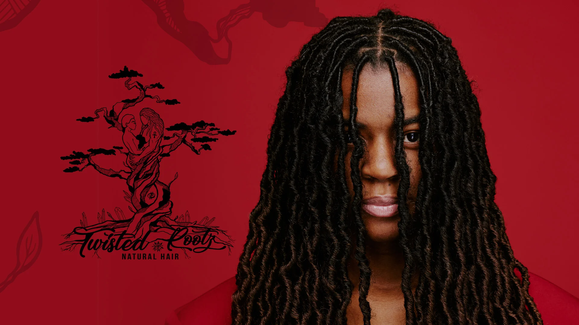
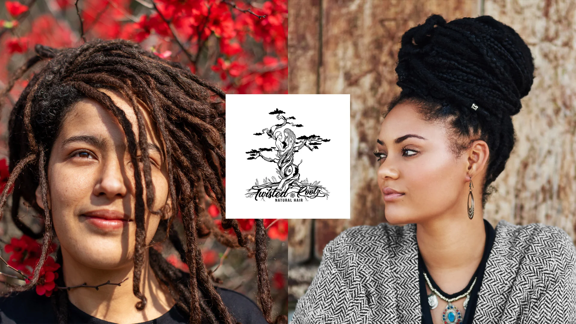
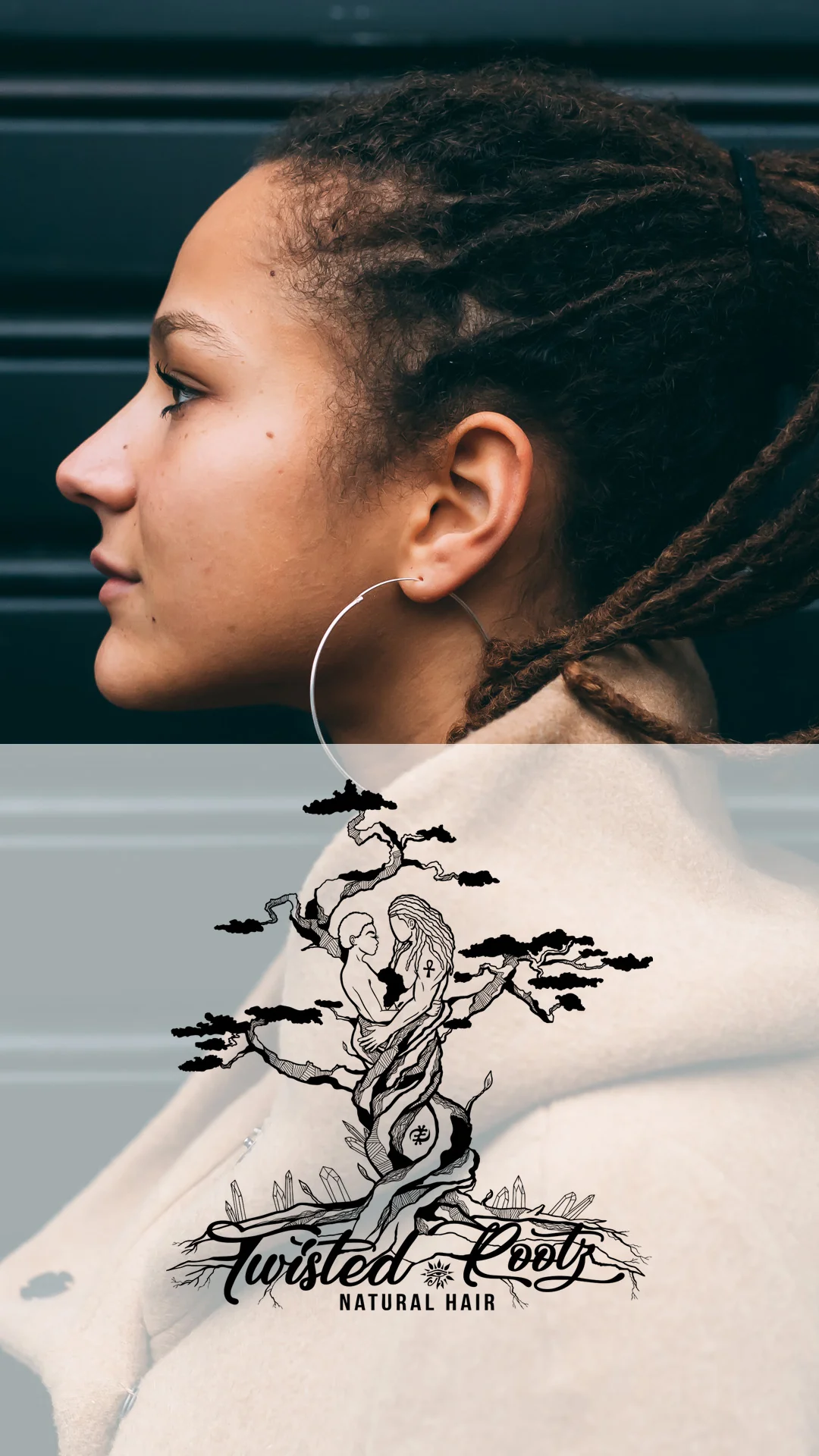
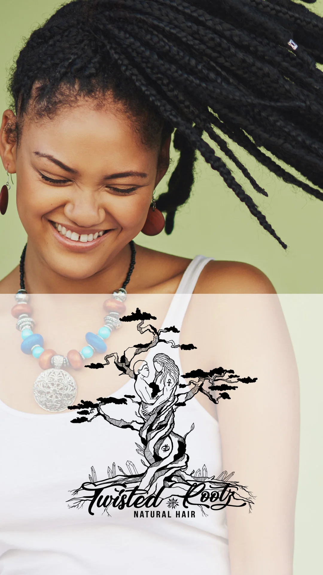
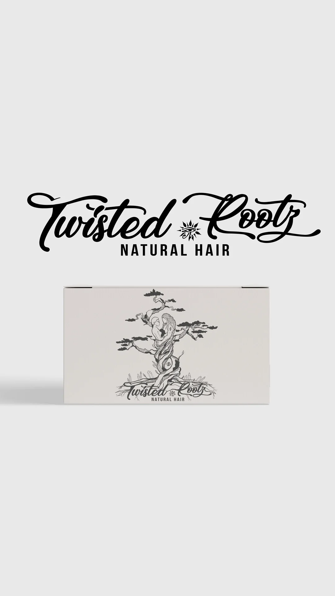
Case Study: Twisted Rootz, a Salon Brand Built From a Client's Own Idea
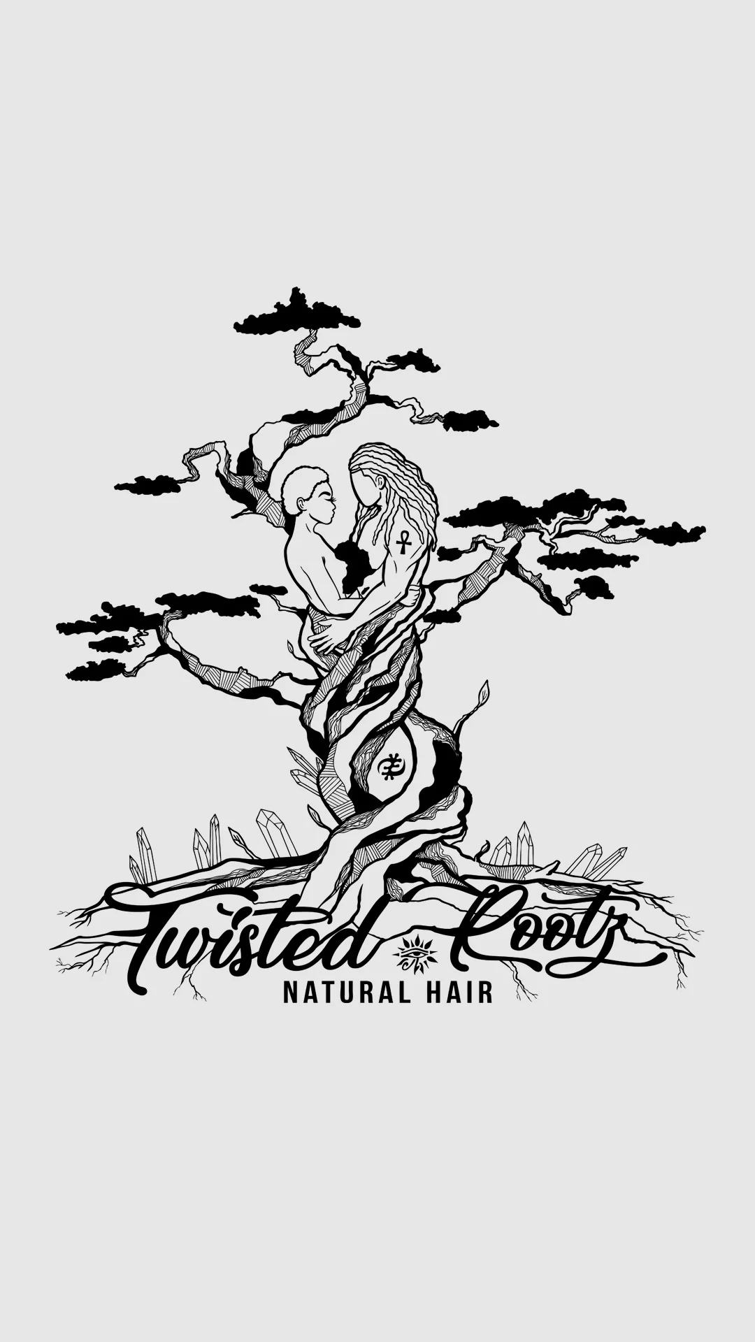
Amani came to me opening a salon with nothing built yet. No logo, no branding, nothing for marketing or a website. What she did have was an idea, and it was a good one.
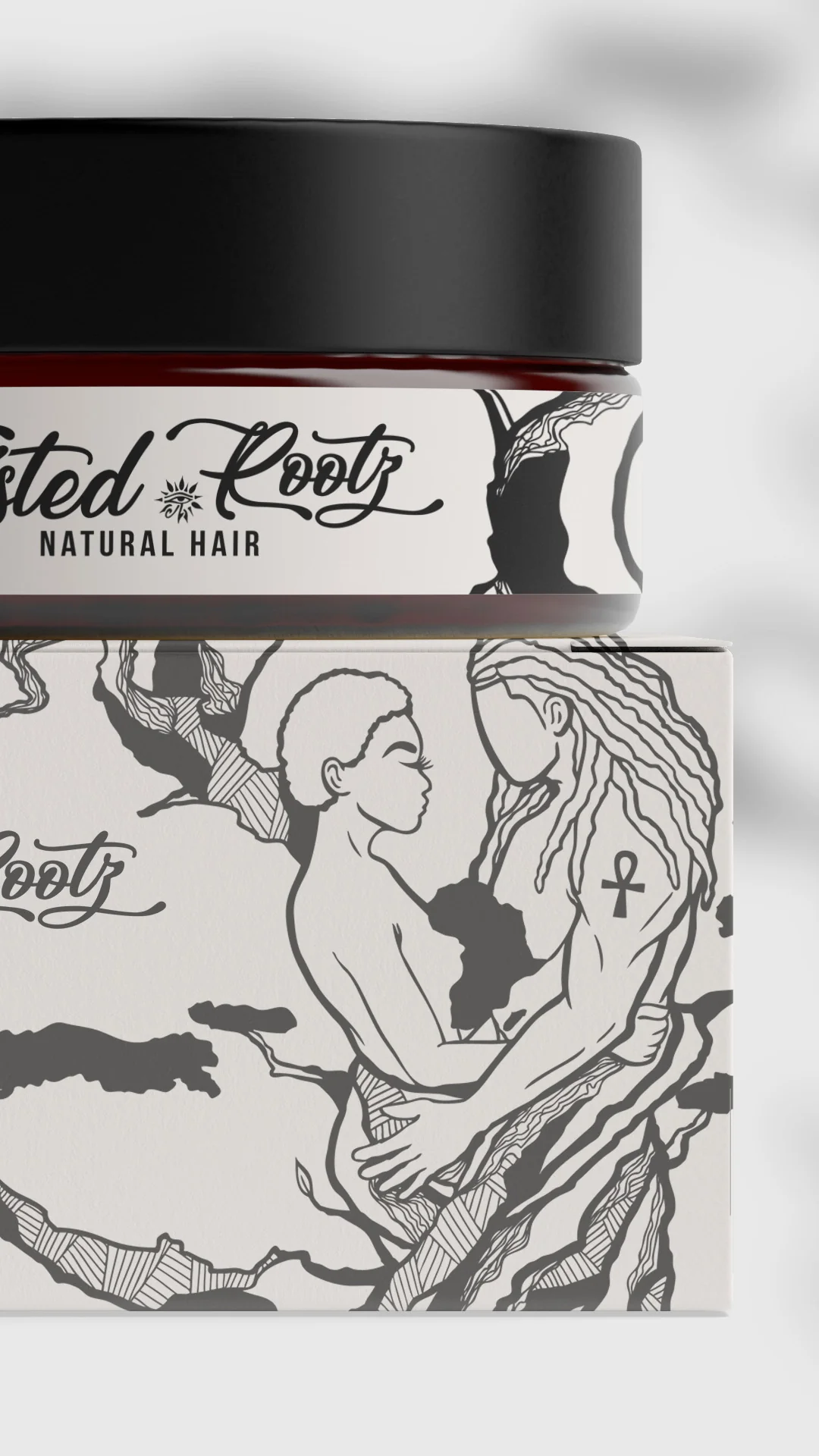
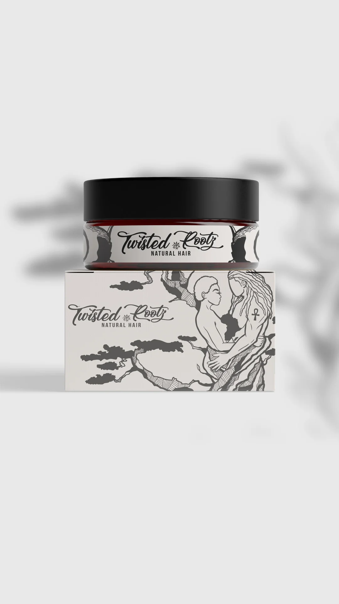
She wanted an illustrative mark: an Afrocentric male and female figure holding each other, drawn so the forms read as roots or trees, wrapped and tangled together. That is a hard brief. It is the kind of idea that either becomes something striking or becomes a mess, with very little room in between.
Why the artistic route was the right call here. Most salon logos are a wordmark and a scissors icon, or a wordmark and a silhouette. Amani's concept was deliberately on the artistic side, and for a salon that is a real advantage. A salon is a personal, physical experience, and an illustrative identity gives people something to point at. "The one with the tree and the two figures" is exactly the kind of description that travels.
The process was redrawing, not tweaking. Amani and I went through several rounds where the drawings were redone, not adjusted. That is normal on illustration-led identity work and it is why I do not promise a fixed number of revision rounds. The figures, the root forms, and how they interlock all had to be resolved by hand before anything was refined.
The objective Amani and I agreed on was simple to state and hard to hit: professional, unique, memorable. Those three words did more to steer the drawing than any brief document would have.
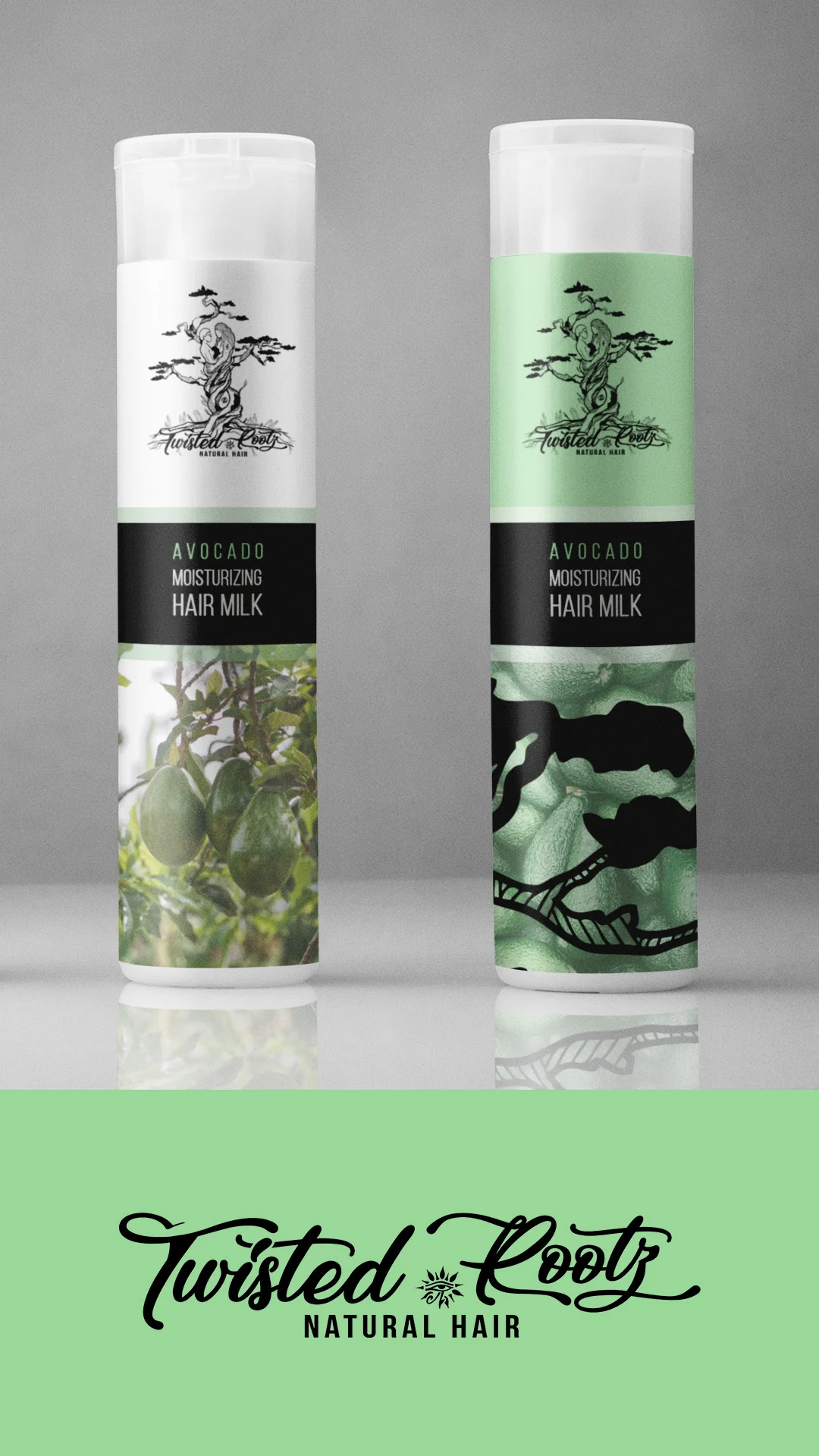
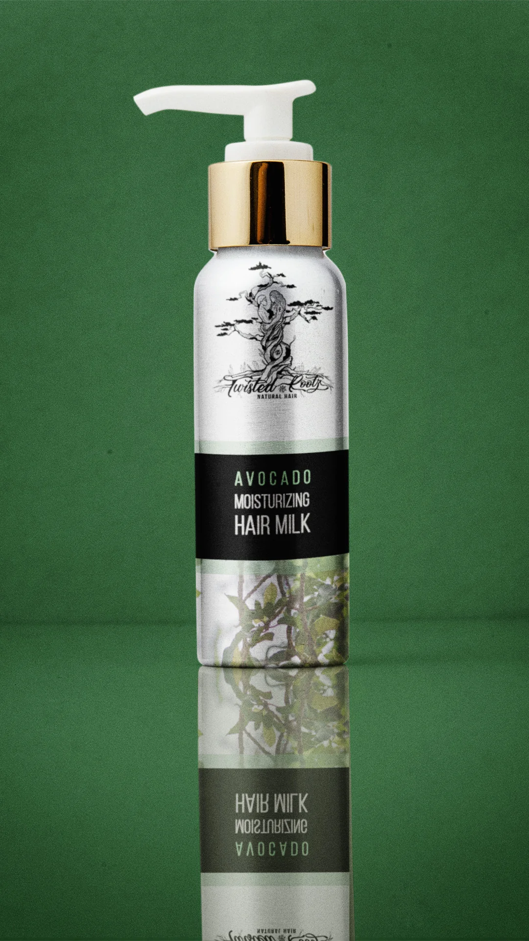
What she received. The finished logo, plus example mockups showing how the mark could carry into future marketing, packaging, and products she could make and sell to clients coming into her studio. She did not have to commission all of that at once. She could see where it was going.
What Amani said afterward:
"I cannot say enough wonderful things about this business. Mr. Louis was phenomenal. He was professional, met deadlines, stayed true to my vision and was extremely patient through all of my last minute changes. I was more than pleased with the final product. Definitely exceeded my expectations. I would gladly refer and use his services again."
That last line is the one I care about. "I would gladly refer." That is the whole point of this page.
Why Do Most Hair Care Logos Fail the Recognition Test?
Most hair care logos fail because they are not actually distinctive, even when they look professional. Ipsos and Jones Knowles Ritchie tested more than 5,000 brand assets with over 26,000 consumers and found that only 15% were distinctive enough for people to reliably connect them to the right brand.
The breakdown is where it gets uncomfortable for this category:
Hair care brands lean hardest on exactly the assets that perform worst. Walk a hair care aisle and count how many brands are betting their recognition on a color and a tagline. Then look at that 4% figure again.
The lesson is not that color is useless. It is that color alone almost never carries a brand. What performs is the product asset itself: the bottle shape, the cap, the jar, the illustration, the thing that is structurally yours. Twisted Rootz has an illustration nobody else can use. That is a product asset, and it is doing more work than a palette ever would.
When I build hair care logos, I am looking for the element that would still identify you if everything else were stripped away.
How Should Hair Care Branding Work Inside a Scroll Feed?
Hair care branding now has to work for people who have never heard of you, because that is who is seeing it. Instagram views from non-followers climbed from 30% to 49% last year, and TikTok views arriving through the For You Page went from 31% to 58%. Your audience is mostly strangers now.
Over 60% of discovery happens on TikTok, Instagram and YouTube, and 49% of Gen Z search TikTok before Google. Among people who actually find products through social creators, 63% are women, with 25 to 34 year olds the single largest group.
What that means practically:
- Your mark has to read at thumbnail size, in motion, held in someone's hand. Not on a white background at full resolution. Test it the way it will actually be seen.
- The product has to be recognizable without the label legible. In a 15 second video the bottle appears, moves, and leaves. Silhouette and color block do the identifying.
- One frame should be able to carry the whole brand. If someone screenshots any second of your video, is it obviously you?
- Creator content will not match your guidelines. Build a system loose enough to survive being filmed in someone else's bathroom with their lighting.
- Motion is part of the identity now. A launch animation is not decoration for hair care companies. It is often the first and only full view a stranger gets of the product.
Genuine Branding Reviews From
Business Owners I've Helped
Time - 1:05 minutes
Time - 41 seconds
Time - 1:41 minutes
Time - 42 seconds
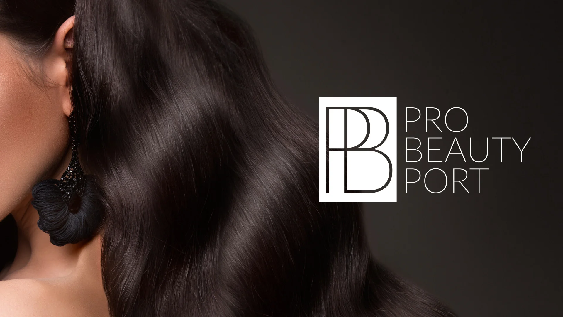
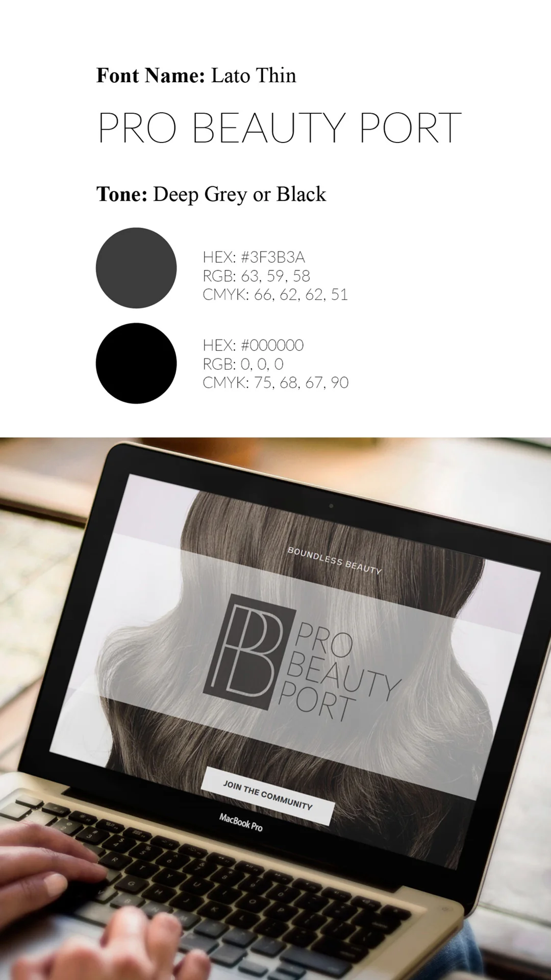
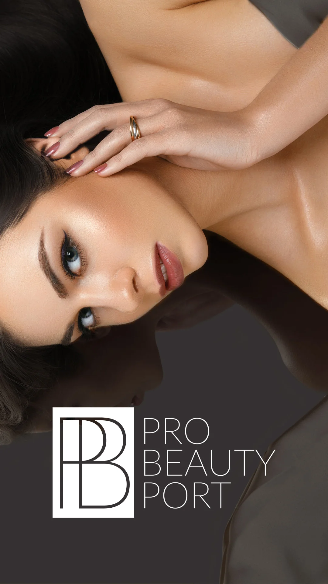
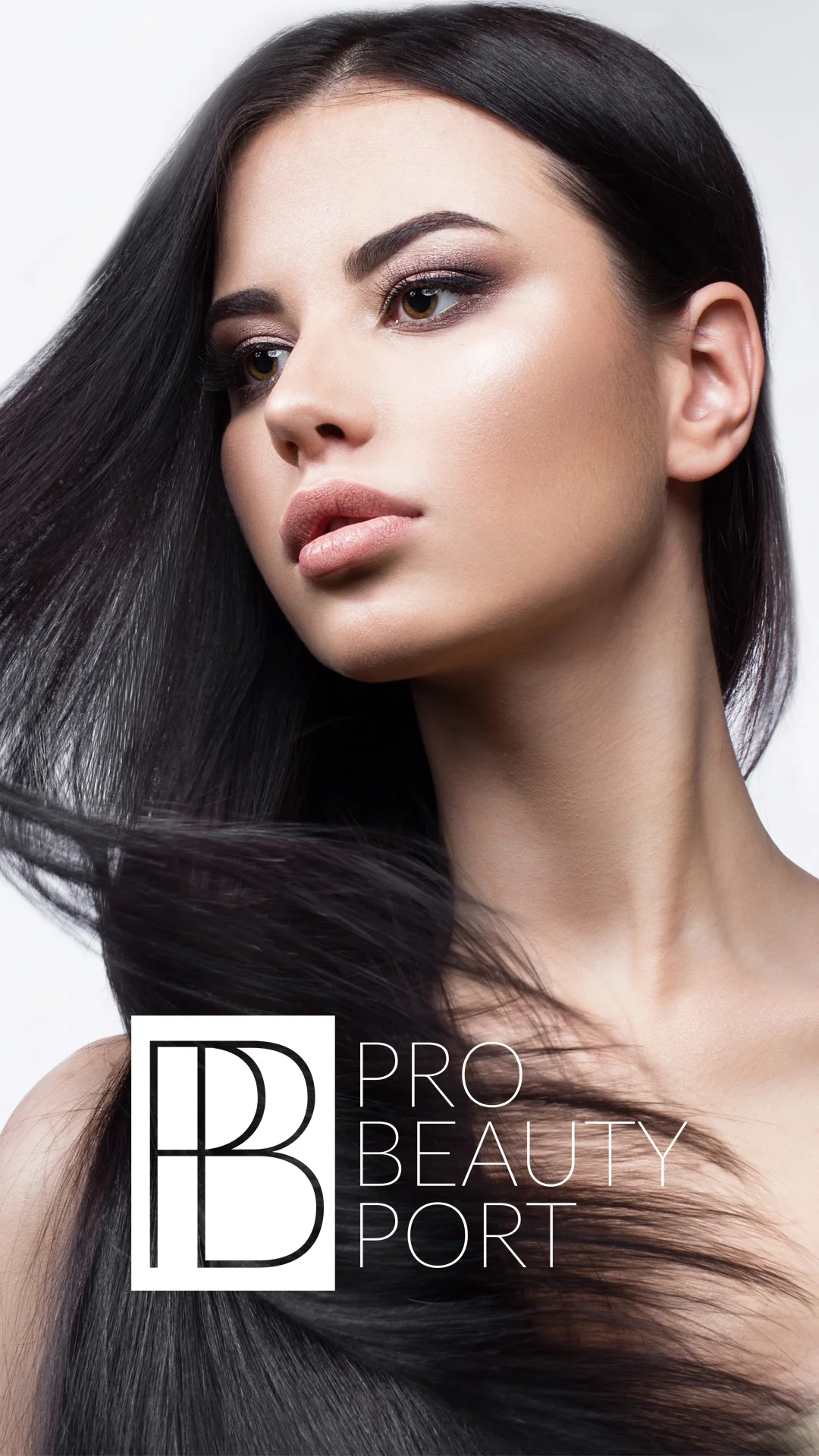
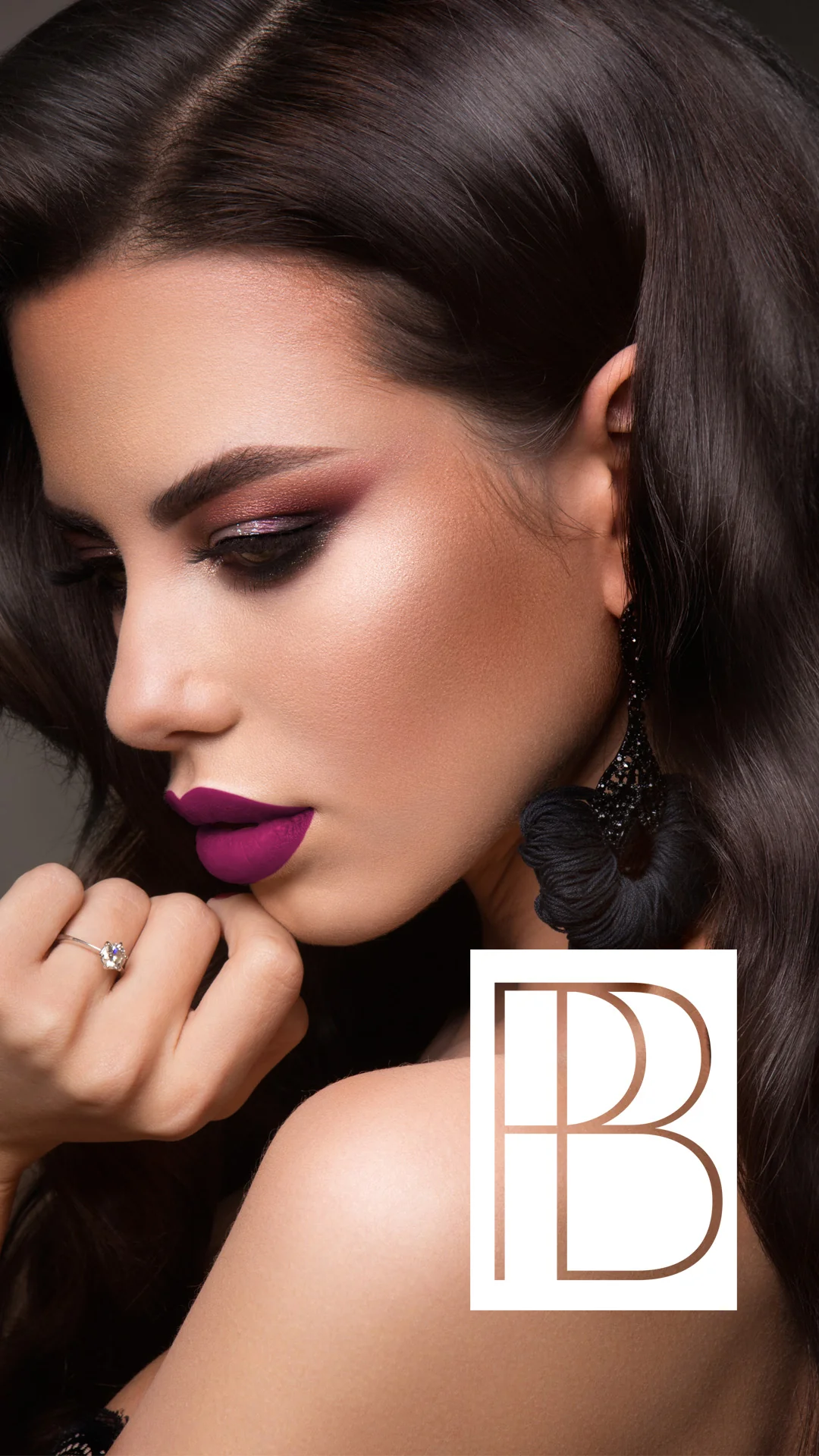
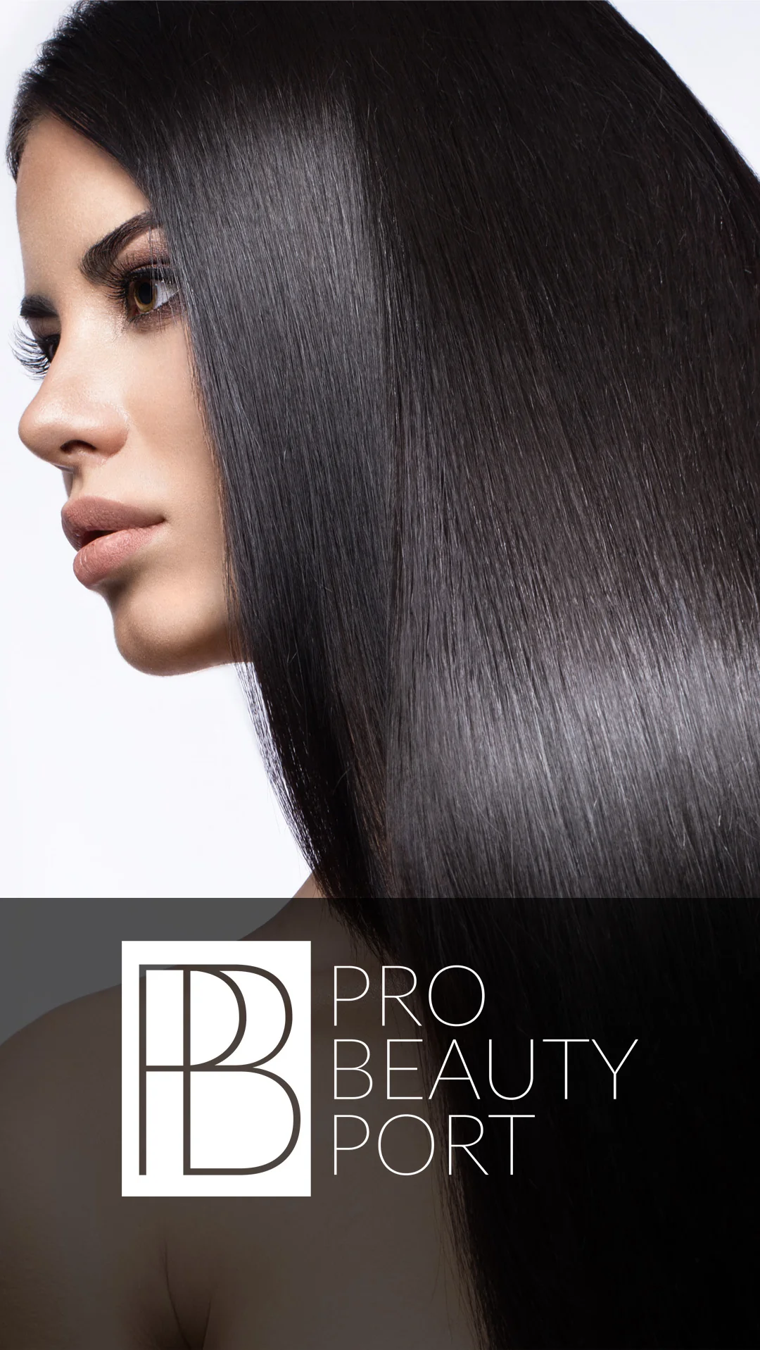
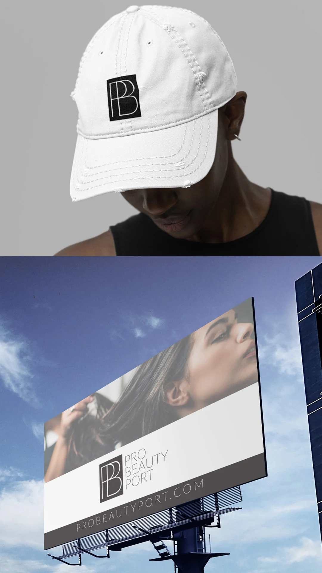
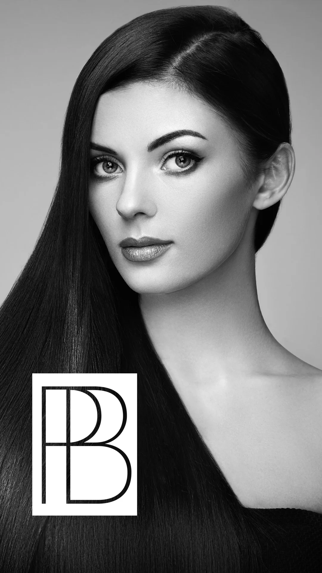
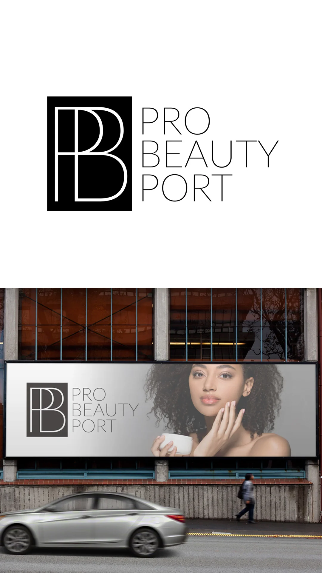
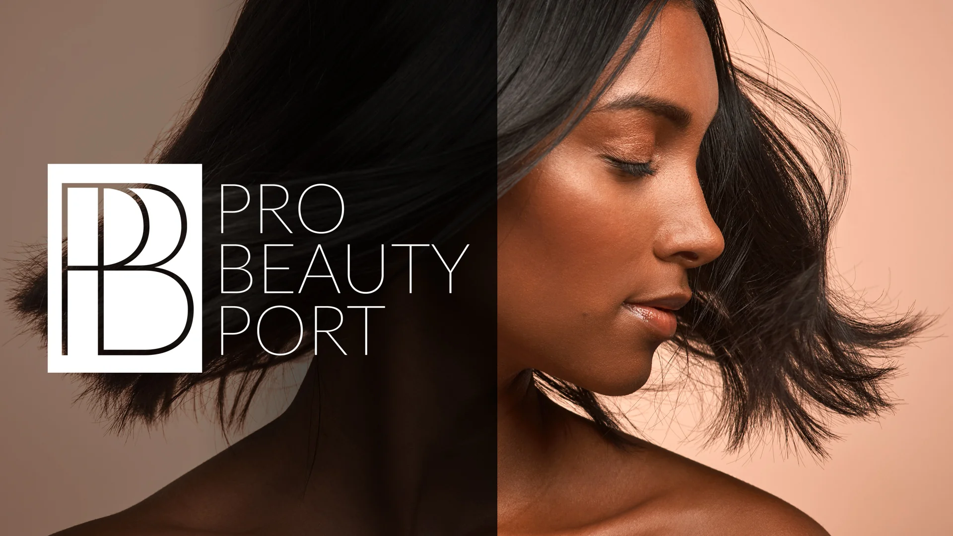
Case Study: Pro Beauty Port, When a Second Venture Needs Its Own Brand
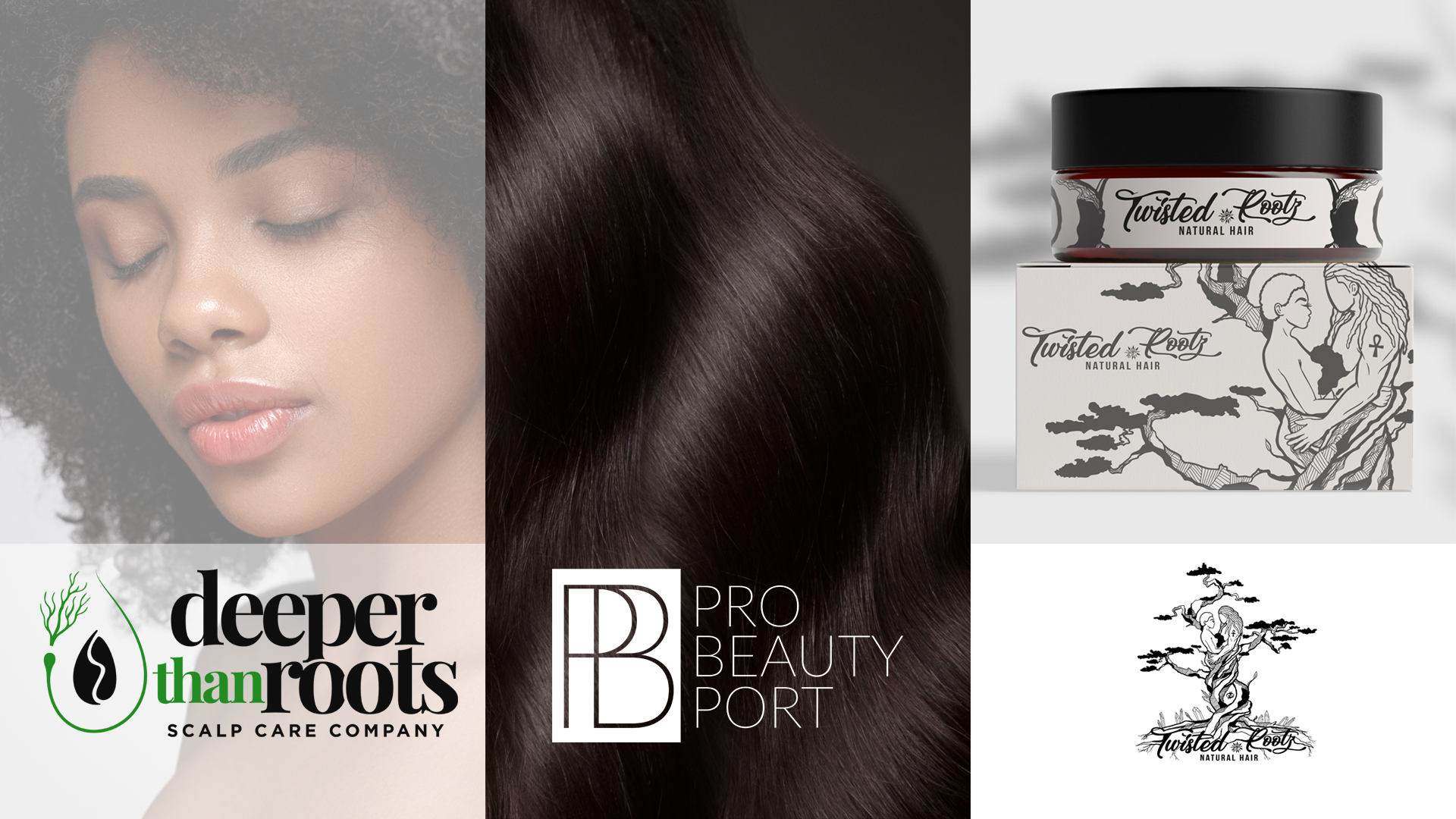
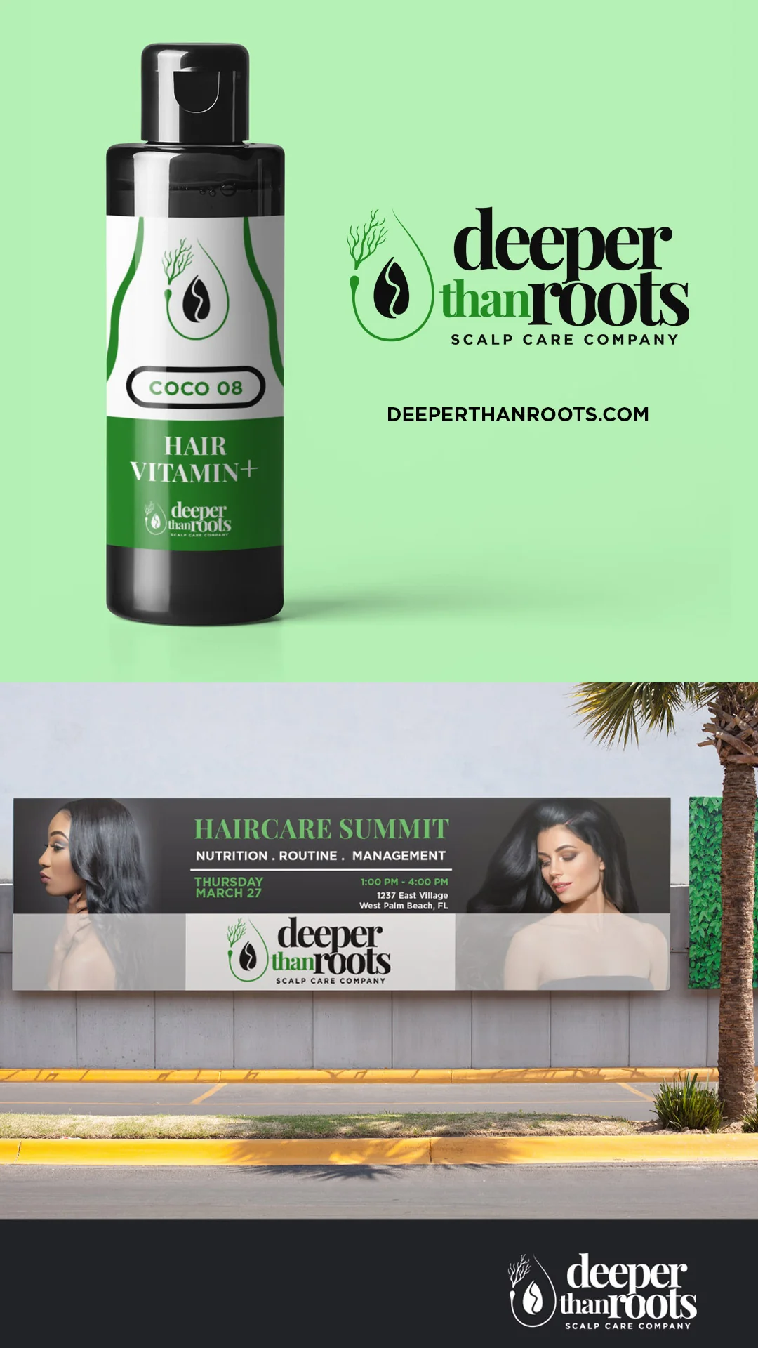
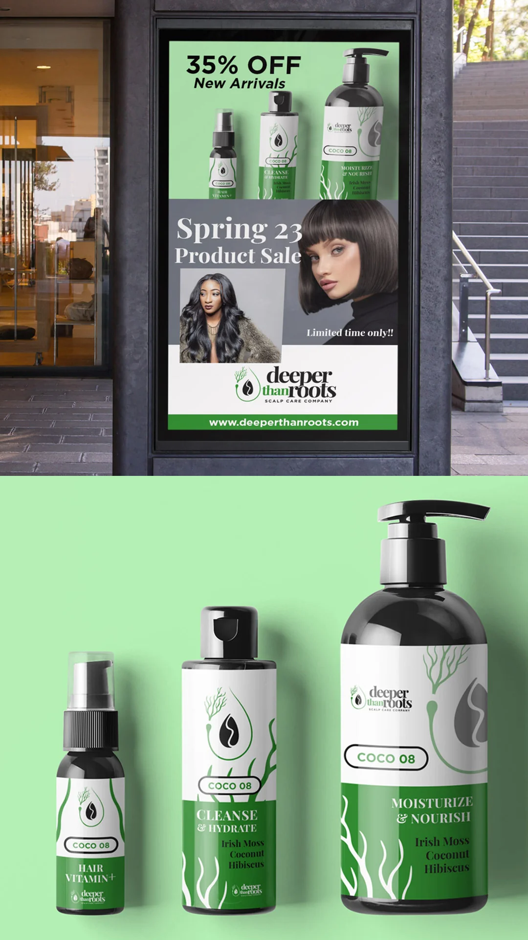
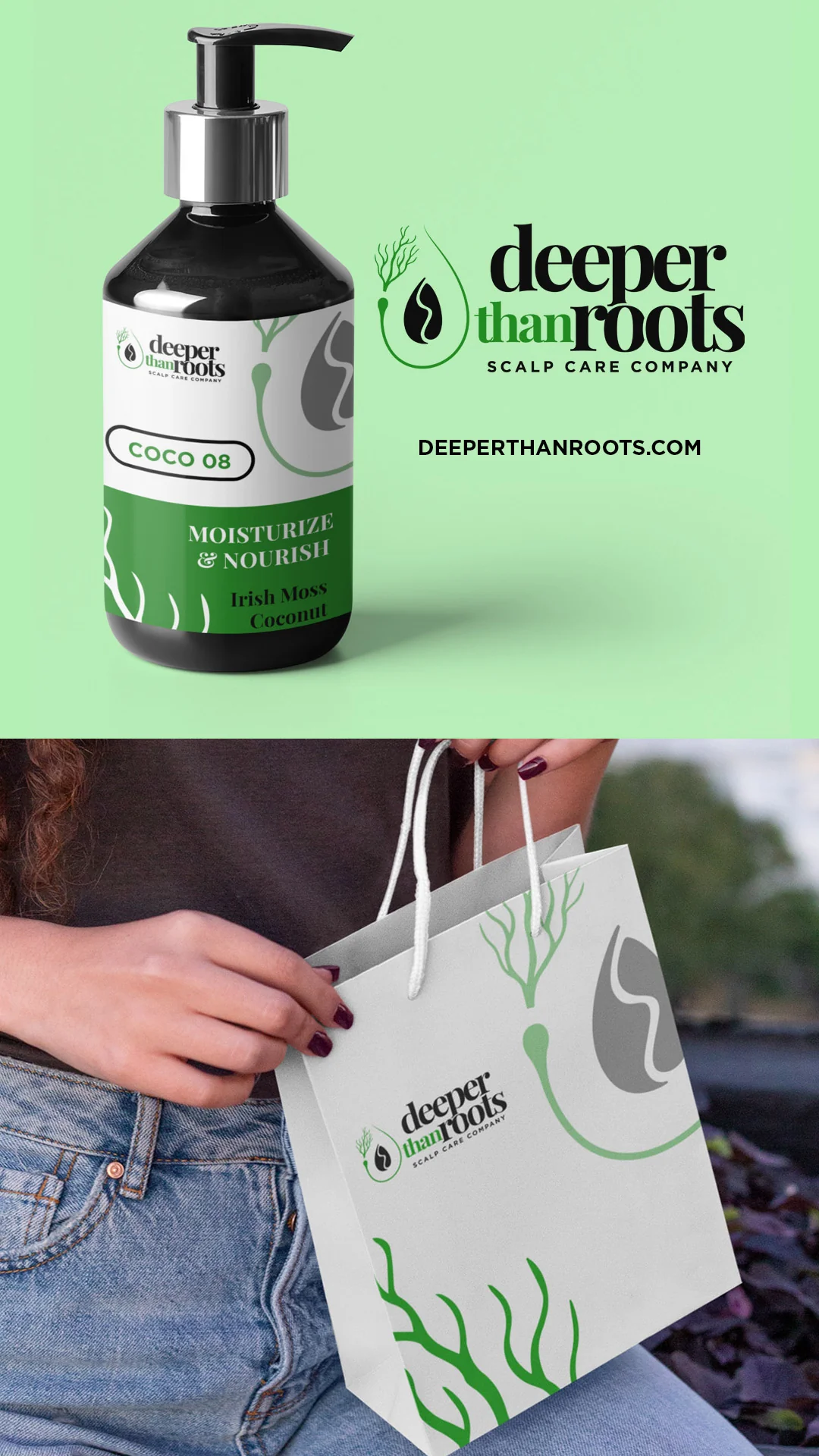
Angel is the founder behind Deeper Than Roots. After that work was finished, she came back with something different: an online educational platform she was building for her existing clients.
It grew out of Deeper Than Roots, but it was not an extension of it. Different purpose, different audience, different business entirely. She needed a secondary brand for her online marketing, her branding, and the website portal she was developing with a web developer.
This time there was no idea to start from. On Deeper Than Roots the client had strong instincts and a direction to refine. Here Angel had no sketch and no definite concept. What she had was a feeling about how it should land: minimal, sleek, not pictorial, not an icon. Chic, classy, modern. Timeless enough to stay attractive to students over time, and still memorable.
That is a harder brief than it sounds, because "minimal and memorable" pull against each other. Strip away enough and you arrive at something clean that nobody can recall. The resolution is usually in proportion and structure rather than in added elements, which is why that kind of work takes longer than it looks like it should.
Why she did not just reuse the existing brand. This is the decision I get asked about most, and it is worth stating plainly. An education platform for students and a scalp care product line for retail buyers are not the same brand doing two things. They are two brands. Forcing one identity to serve both would have weakened the product line's positioning and made the platform feel like merchandise.
I delivered the logo for the platform. That was the scope, and that was what the project needed.
One note on the thing I am not saying. I do not have post-launch numbers for this one. What I will say is that Angel is a returning client who chose to build a second brand with me after the first, and in this business that is its own kind of result.
How Is Branding for Stylists Different From Direct to Consumer?
Branding for stylists is different because stylists are not buying a product, they are deciding whether to attach their professional reputation to it. That raises the bar on credibility and lowers the value of consumer-style persuasion.
The professional channel is also structurally different from retail. Independent stylists now make up the majority of hairdressing professionals in the US, and they source through retail and online rather than traditional distribution. Beauty supply stores account for roughly 20% of US professional channel value, and e-commerce for salons rose from 19% to 26% in a single year.
What that changes in the design:
As the industry publication Global Cosmetic Industry put it, stylist loyalty dramatically increases the recommendation and endorsement of a product to their clientele. The same piece makes a point I agree with completely: putting a stylist's name on a bottle is not a brand. Plenty of founders assume reputation transfers automatically to a product. It does not.
If you are selling into both channels, you may need two expressions of one identity rather than one compromise that serves neither. That is a scoping conversation, and it belongs in brand identity services rather than in a logo project.

Case Study: Deeper Than Roots, Rebuilding a Brand and the Trust Around It
Angel did not find me through an ad. A chemist referred her, which tells you something about how this industry actually works: the recommendation came from a technical peer, not a marketing channel.
She arrived having lost contact with a prior designer. That situation is more common than people admit, and the damage it does is not only to the assets. It damages the founder's willingness to hand anything over again.

So the first work was not design work. It was establishing that the project would be communicated about, that decisions would be explained, and that she would know where things stood. I reset projects like this with transparent communication, real discovery, and clear accountability before anything gets drawn. On engagements where a client needs additional assurance I can work under an NDA, and in some situations I have provided a notarized signed release confirming the client owns the design after payment and that I retain no ownership stake.
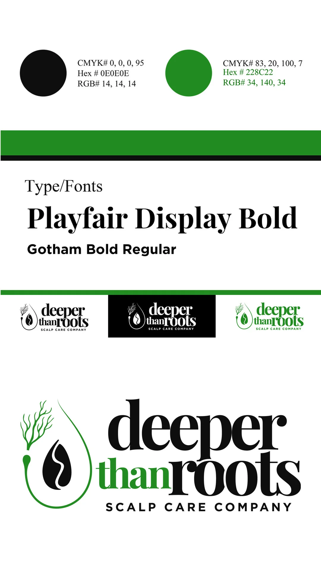
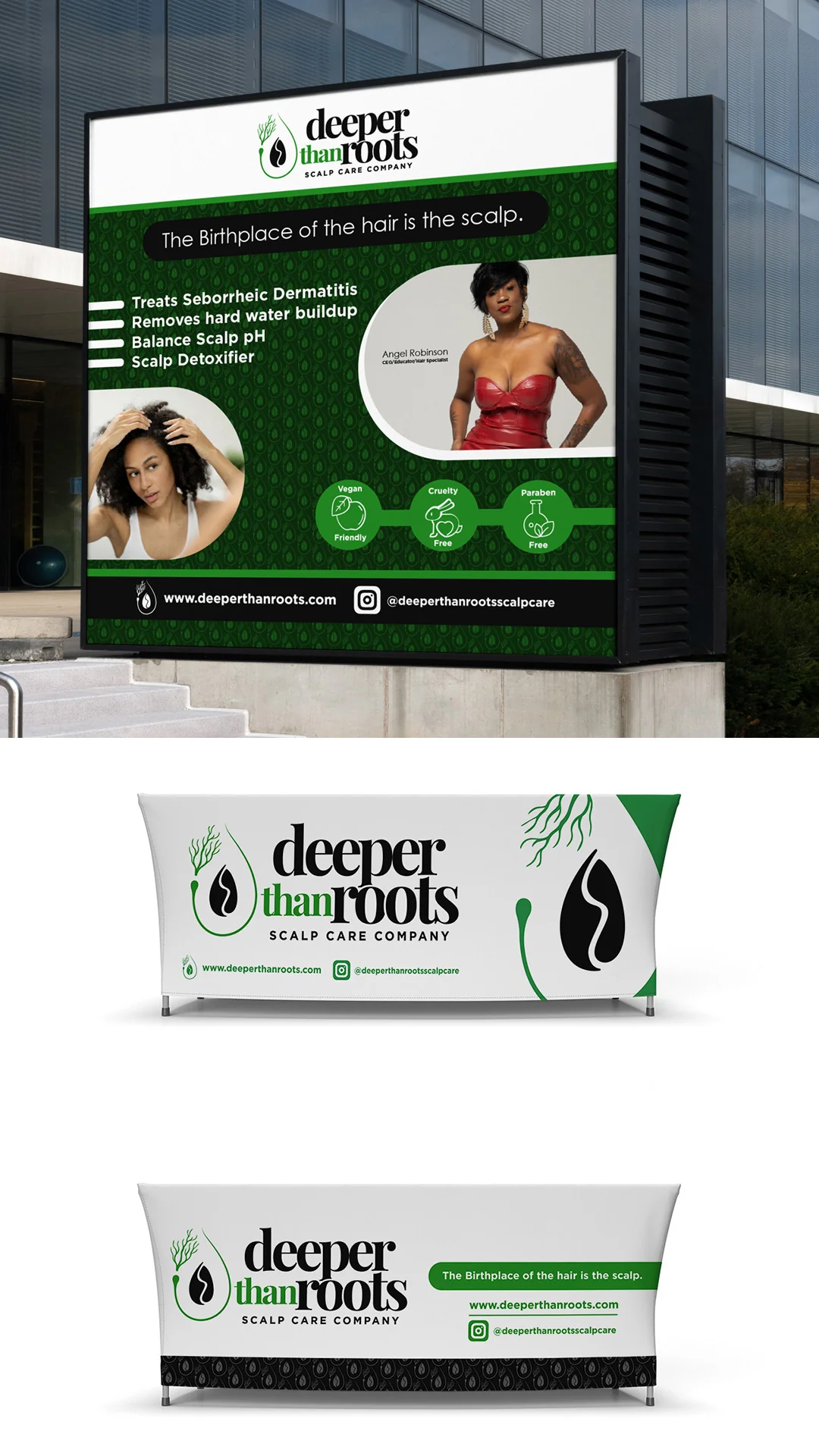
The message came before the mark mattered. Deeper Than Roots is a scalp care brand, and the line that anchored everything was "The Birthplace of the Hair is the Scalp." That sentence does what I described earlier: it is one promise, in plain language, that a customer can repeat. Once that was settled, every visual decision had something to be measured against.
This is the part founders tend to skip. They want to see logo options. What actually determines whether the logo works is whether you have decided what the brand says first.
The proof that it held. Angel came back later to build Pro Beauty Port, a second brand for an entirely different venture. Clients do not do that when the first experience was merely acceptable.
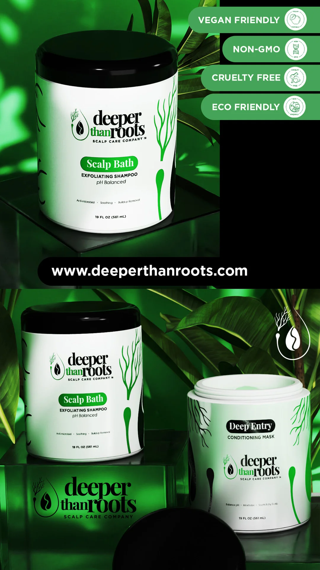
You can read the full breakdown of the identity, labels and product visuals on my hair product branding page.
What Should a Hair Care Brand Decide Before Any Design Starts?
Decide five things before design starts: who it is for, what single promise you are making, which channel you are selling through, what you want people to say about you, and which assets your first twelve months actually require. Every one of those shapes the design, and none of them is a design question.
I build brand direction around a business's archetype, personality, niche, intended audience, demographics, psychographics, affinities, business purpose, and market position. That is not a questionnaire for its own sake. It is how you avoid a generic visual style that could belong to any of the thousands of hair care brands launching this year.
Here is the short version of what I want from you before I draw:
- The specific person. Hair type, life stage, what they have already tried and abandoned, what they are afraid of wasting money on again.
- The one promise. Written as a sentence a customer could repeat. If you cannot write it, you are not ready for a logo yet.
- The channel. Retail, direct to consumer, salon, beauty supply, or a combination, because the answer changes the packaging brief entirely.
- The sentence you want repeated. Literally write down what you want someone to say about you in a parking lot.
- The asset list for year one. Labels, hair care packaging, social templates, a site, event collateral, product visuals. Not everything at once, but a plan.
If you do not have answers yet, that is normal and it is part of what discovery is for. If a client has no concept, I build one with you rather than handing over a style I like.
How Do You Keep Hair Care Branding Consistent as the Line Grows?
You keep hair care branding consistent by deciding the system before you add the second product, not after the fifth. Most lines lose coherence somewhere between SKU three and SKU eight, when color-coding decisions get made one product at a time by whoever is closest to the deadline.
Four rules that prevent it:
Decide what varies and what never does. Usually the mark, the type system and the layout structure stay fixed, and one element varies by product. Pick which element that is and write it down.
Do not give every product its own personality. A line where each item has a different feel is five weak brands, not one strong one. The shared elements are what let a customer who loved your shampoo recognize your mask.
Protect the family resemblance at small sizes. Products that look clearly different at full size often become indistinguishable as thumbnails. Check the lineup as a row of 100 pixel squares before you approve it.
Know when it is a new brand, not a new product. Pro Beauty Port is the example. A different audience and a different purpose earned a separate identity rather than a stretched one.
This is what brand guidelines are actually for. I provide brand guides that can include typeface names, color codes, logo-use guidance, background guidance, and application notes. On larger branding packages those can extend into expanded guides with narrated video guides or presentation slides that walk through the brand, so the rules survive being handed to a printer, a photographer or a social media manager who was not in any of the calls.
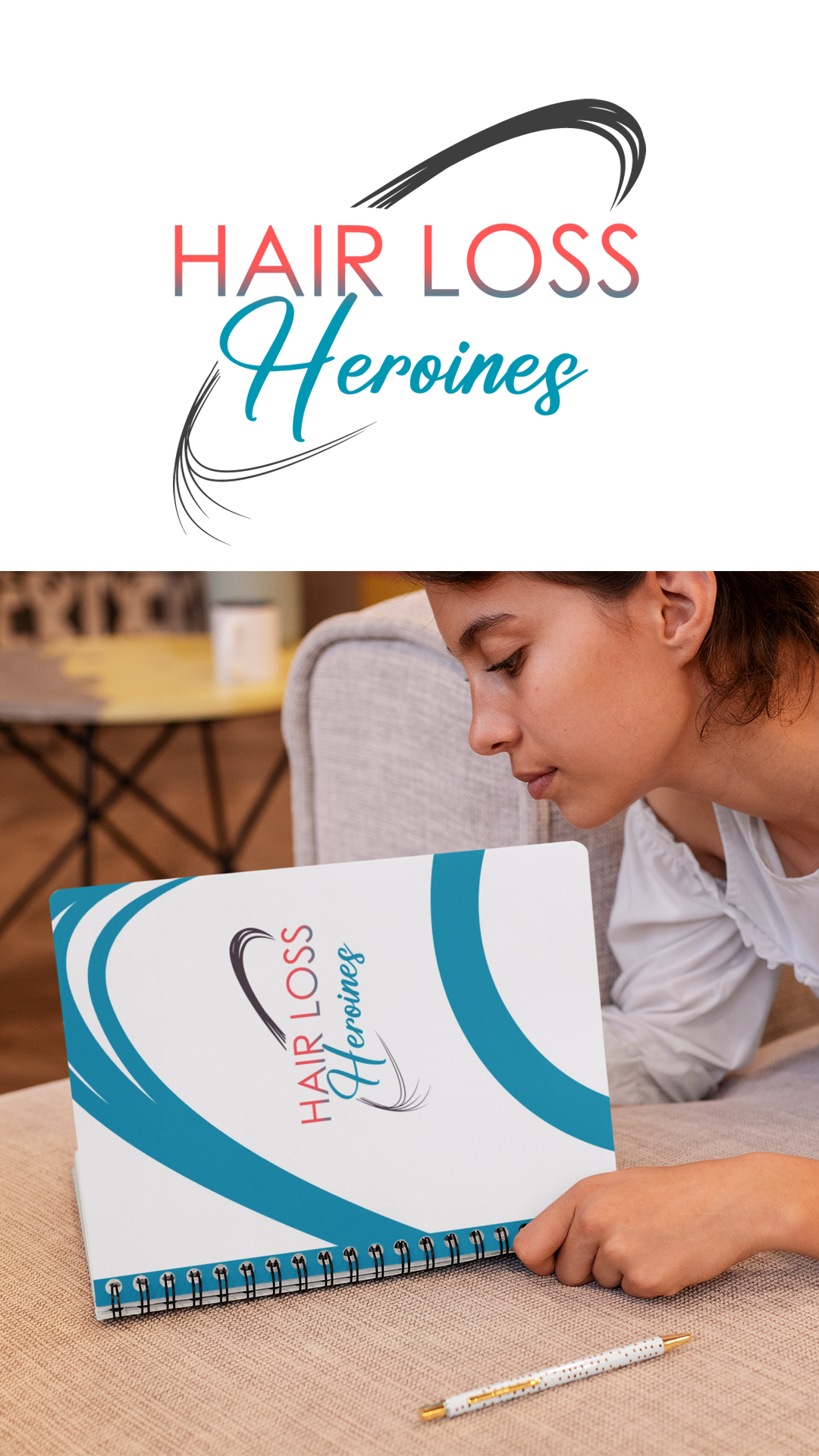
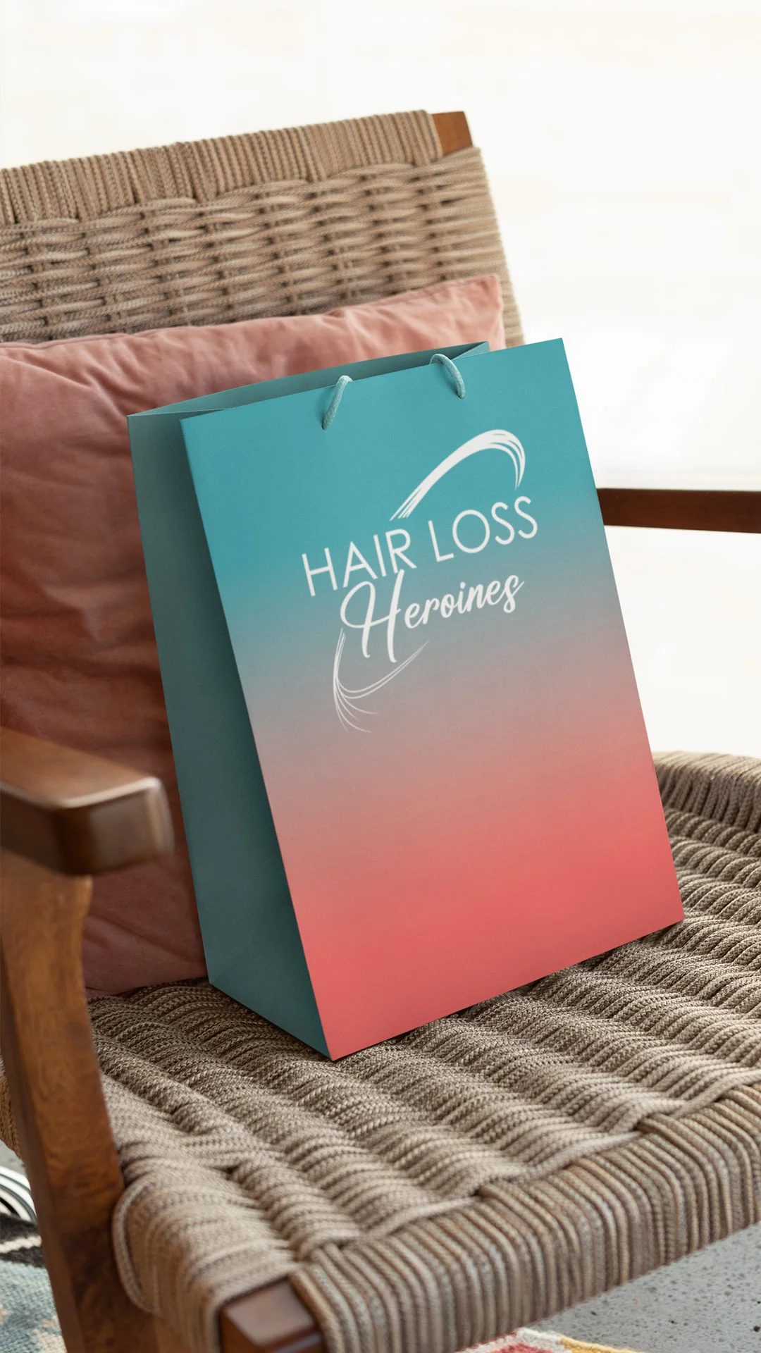
Case Study: Hair Loss Heroines, Branding Something People Gather Around
Hair Loss Heroines is a brand for women navigating hair loss, built around products and a community rather than products alone. That second part changed the entire design brief.
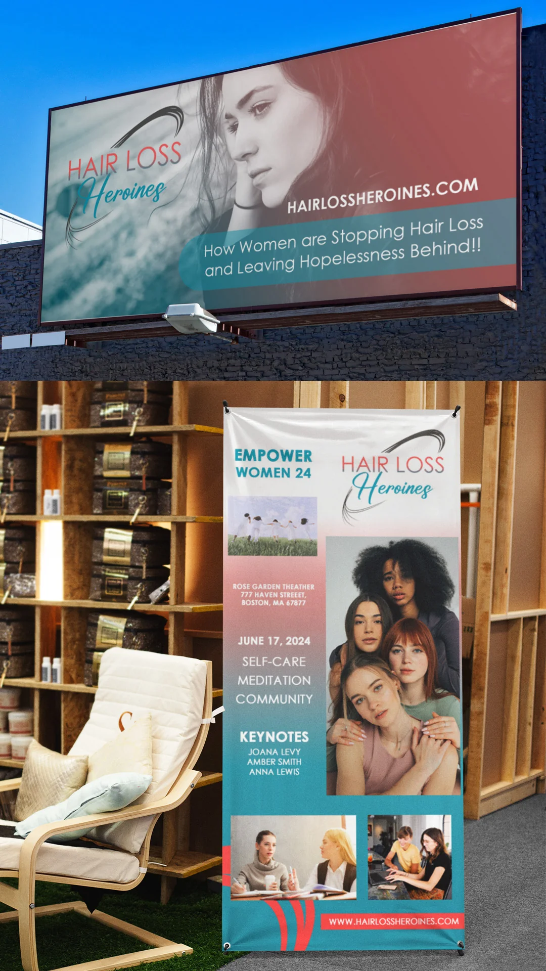
A community brand lives in rooms, not only on shelves. Most hair care branding projects plan for a label, a listing, and a feed. This one also had to work at an event, where the brand is physically surrounded by people, standing at human scale, competing with every other banner in the room. For the "Empower Women 24" self-care summit, the materials had to be welcoming and informative at the same time, which is a harder balance than it sounds.
Tone was the hardest constraint, not aesthetics. Branding for someone in a vulnerable moment has two failure modes and both are easy to hit. Go clinical and you feel like a diagnosis. Go soft and inspirational and you feel like you are not taking the problem seriously. The identity had to carry compassion and confidence simultaneously, and every color, type and imagery decision was measured against that rather than against what looked good.
What this teaches about hair care brands generally. If people are going to gather around your brand, whether at a summit, a pop-up, a salon event or a Facebook group, your identity needs assets that most launch plans leave out. Banners. Name badges. Step and repeat. Slide templates. Printed collateral. A brand built only for packaging falls apart the first time it has to stand six feet tall.
That extended system is what a full branding package is for, and it is the reason I scope branding packages around what a specific business will actually need rather than a fixed deliverable list.
MORE CLIENT Testimonials
Time - 1:02 minutes
Time - 4:55 minutes
Everyone wants to see reviews from trusted sources that can validate whether a product or service. Therefore, our design and logo brands reviews play a crucial role in helping them decide if it's worth their investment.
The following is a page source of design reviews from past clients: video and written reviews of the client experiences working with Branding Design Pro.
Time - 58 seconds
Time - 1:31 minutes
What Happens to Hair Care Branding After Launch?
After launch, hair care branding stops working on persuasion and starts working on reassurance. The job shifts from getting noticed to being recognized again, and from making a promise to visibly keeping one.
The data on loyalty is blunt about what actually keeps customers. In a March 2026 survey of 1,500 Americans, 55% named quality as their top loyalty driver, and 47% of skincare buyers said they stop purchasing when product quality declines. Branding cannot rescue a product that got worse. What it can do is make a good product recognizable and easy to re-find.
Two other findings from the same survey shape post-launch decisions. Nearly 60% of people say the sheer number of choices overwhelms them, and 48% use customer reviews and ratings to guide what they buy. Both point the same direction: reduce what you ask the customer to process, and make it easy for other people's words to do the convincing.
Practically, that means your packaging should get clearer over time rather than busier, your product photography should stay consistent enough that repeat buyers spot you instantly, and your reviews and user content should be treated as brand assets with somewhere to live.
Hair care and beauty are categories where a brand can be killed by its own success, adding claims and callouts and badges until the thing that made it recognizable is buried. Restraint after launch is harder than restraint before it.
How I Work With Hair Care Brands and Salons
I am Kenal Louis. I run Branding Design Pro as a solo studio in Omaha, Nebraska, working with clients nationally. I take on roughly four to six clients per month on purpose, because the work in this article is not the kind you delegate.
What that looks like in practice:
- I build direction from your audience and market position, not from a house style. A salon, a scalp care line and an education platform need three different answers, as the projects above show.
- If you arrive with a concept, I refine it rather than replacing it, which is what happened with Twisted Rootz. If you arrive with nothing but a feeling, I build the concept with you, which is what happened with Pro Beauty Port.
- On rebrands I generally start fresh rather than patching an old mark. If you want to keep a substantial part of a pre-existing design, I will tell you plainly that I do not claim full authorship of the result.
- Returning clients can add à la carte work later, and I work with them on pricing. Angel building a second brand is that policy in action.
- I keep your project files. If you lose them or a device fails years from now, I resend them without a fee.
If you want the full range of what I can build around an identity, my creative services page lays it out.
Frequently Asked Questions About Hair Care Branding
Name it so it survives being spoken by someone who saw it once. Say the name out loud to three people and ask them to type it into a phone. If any of them hesitates, spells it wrong, or asks you to repeat it, the name will cost you recommendations for the life of the brand. Invented spellings look distinctive on a label and fail in conversation.
Color-coding a line works, but only when one element varies and everything else holds. The mark, the typography and the layout structure should stay identical across every product, with color as the single differentiator. Keep in mind that brand colors are the weakest distinctive asset on their own, reaching top distinctiveness only 4% of the time, so color should separate your products from each other rather than separate your brand from competitors. You can see how that fits into a wider system on my visual identity page.
There is no fixed number, but the breaking point is usually a decision, not a quantity. An identity supports as many products as share the same audience and the same promise. The moment a new product speaks to a different buyer or makes a different promise, you are looking at a sub-brand or a separate brand, not another SKU.
They often need different expressions of the same identity rather than separate brands. The mark and the core system stay constant, while sizing, information hierarchy and packaging practicality change. A back bar bottle used with wet hands all day has different requirements than a retail bottle designed to be noticed on a shelf. Scoping both channels at once belongs in brand identity services rather than a logo project.
Stylists are deciding whether to attach their reputation to your product, so they look for evidence before they look for appeal. Ingredient specificity, clarity about what the product does and does not do, and who else in the profession uses it all matter more than consumer-style persuasion. Education and training alongside the product are a meaningful part of why professional brands earn endorsement.
At minimum: a post template, a story or vertical template, a quote or testimonial layout, a product feature layout, a before and after layout, and a profile set. The more useful question is whether the kit survives contact with reality. Templates that only work with professional photography go unused once the founder is posting from a phone between clients. Template kits are commonly part of my branding packages.
Yes, and Pro Beauty Port is the example. Angel specifically wanted something minimal, sleek and not pictorial. A typographic or monogram identity can absolutely be distinctive, but minimal and memorable pull against each other, so the distinctiveness has to come from proportion, structure and execution rather than from added elements. That work is less visible and usually takes longer.
Specificity is the advantage, so make it legible rather than implied. A line built for a particular hair type, texture or concern should say so in language that buyer already uses about herself, not in coded visual cues she has to decipher. The risk of being too subtle is that the person you built it for walks past it.
My brand guides can include typeface names, color codes, logo-use guidance, background guidance, and application notes. Larger branding packages may include expanded branding guides along with narrated video guides or presentation slides explaining the brand, so the reasoning travels with the rules instead of living only in your head.
Hand over documented rules, not just files. Most brand drift after launch comes from capable people making reasonable guesses because nobody told them what the rules were. A brand guide with usage guidance, background rules and application notes answers the questions they would otherwise answer themselves, which is exactly the scenario the expanded guides and walkthrough materials are built for.
Ready to Build a Hair Care Brand People Can Pass Along?
The brands that win in hair care are not the ones with the biggest budgets. They are the ones a customer can name, describe, and hand to someone else without getting it wrong.
If you are launching a hair care line, opening a salon, or building something next to a brand you already own, book a call. Tell me who it is for and what you want people saying about it, and I will tell you what it will take to build.