
Restaurant Branding Services for Food and Dining Businesses
Your guests meet your restaurant before they taste anything. They see a sign from the street, a listing on a phone screen, a takeout bag on a desk across town.
Restaurant branding design is the work of making every one of those moments look like it came from the same place.
I’m Kenal Louis, and I design that system one-on-one, from the first sketch to the files you hand to your sign shop and print vendor.
This page explains what the work includes, how it runs, and what two finished identities look like in practice.

TL;DR
- Restaurant branding design is the full identity system behind your restaurant: logo, color palette, type, a repeating graphic device, artwork for the surfaces you use, and written rules for using it all.
- I work one-on-one. The process runs from a discovery call to six to nine hand-drawn sketches, then grayscale, then color.
- Two example projects below show the approach: a Las Vegas pizzeria built on a script wordmark and a tiled monogram, and a Miami café built on art deco geometry and a two-color palette.
- Every project is scoped on a call, and you receive a defined deliverable list and a firm number before any work begins.
- Unlimited revisions are included, and you receive access to editable project files (AI, PSD, and PDF where applicable) after completion.
What Does Restaurant Branding Design Include?
Restaurant branding design includes the logo and everything that makes it usable: a color palette, a type system, a repeating graphic device, artwork for the surfaces you actually use, and written rules for applying all of it. The logo is where a brand identity starts, not where it ends.
A complete system usually contains these pieces:
- A logo suite. A primary lockup, a compact monogram for avatars and seals, and a reversed version for colored fields.
- A color palette with print values. A hero color, a working print variant, and a rule for how much of each surface the hero is allowed to cover.
- A type system. A display voice for the name and a reliable workhorse for menus and body copy.
- A repeating graphic device. A pattern, a color-blocking angle, or a brushstroke that travels across surfaces so the brand compounds instead of resetting.
- Application artwork. Menus, signage, packaging, cups, bags, apparel, and gift cards, depending on what your restaurant actually uses.
- A brand guide. Typeface names, color codes, logo-use guidance, background guidance, and application notes, so the next vendor you hire doesn’t undo the work.
Which applications you need depends on the room. A sit-down restaurant leans on menus and signage. A delivery-heavy kitchen leans on bags, boxes, and a mark that holds up at thumbnail size. I identify the list with you on the call.
Why Does a Restaurant Need More Than a Logo?
A restaurant needs more than a logo because guests rarely meet the logo alone. They meet it on a sign, a menu, a cup, or a phone screen, and each of those places needs a design decision that someone has to make.
Speed matters here. Researchers studying web pages found that people form a visual-appeal judgment in about 50 milliseconds. That finding came from web pages, but a delivery-app listing is a screen too, and so is a sign glimpsed from a passing car. If those first glimpses don’t agree with each other, the impression is muddy before anyone reads a word.
A logo design with no system behind it leaves every later decision to whoever is standing closest to the problem: the sign vendor, the print shop, the person building the menu. Each guess moves the brand a little further from itself. A system takes those guesses off the table.
What Does My Restaurant Branding Design Process Look Like?
My process starts with a conversation, not a mood board, and it runs in six stages from discovery to a finished system. Once the agreement is signed and the deposit is paid, this is the sequence:
- Discovery call. I ask about your audience, why you’re starting or changing now, your vision, any concept or tagline you already have, the assets you need, and what your category expects. If you don’t have a concept yet, you and I build one together.
- Research and inspiration. I use what came out of the call to research your market and build inspiration boards before I draw anything.
- Sketching. I present six to nine hand-drawn rough compositions. They’re rough on purpose: I’m testing structures and learning what you respond to, and it’s far cheaper to learn that in pencil.
- Grayscale prototyping. A mark that only works in color isn’t finished, so the structure has to hold in black and white first.
- Color testing. Color comes last, once the shape is settled.
- System build. The approved logo becomes the basis for the palette, type, pattern, and application artwork.
Throughout, I explain what works and why, but I don’t dictate. You hired me for judgment, and the work still has to fit your restaurant. I stay reachable by phone, text, Zoom, Google Meet, or screen share, and I set a real deadline, because projects without one drift and lose momentum.
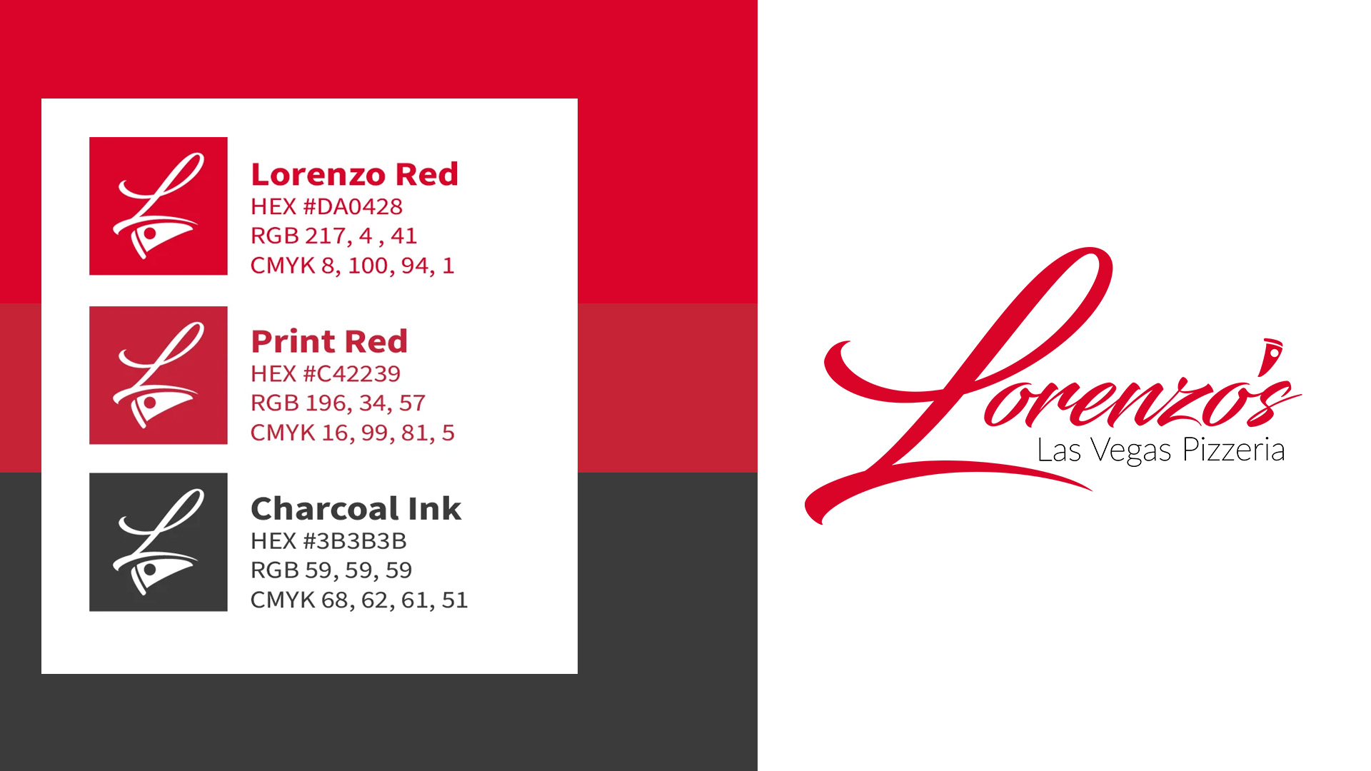
Example Project: Lorenzo’s Las Vegas Pizzeria
Lorenzo’s is a pizzeria identity I designed for the Las Vegas market: an independent, handmade-pizza concept with dine-in, takeout, and delivery. It shows how one strong idea can carry a full set of surfaces.
The Design Problem
Las Vegas is crowded with chains and high-volume pizza operators, and on a delivery app every listing appears at the same size. The identity had one job before the food gets a chance: make “a family name is on this” obvious in about a second.
One Move: A Script Wordmark With a Slice for an Apostrophe
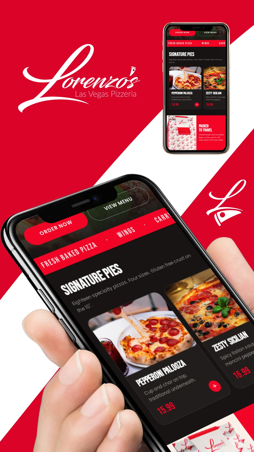
I skipped the badge, the shield, the crest, and the cartoon chef. After exploring several variations, I chose a calligraphic script that reads as handwritten but carries an edge. A signature registers as human before the brain finishes reading the letters.
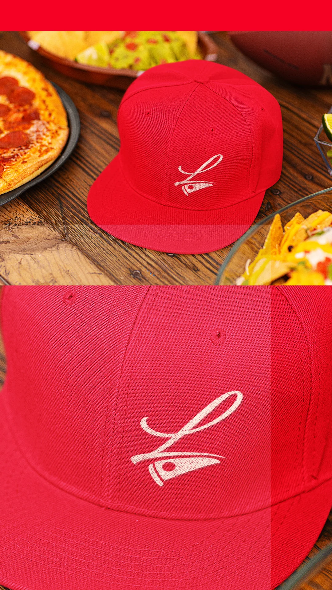
The apostrophe in “Lorenzo’s” became a small pizza slice glyph, so the mark states its category without spelling it out. Without the slice, the name could belong to almost any kind of business.
A Palette Held to Two Colors Plus Ink
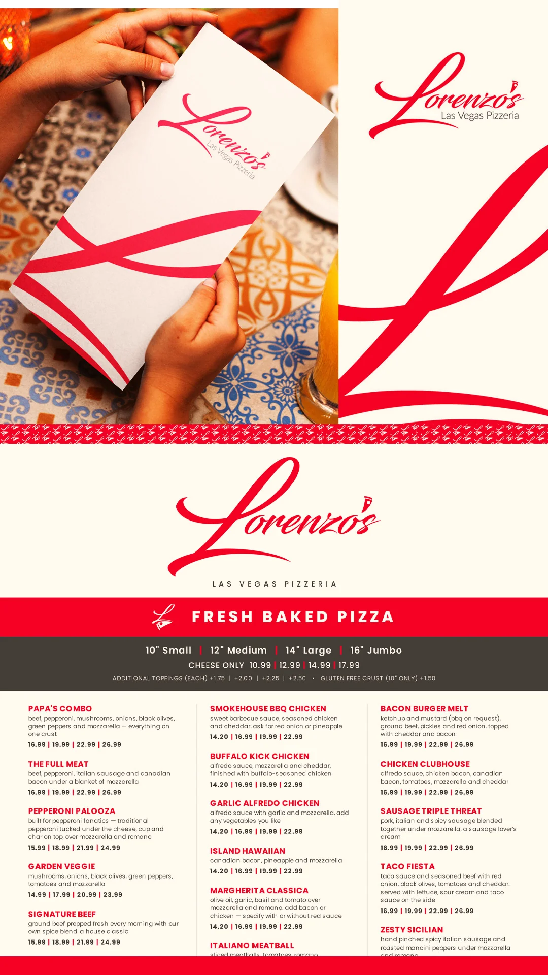
The palette has four values. Lorenzo Red (#DA0428) is the hero. Print Red (#C42239) is how that red behaves on coated stock, a working variant and not a second brand color. White is the base and covers roughly two-thirds of every surface. A soft charcoal (#3B3B3B) handles the small “Las Vegas Pizzeria” descriptor, and it’s never true black.
I specify a print variant because a red that drifts toward magenta makes packaging look wrong on a shelf. The restraint is the point.
A Monogram Pattern That Travels
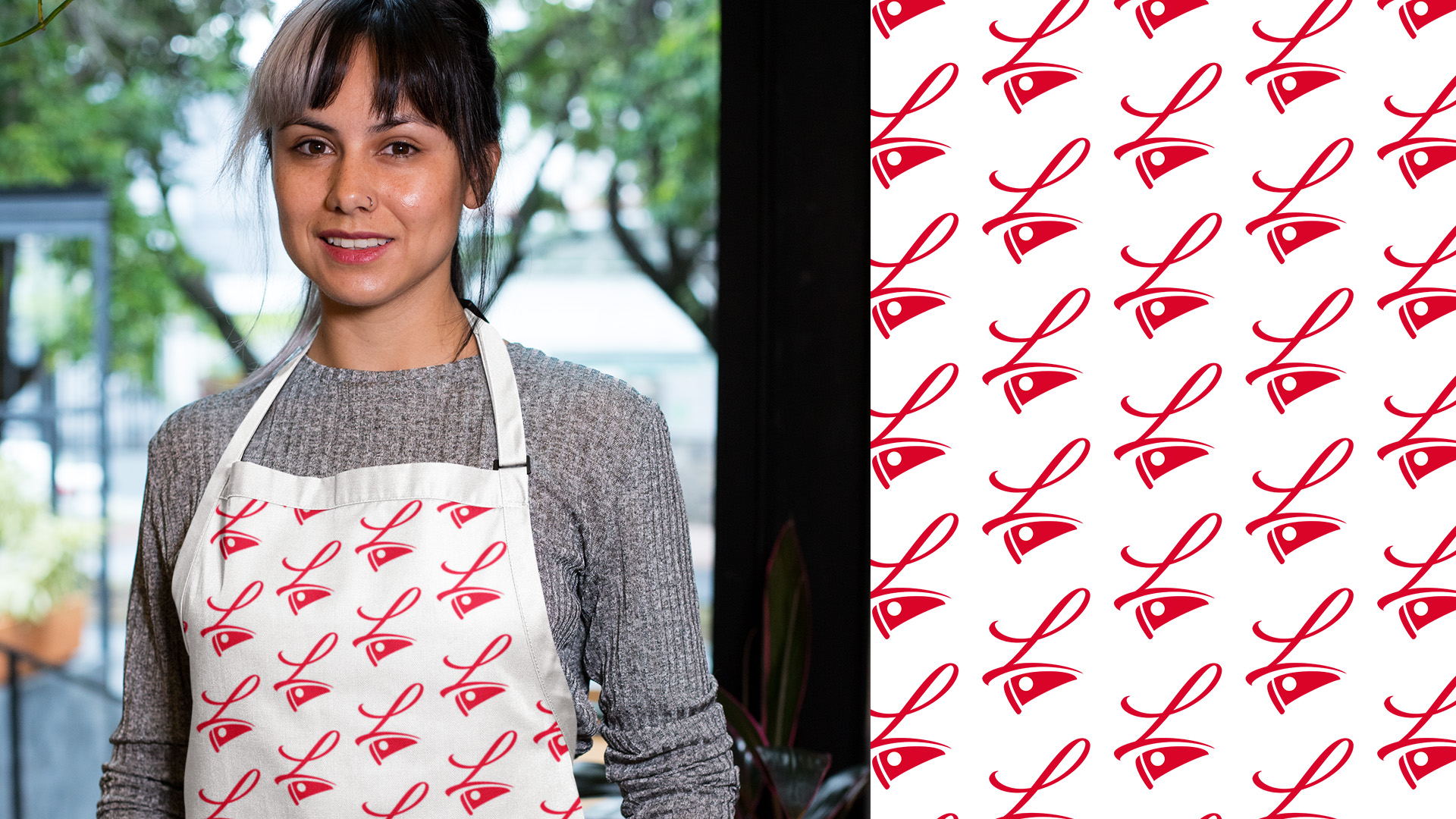
I tiled the L monogram into a repeating pattern in two colorways. Red on white covers takeout bags, menu interiors, and wraps. White on red covers box lids, apron panels, and signage fields.
The reasoning is distance. At fifty feet, nobody can read a logotype, but a pattern still registers. The one rule is to keep the tile at a consistent scale across every surface, because a pattern that grows and shrinks stops reading as a signature and starts reading as filler.
The Surfaces
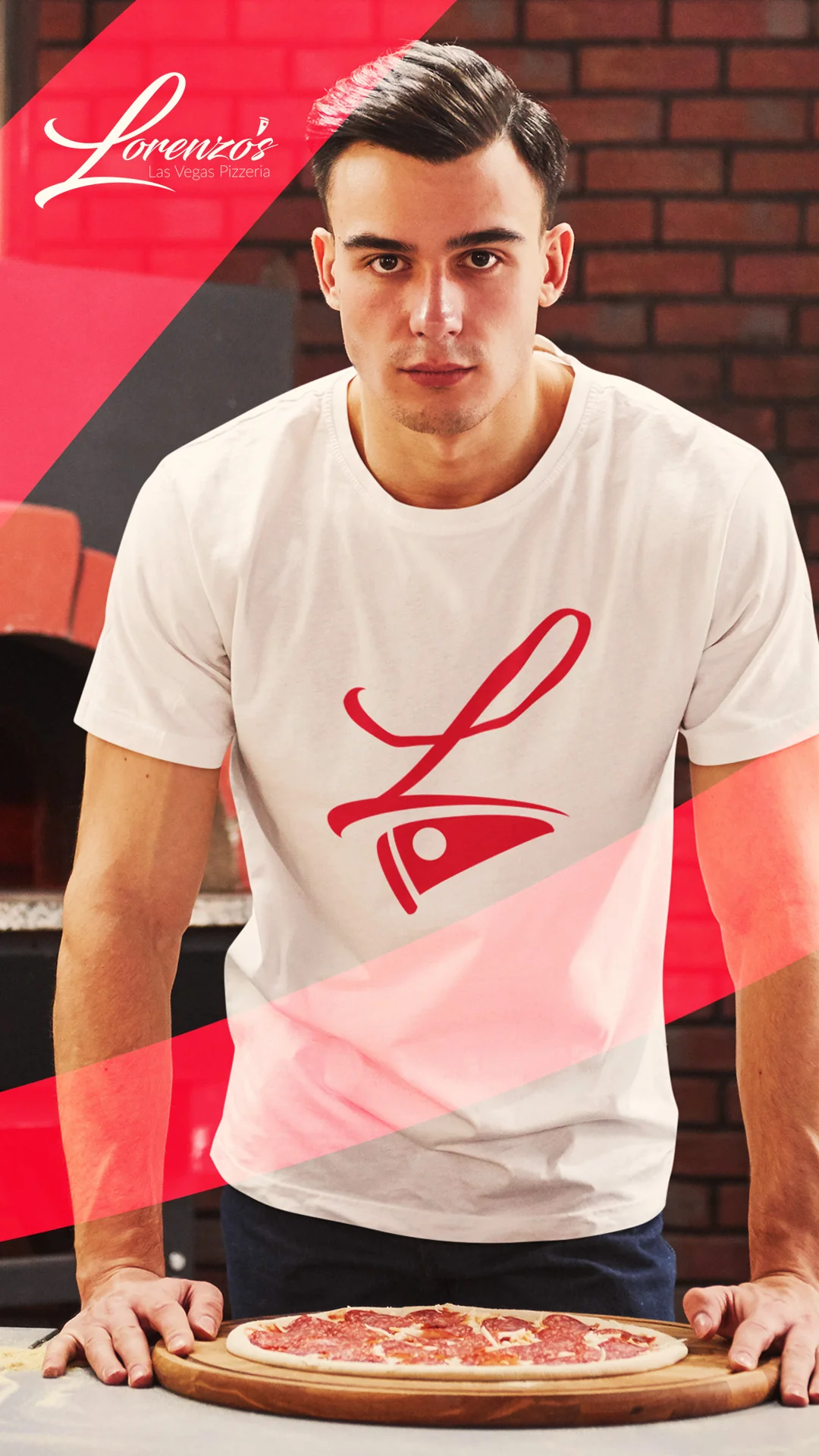
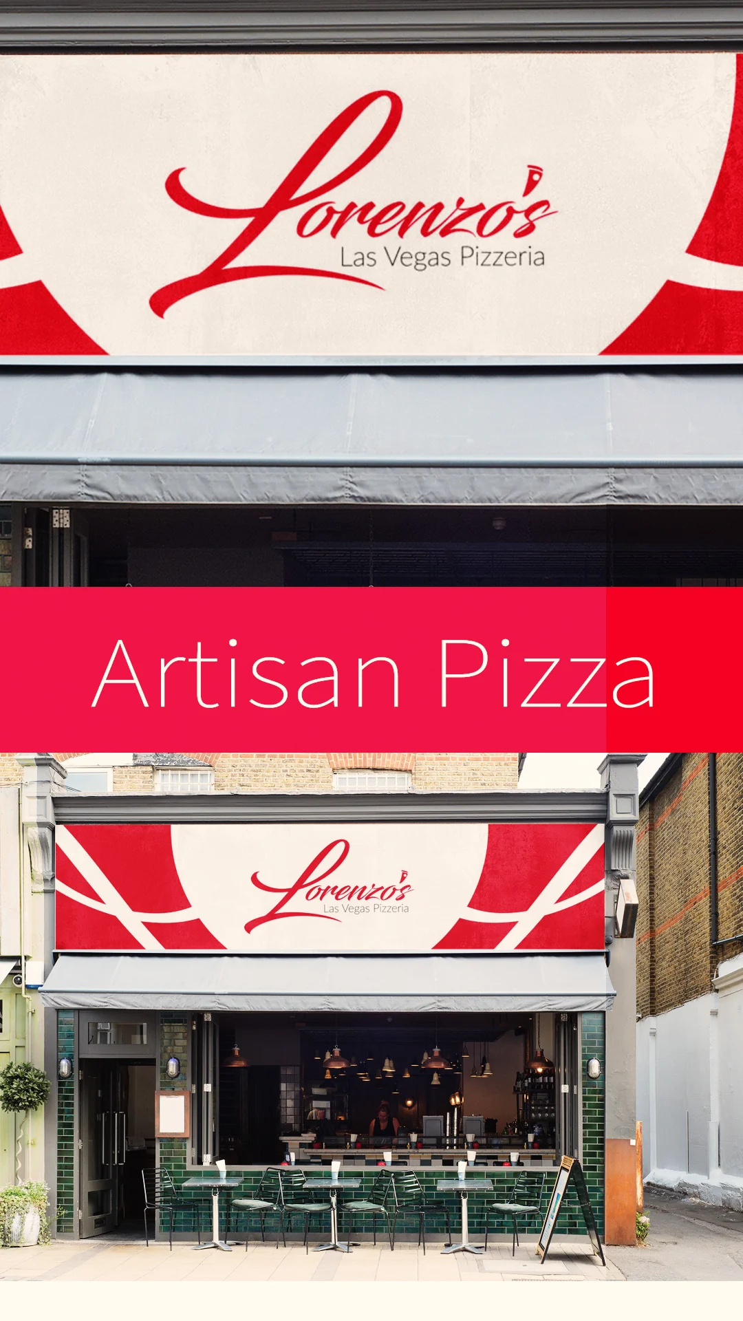
Each piece was designed for how it’s handled:
- Pizza boxes use a split-field build: a white logotype panel beside a red pattern panel.
- Takeout bags carry the red-on-white pattern, a white logotype band, and a solid red seal block.
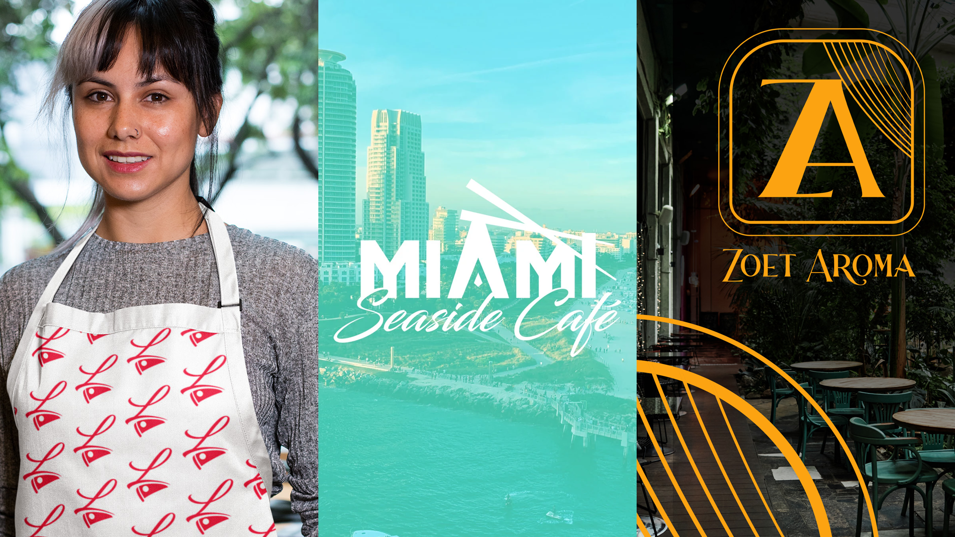
- Aprons carry a pattern-print bib on natural canvas, so staff become part of the identity the moment they walk the floor.
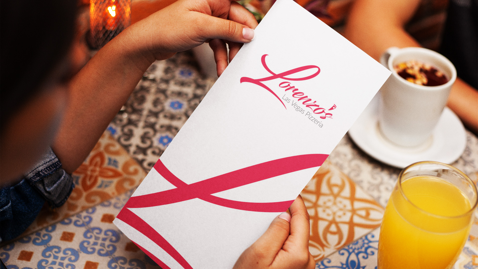
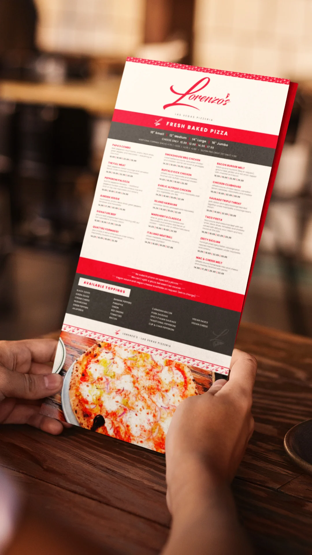
- The menu goes the opposite direction: a white ground, the logotype at top right, and one sweeping red brushstroke lifted from the L swash across the lower third.
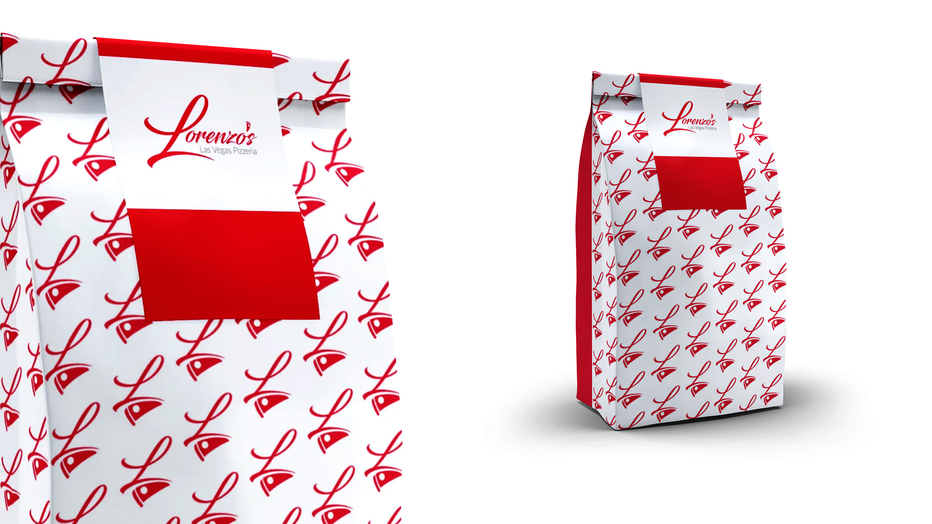
Packaging carries real weight. In one Ipsos poll, 72 percent of Americans said a product’s packaging design often influences their purchase decisions. That poll covered products in general, not restaurants, but a takeout box is packaging, and it’s often the only part of your brand a guest holds. My packaging design page covers that side of the work in more detail.
Genuine Branding Reviews From
Business Owners I've Helped
Time - 1:05 minutes
Time - 41 seconds
Time - 1:41 minutes
Time - 42 seconds
Example Project: Miami Seaside Café
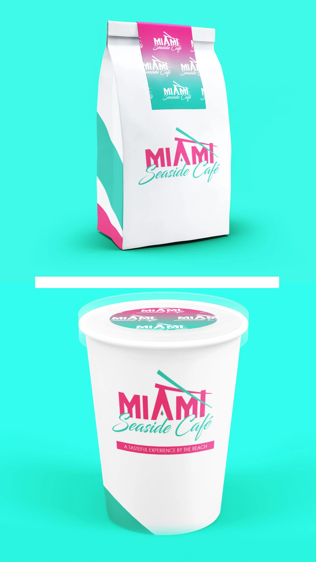
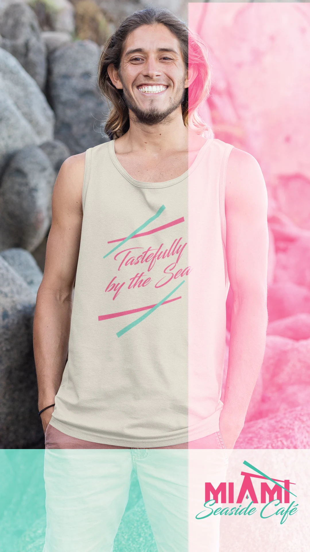
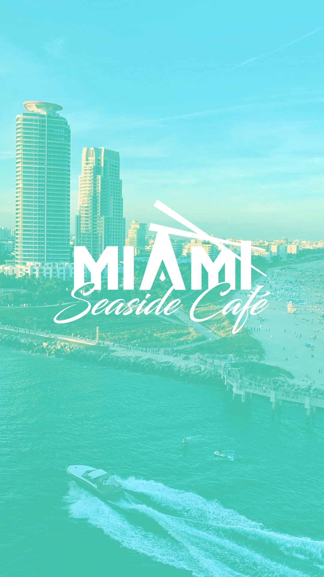
Miami Seaside Café is a coastal café identity I designed for a menu of coffee, sushi, and casual dining, with the tagline “A Tasteful Experience by the Beach & Tastefully by the Sea.” It shows what happens when a design has to say a place without shouting it.
The Design Problem
My reference was Miami Vice, and my rule was that the result had to feel like Miami to someone who lives there, not to someone shopping for a souvenir. The easy route was full neon pastiche: palm silhouettes, sunset gradients, chrome type. That route works for a single T-shirt and then disappears.
So I took the palette and geometry from Miami’s art deco vocabulary and left the nostalgia props behind. It reads as Miami without a palm tree in sight. For local work like this, my Miami logo design page covers the wider approach.
One Shape Doing Two Jobs
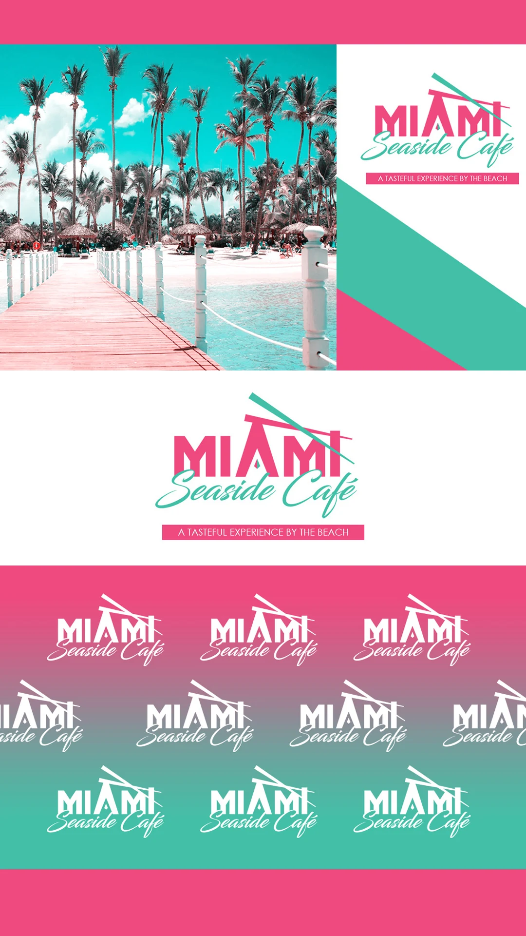
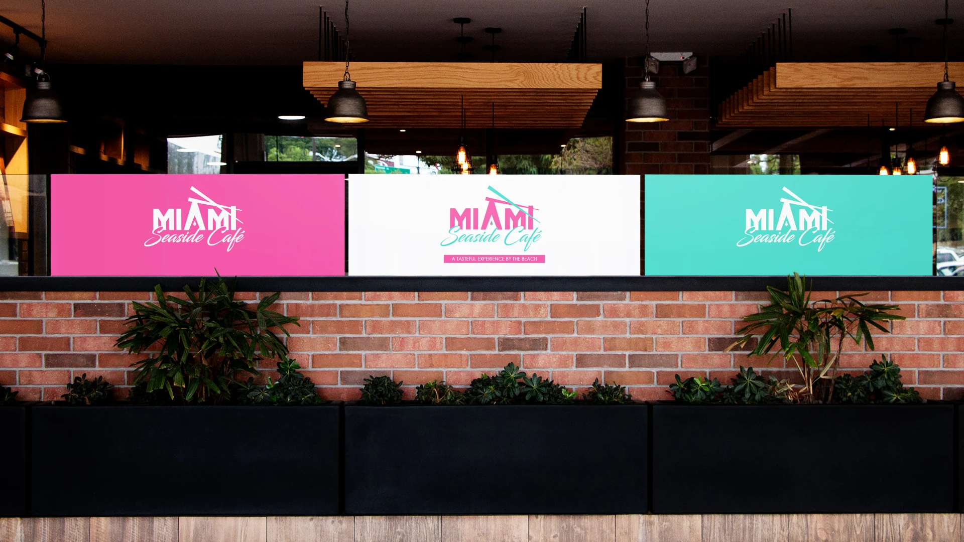
“MIAMI” is set in tall condensed deco capitals. The letter A has no crossbar. It’s a solid triangle that doubles as a roofline apex.
Crossed beams run through the lockup. Read one way, they’re an awning or a beach-shelter frame. Read another way, they’re chopsticks, a quiet nod to the sushi on the menu. One graphic element handles location and category at once, without illustrating either.
A Two-Hero Palette
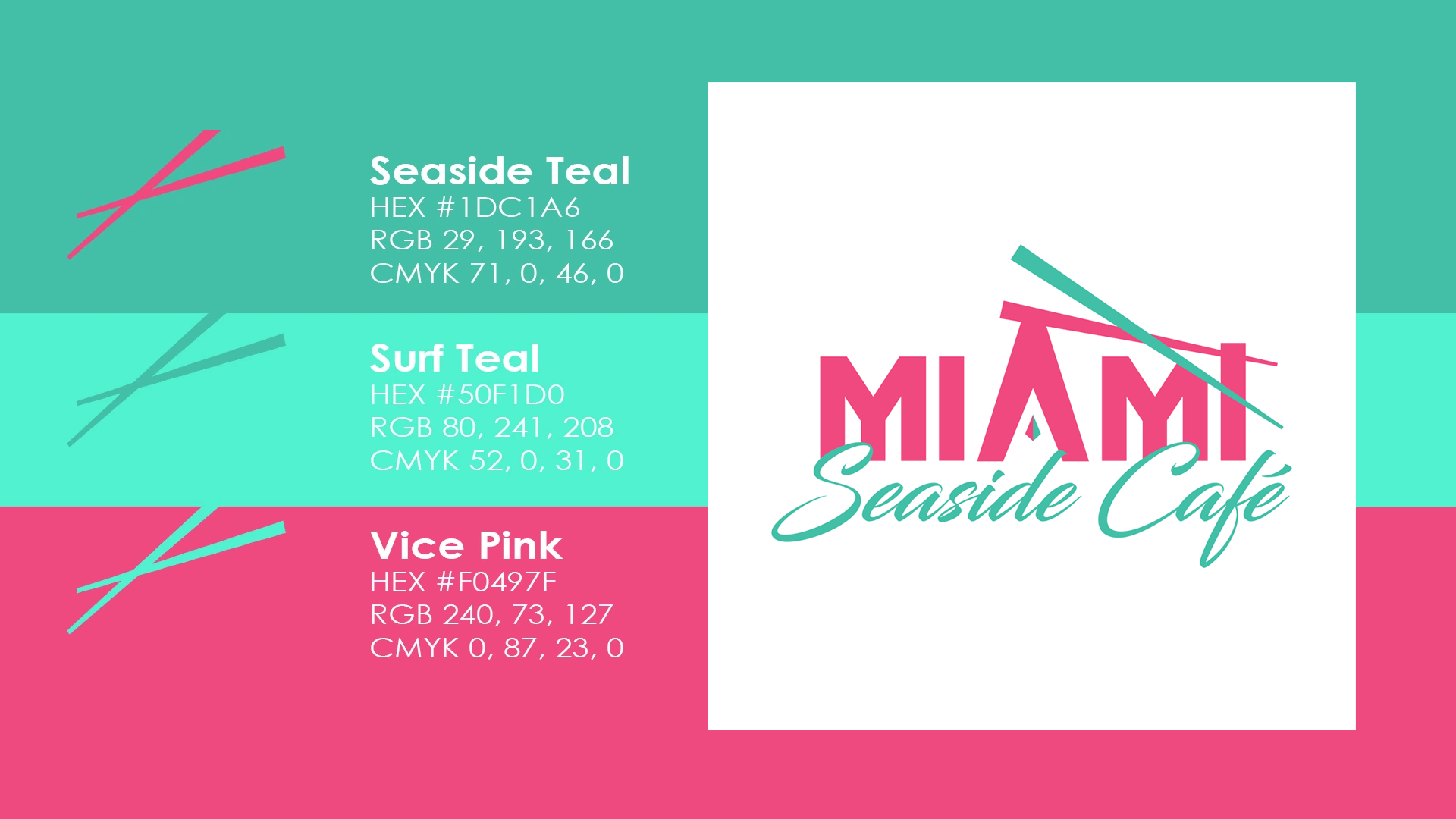
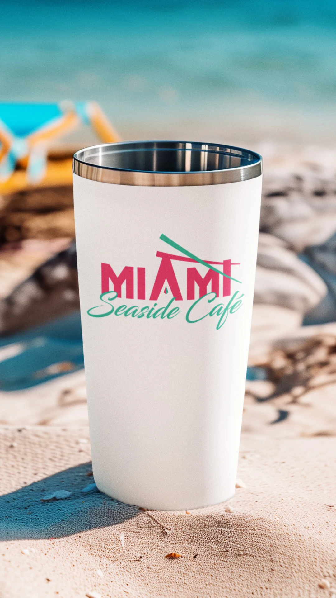
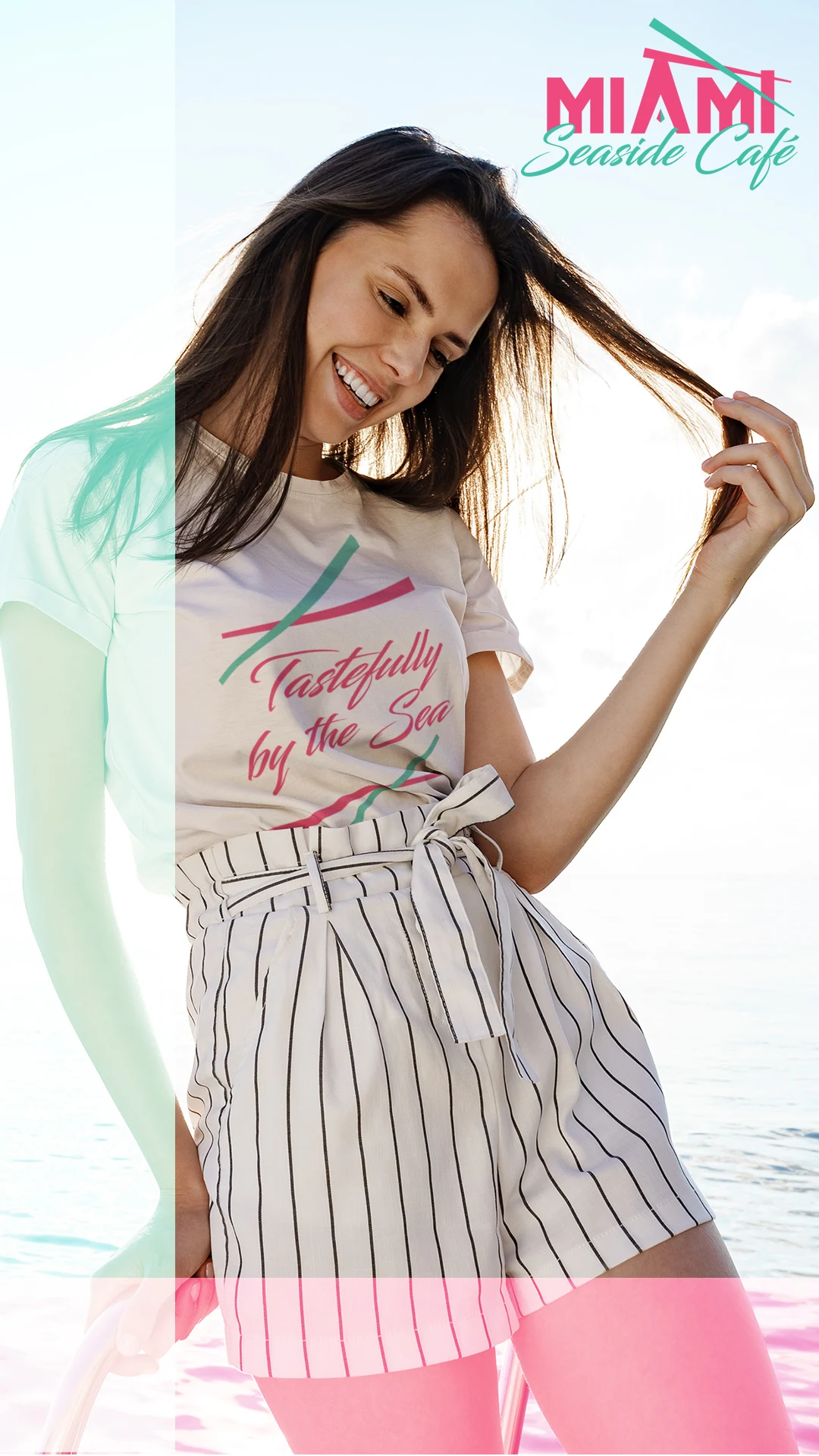
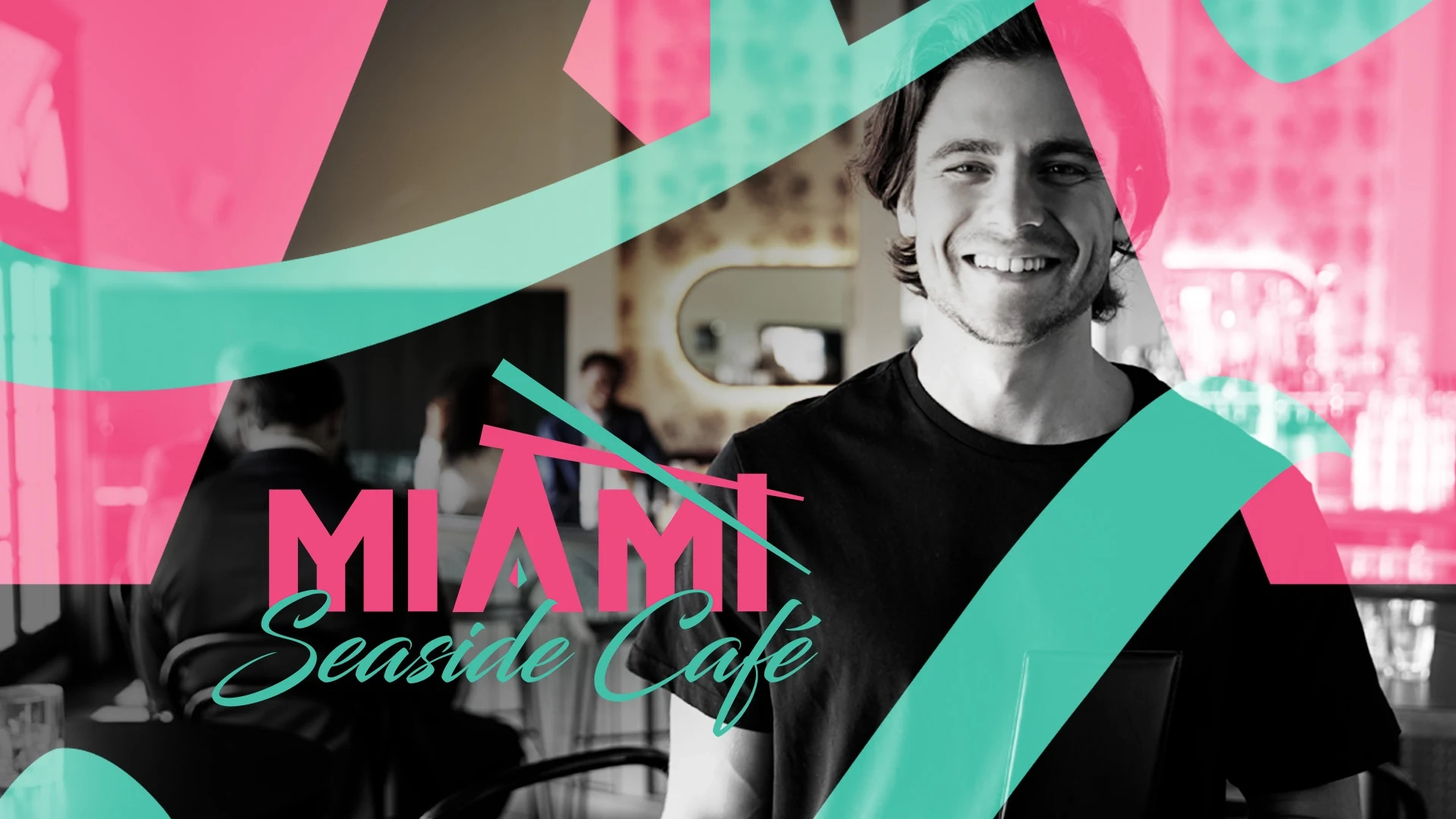
Most identities pick one hero color and one accent. This one refuses. Vice Pink (#FF2C7D) carries the wordmark, the tagline bar, and the primary signage field. Seaside Teal (#1DC1A6) handles the script and the crossed beam because it holds legibility at small sizes. Surf Teal (#50F1D0) is for large color fields and reversed applications only, never for type. White is the ground, at two-thirds of each surface at minimum.
Pink and teal sit at equal weight on purpose, because that pairing is the Miami signal. One watch-out: the two teals are close enough to look like a printing mistake when they land side by side at similar scale, so I separate them by role.
Typography: Architecture Against Water
The pairing is rigid geometry against loose brushwork. Deco condensed capitals set the city. A fluid brush script sets “Seaside Café.” Small, widely tracked capitals carry the tagline inside a solid pink bar. A neutral sans handles menus and body copy, because neither display face belongs in a paragraph. I explored six typeface combinations, and every reject paired script with script or capitals with capitals and lost the tension.
Lettering on a sign is never neutral. One outdoor signs study asked Chinese consumers to judge Japanese and Taiwanese restaurants, and the style of the characters on the sign shaped how authentic and high-status the restaurants seemed, which in turn tracked with intent to visit and willingness to pay. The setting differs from Miami, but the principle carries: the letterforms are doing work before anyone reads the name.
Applications Built for an Open-Air Room
- Storefront: a three-panel treatment of pink, white, and teal, side by side, so the color blocking alone identifies the building from across the street. The white center panel carries the full tagline lockup.
- Awning: diagonal pink and teal blocking on white, with angles pulled from the beam motif.
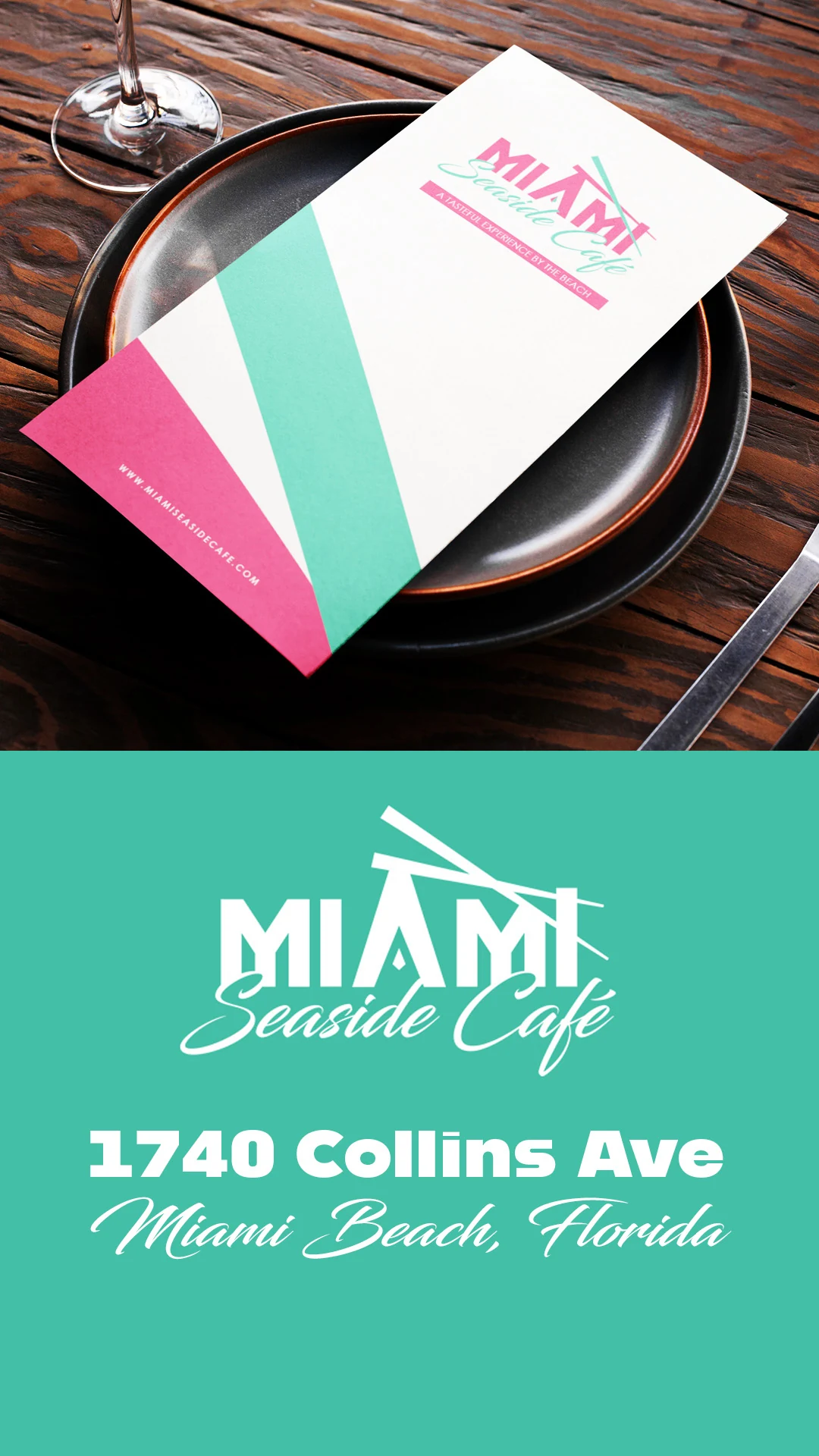
- Menus: ivory stock, the lockup at top right, and diagonal bands running off the lower-left corner.
- Cups: the tagline lockup centered, with a tiled-logo gradient lid seal.
- Takeout bags: the lockup alone, for a softer daytime read.
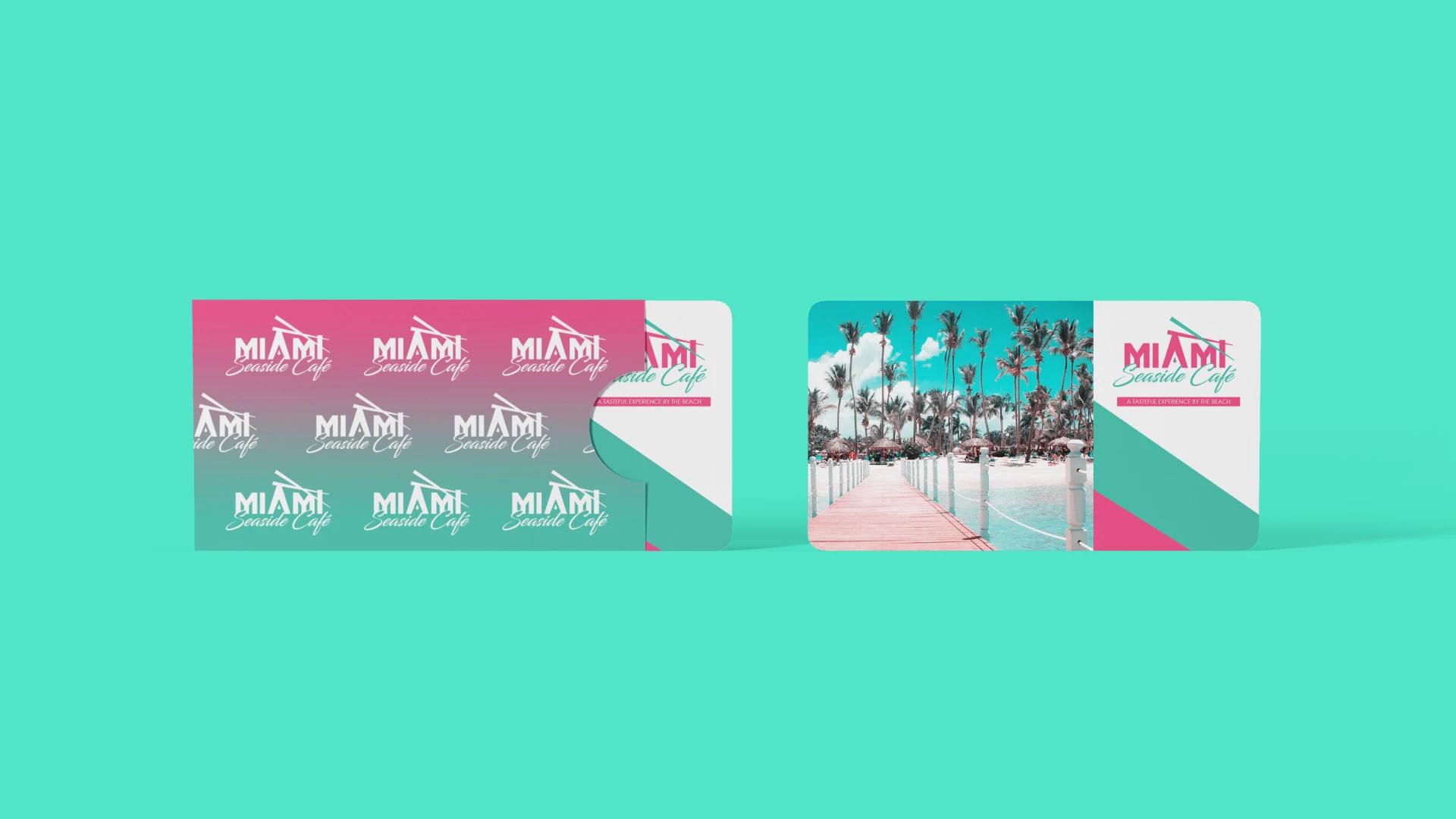
- Gift cards: the one place Miami photography appears, inside a tiled-logo gradient sleeve.
What Do These Two Projects Show About How I Design?
Both projects rest on the same five design decisions, and they’re the decisions I bring to a restaurant brand from the first sketch.
- Commit to one idea. Lorenzo’s is a name written by hand. Miami Seaside Café is deco geometry and ocean color. Neither brand tries to say five things at once.
- Let white space carry the weight. Both systems keep white at about two-thirds of every surface, because loud color reads as confident only when it’s surrounded by quiet.
- Build something that repeats. A tiled monogram in one, a diagonal color-blocking angle in the other. Something has to travel across surfaces or the brand never compounds.
- Reject the obvious. No checkered tablecloths or cartoon chefs for the pizzeria. No flamingos or neon tubes for the café. The obvious version is faster to produce and easier to lose in a crowd.
- Design the everyday surfaces. Boxes, bags, aprons, cups, and seals are what guests actually hold, and that’s where a brand either holds together or falls apart.
How Much Does Restaurant Branding Design Cost?
Restaurant branding design is quoted after a discovery call, so you see a defined deliverable list and a firm number before any work begins. I don’t publish a single restaurant price because the scope changes the number.
The main factors are how many deliverables the launch requires, how many surfaces the identity has to cover, how complex the packaging is, and whether a website is part of the project. A pizzeria that needs boxes, bags, and aprons is a different scope than a café that needs signage and cups. Website design is scoped and quoted individually.
The call is not a sales formality. It’s how I find out whether you need a full system or a handful of assets, and it’s how you avoid paying for pieces you won’t use.
What Will You Receive, and What Is Not Included?
You receive the finished identity and access to the applicable editable project files, such as AI, PSD, and PDF files, after completion. I offer unlimited revisions and work toward a client-satisfactory design outcome. I also keep your project files, and if you lose yours or need them again years later, I’ll resend them at no fee.
Unless a line in your proposal says otherwise, the following are not included:
- Purchasing or owning your domain name
- Purchasing or managing web hosting
- Professional photography
- Paid advertising services or advertising spend
- Ongoing SEO services
- Ongoing website maintenance or business management
- Future pages, new features, or additional work outside the approved scope
Those boundaries keep the scope clear. My role is design, and I’ll tell you plainly when something falls outside it.
Why Hire a One-on-One Restaurant Branding Studio?
You work directly with me, the person who designs the identity, from the first call through the final files. Branding Design Pro is a one-person studio, and I work with roughly four to six clients a month, so your project has my full attention.
I provide a one-on-one custom design process rather than a crowdsourced concept marketplace where many designers compete on the same idea. I create original concepts and do not intentionally copy another brand’s design. That structure is what gives you direct access, a clear line of accountability, and someone who can still answer your questions after the files are delivered.
I have 15 years of design experience, and I’d rather you judge that against the work. Read the client reviews before you book a call with me or anyone else.
Frequently Asked Questions
Yes. I generally start a rebrand from scratch, including when the current mark was improvised, AI-generated, or made by a friend. If you want to keep a substantial part of an existing design, I’ll work with it, though I won’t include that project in my portfolio.
Yes. I’m based in Omaha, Nebraska, and I work with businesses nationwide. I conduct client work and delivery digitally, and I’m reachable by phone, text, Zoom, Google Meet, or screen share.
Depending on your scope, I design signage artwork, menus, packaging, cups, bags, apparel, gift cards, and social templates, all built from the same identity system. On the call, you and I decide which ones your restaurant needs first and which can wait.
I can’t promise sales, foot traffic, or orders. Results depend on your food, your service, your location, your marketing, and other factors outside my control. What I can commit to is a clear, consistent, professionally built identity and a design process you can see and shape.
You receive access to the applicable editable project files after completion. In some situations I’ve also provided a notarized signed release confirming that the client owns the design after payment and that I retain no ownership stake.
No. I’m not an attorney and I don’t provide legal advice or trademark clearance. If you’re working with an IP attorney and a design adjustment is needed, such as a name change, I generally make that adjustment at no additional charge.
MORE CLIENT Testimonials
Time - 1:02 minutes
Time - 4:55 minutes
Everyone wants to see reviews from trusted sources that can validate whether a product or service. Therefore, our design and logo brands reviews play a crucial role in helping them decide if it's worth their investment.
The following is a page source of design reviews from past clients: video and written reviews of the client experiences working with Branding Design Pro.
Time - 58 seconds
Time - 1:31 minutes
Ready to Book Your Restaurant Branding Call?
If you’re opening a restaurant, rebranding one, or tired of signs, menus, and packaging that don’t match, the next step is a conversation. Tell me about your concept, your audience, and the surfaces you use. I’ll lay out what a complete system would include and give you a defined deliverable list and a firm number before any work begins.
If the honest answer is that you need fewer pieces than you expected, I’ll tell you that too.
About the Designer
I’m Kenal Louis, the designer behind Branding Design Pro. I have 15 years of design experience, and I work with clients one-on-one. Every project is designed and delivered by me.