The real estate brand video for this page; read or watch the video if you would prefer a visual experience of the content written.
Cover the name, and most real estate agents look exactly the same. Clients remember the one that doesn't, and it's rarely because of the logo, the headshot or the brokerage colors. A real estate brand is what people say about you when you're not in the room.
I've designed for business owners and brands for over 15 years. In this post, I'll show you how that plays out with real projects, plus one simple test you can run on your own brand tonight.
TL;DR
- A real estate brand is not your logo, headshot or brokerage colors. It's what past clients say about you when you're not there.
- Most agents blend in because they borrow a look: the brokerage template, a generic or AI-generated logo, or a copy of a top agent's style.
- Positioning comes before design. Decide what you sell, who it's for and why they should care, then build every visual from those answers.
- Your own brand works like owned equity. Leaning only on your brokerage's brand works like renting.
- The One-Sentence Test shows whether your brand is working, and you can run it tonight in under 30 minutes.
What Happens to Your Real Estate Brand When You Leave Your Brokerage?
If your brand is really your brokerage's brand, most of it stays behind when you leave. The colors, templates and name recognition belong to the company, not to you.
That isn't a rare scenario. About 16% of agents moved to a new brokerage in 2025, roughly 230,000 people. Every one of them had to answer the same question: what do clients remember about me without the company logo on my sign?
It matters because the first conversation often decides who gets hired. Zillow found that 59% of sellers hired the first agent they spoke with. If sellers don't think of you first, you may never get that conversation.
So what are most agents showing people instead?
Why Do So Many Real Estate Agents Look the Same?
Most agents look the same because they borrow a look instead of building one around who they are.
Think about a “Hello, my name is” tag at an event. It tells people your name. It doesn't make a single person remember you on the drive home.
A lot of agent personal branding works the same way. You have the headshots. You post. You show up. And people still say, “Oh, you're in real estate? I didn't know that.”
In my experience, it usually comes down to three borrowed looks.
The Brokerage Look
Your brokerage's colors, fonts and templates are a credential, and often a good one. But many agents under the same flag use the exact same look. Your marketing starts to blend in with the people you compete against most: your peers.
The Generic or AI-Generated Logo
A clip-art house. A key. A roofline. Or lately, a logo generated with AI in seconds.
AI is a useful tool. It can speed up production, and capable designers should adapt to it. But a tool can't ask who your client is, what you want them to feel or whether the mark will hold up on a yard sign read from across the street. That judgment is what a logo designer brings to the work.
There's also an ownership question worth knowing about. The U.S. Copyright Office has concluded that prompts alone don't give a person enough control over an AI output to claim authorship of it. What that means for your specific mark is a question for an IP attorney, not a designer, but it's worth asking before the logo goes on every sign you own.
The Copycat Look
You find a top agent whose style you admire, and you build a version of it. That feels safe. But a close copy tells people you're the backup option, because they've already seen it somewhere else.
Brand research backs this up. Jenni Romaniuk of the Ehrenberg-Bass Institute explains that a distinctive brand asset has to evoke only one brand before it can do its job. A look that also belongs to someone else can't point back to you.
What do all three have in common? They're borrowed. Borrowed brands are one of the most common agent branding mistakes I run into, because they look finished while saying nothing about you.
Dropping the borrowed look is the easy part. Deciding what goes in its place is harder, and for many agents, that decision hasn't been made yet.
What Should a Real Estate Brand Be Built On?
A real estate brand should be built on positioning: what you sell, who it's for and why they should care. That decision comes before any logo, color or font.
The framework I use is Brand Positioning Discovery, which defines your core focus. The rule is simple: “Before you design anything, know exactly what you sell, to whom, and why they should care.”
For an agent, that comes down to three answers:
- What you sell: Not “real estate.” It might be a first home without the overwhelm, or a quiet, discreet luxury sale.
- Who it's for: A specific person, not “buyers and sellers.”
- Why they should care: The problem you solve better than anyone around you.
Why does this matter so much in real estate? NAR's 2025 profile found that 37% of sellers found their agent through a referral from a friend, neighbor or relative. The top factor sellers named in their choice was the agent's reputation, cited by 35%. And 80% of sellers contacted only one agent before choosing.
Think about what that means. Your next client is often hearing about you secondhand. Someone else is making your introduction, and 88% of people trust recommendations from people they know more than any other channel. So what exactly are they saying about you?
In discovery, I dig into the details that shape those three answers: the audience's age range, demographics and psychographics, what's motivating the client to act now, and the vision they're working toward. Right now I'm starting a full identity for a returning client, from logo to website, and it starts with strategic planning, not a sketch. Every visual in a brand identity has to trace back to those answers.
Renting Your Brand vs. Owning It
You'd never tell a client to rent forever when they could build equity. But leaning only on your brokerage's brand is a lot like renting. You live in it, you pay into it, and when you move out, you leave with nothing.
Your own brand is ownership. Every post, every sign and every closing adds equity to something that goes with you.
Ownership pays off over time. NAR's 2026 Member Profile found that Realtors earned 28% of business from repeat clients and customers, plus another 22% through referrals from past clients.
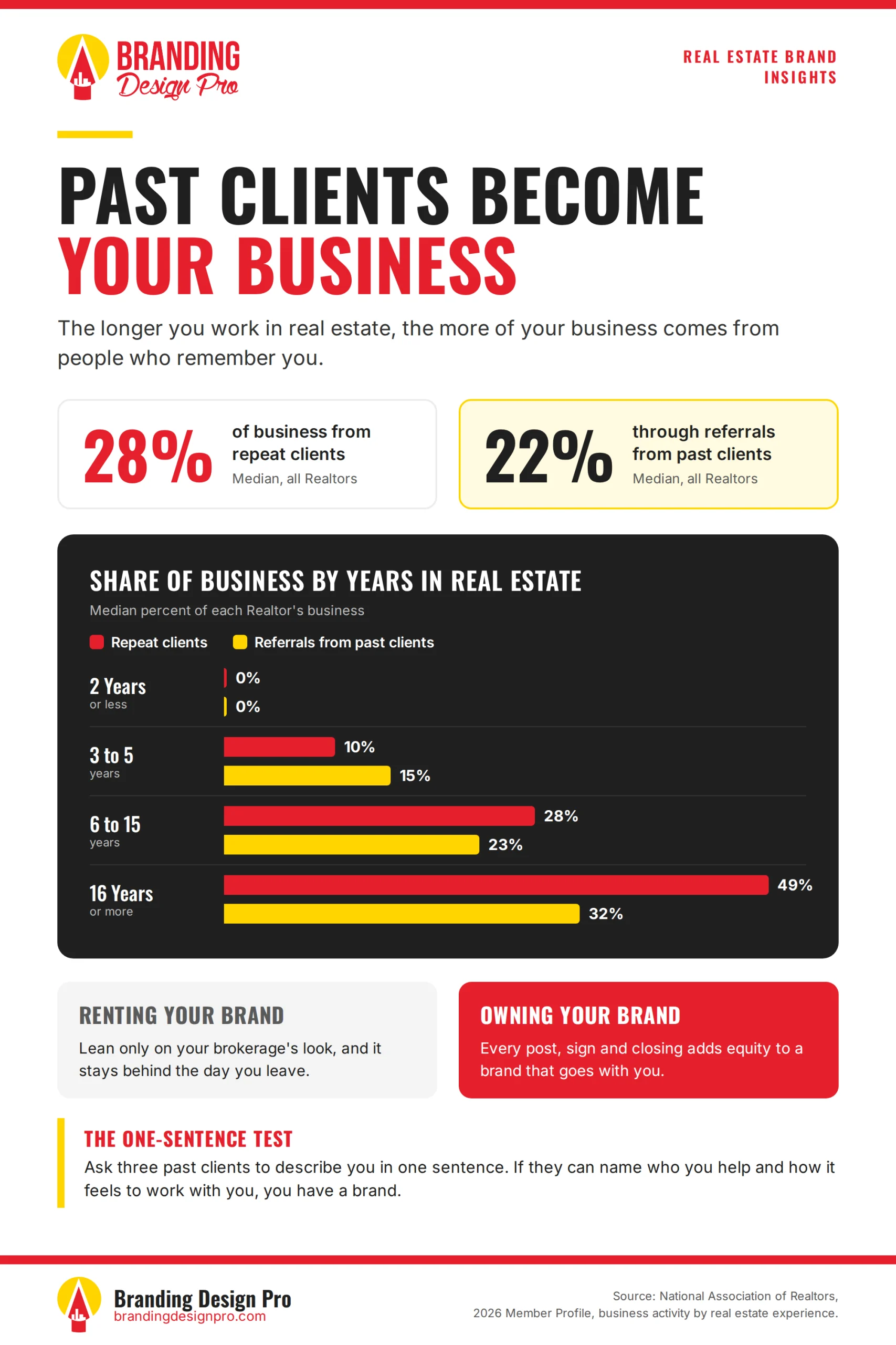
The catch is that past clients can only come back to someone they remember. Zillow's research shows how wide that gap can be. Among repeat buyers, 79% would consider working with the same agent again, but only 13% actually did.
A brand can't close that gap on its own. A forgettable one makes it wider.
Here's what can still go wrong, though. You write your positioning statement, it sounds great on paper, and the visuals don't match the business or the person behind it. I saw exactly where that breaks with an agent in San Diego.
What Jennifer St. Clair's Mid-Project Pivot Taught Me


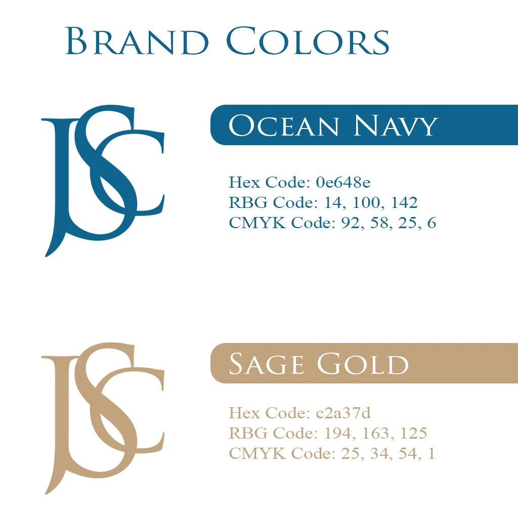
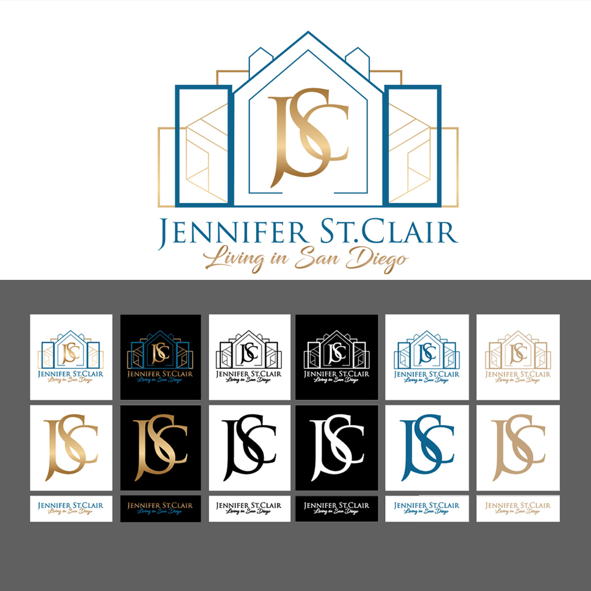
Jennifer St. Clair is a real estate agent in San Diego. She came to me with an AI-generated logo, and she said it felt more like a sticker than a real personal brand.
She wanted one identity for her real estate business and her YouTube channel. Her first idea was a medallion-style concept, so that's where I started.
Then her brand photoshoot happened. The photography made a completely different direction clear, so she pivoted mid-project.
A pivot can feel like a problem. I see it as a good sign. It means the client is paying attention to who the brand is becoming, not just what she pictured at the start. My job wasn't to protect my first concept. It was to follow the new direction with the same care.
I offer unlimited revisions, so I worked through every one until the mark matched her photography and the brand she'd already been building. In her Google review, she described the result in one line: “It reflects exactly who I am and the brand I've been building.”
Here's the lesson. That first logo wasn't weak because AI made it. It was weak because it had no relationship to her positioning, her photos or her market. It didn't describe her, and it wasn't built for the people she attracts.
This matters most on social media, where you are the brand. People follow the person first. If your logo, your photos and your captions each describe a different agent, your audience can feel it.
A logo that looks like you is only half of it. The other half is where a brand either proves itself or falls apart without you noticing.
How Does a Real Estate Brand Hold Up Across Every Surface?
A real estate brand holds up when every surface tells the same story, so people recognize you before they read your name.
The Bradshaw Group is a luxury real estate brokerage in Palm Beach County. When they came to me, they had no identity at all: no mark and no colors. The positioning was clear, though. Their clients are luxury buyers and sellers who expect polish and warmth at the same time.
Every decision traced back to that:
- A cursive B that signals heritage and elegance
- Golden rings around it for movement and a modern luxury feel
- A black and gold palette that sits at the premium end while staying timeless
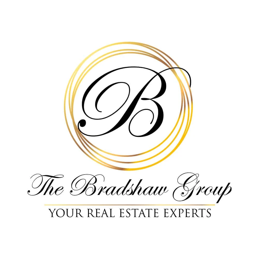

Then came the real test. A brand doesn't live in a logo file. It lives on surfaces. For The Bradshaw Group, that meant the office wall, a vehicle wrap moving through the neighborhoods where their clients live, and all the way down to a key fob. Every one of those surfaces tells the same story, and that's the standard behind all of my real estate branding work.
For an individual agent, the surfaces are your yard sign, your listing presentation, your website, your email signature and your social content.
More of that first impression is happening online. Zillow found that 36% of sellers now find their agent through online channels, more than double the 15% share in 2018. For many sellers, your website design is the first surface they see.
This is the part most agents underestimate. Consistency isn't about being boring. It's what lets someone recognize you on the third surface without reading your name. Romaniuk calls inconsistent colors, fonts and logos the enemy of building distinctive assets.
That's why the brand guides I deliver can include typeface names, color codes, logo-use guidance, background guidance and application notes. A guide only helps if it gets used, though. Marq's research found that 85% of organizations have brand guidelines, but only 30% consistently enforce them.
No amount of coaching or ad spend can make a look that changes every week recognizable.
How Do You Know If Your Brand Is Working?
Ask a past client to describe you in one sentence. If they can say who you help and what it's like to work with you, you have a brand. If they can't, you have a look, just like every other card in the stack.
When every brand asset you own says that same thing, you have a brand clients can't ignore. I call it the One-Sentence Test.
How Do You Run the One-Sentence Test?
Write your own sentence, ask three past clients for theirs, compare the answers, then check five of your brand assets against them. The whole test takes under 30 minutes.
- Write your own sentence first. “I help this specific person with this specific move, and working with me feels like this.” Fill in each part as precisely as you can.
- Text three past clients. Keep it simple: “Quick favor. How would you describe me to a friend in one sentence?”
- Compare the answers. Did they name who you help? Did they use a word close to how you want working with you to feel?
- Pull up five brand assets. Look at your website header, your last few posts, a listing flyer, your business card and your email signature. Does each one say the same thing?
Fix the first asset that doesn't match. That's where your brand needs work.
What to Do When the Answers Don't Match
If your clients' answers don't match yours, that's fixable. It usually means the positioning was never defined, or the visuals drifted away from it.
I work one-on-one with agents to define that positioning and build a brand that says who you are on every surface, from the logo to the yard sign. If you want to see what a real brand investment looks like before you spend anything, my free Branding Investment Guide walks through it.
Use the calendar below to book a discovery call with me at Branding Design Pro.
Genuine Branding Reviews From
Business Owners I've Helped
Time - 1:05 minutes
Time - 41 seconds
Time - 1:41 minutes
Time - 42 seconds
Let's talk about your vision for your brand. Use the calendar to book your free consultation call — you'll share your goals, get answers, and see whether we're the right fit for each other.