If you're searching for restaurant branding help, you've probably already run into the same wall every owner hits.
You type in "restaurant logo design" and you get a thousand studios, agencies and freelancers all saying the same thing. Everybody promises a beautiful logo. Nobody explains what happens after the logo is done.
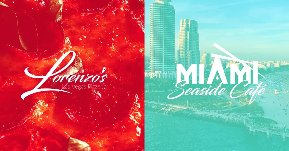
So in this article I'm walking you through two creative projects I designed from the ground up. One is a pizzeria in Las Vegas. One is a café on the beach in Miami. Two very different restaurants, two very different problems, and two very different answers.
By the end you will know exactly what strong restaurant brand design looks like, what it includes, and how to pick the right designer for your place.
Let's get into it.
Restaurant Branding: Why a Logo Alone Won’t Cut It
Restaurant branding is the full system of visuals, words and details that makes people recognize your restaurant and remember how it felt to be there.
That's it. That's the whole definition.
A logo is one piece of that system. An important piece. But one piece.
True restaurant brand design covers your logo, your colors, your fonts, your menu, your packaging, your signage, your aprons, your delivery bags, and the tone of every word you put on all of it. When those things agree with each other, people trust you faster. When they argue with each other, people feel it even if they can't name it.
Here's the part most owners miss. Your customer meets your brand before they ever taste your food.
They see a sign from the street. They see a box on a neighbor's porch. They see a photo on a phone screen. Most of your first impressions happen with zero food involved. That's the job restaurant branding does for you while you're busy in the kitchen.
Why Restaurant Logo Design Alone Is Not Enough
I get this call all the time. "I just need a logo."
I understand it. A logo feels like a finish line. But a logo by itself is a signature with nothing to sign.
Think about it this way. If I hand you a beautiful mark and nothing else, you still have to figure out what color your boxes are. You still have to guess what font goes on the menu. You still have to decide what your sign looks like at night. Every one of those guesses becomes a small crack in your brand.
Ten small cracks later, your restaurant looks like four different restaurants.
That's why a strong restaurant branding project ships a system, not a picture. Now let me show you what that actually looks like in practice.
Case Study 1: Lorenzo's Las Vegas Pizzeria
Owner: Natalia Lorenzo
Category: Independent pizzeria — dine-in, takeout, delivery
Market: Las Vegas, Nevada
Pizza brand design logotype and monogram for a Las Vegas pizzeria

The problem: a great pizzeria hiding inside a crowded market
Las Vegas is stacked with chains and high-volume pizza operators. Natalia makes her pizza by hand. Everybody who ate there already knew the difference.
The trouble was the people who hadn't eaten there yet.
When a hungry person opens a delivery app, every option looks the same size on the screen. So the brand had one job before the food ever got a chance: make "somebody's family name is on this" obvious in about one second.
The one move that carried everything
No badge. No shield. No crest with a rolling pin in it. No cartoon chef.
After looking at multiple variations that aligned with the vision, I landed on a calligraphic script. The goal was a typeface that felt written by hand but carried an edge.
That single choice did the heavy lifting. A signature reads as human before your brain even finishes reading the letters. And the apostrophe in "Lorenzo's" got swapped for a small pizza slice glyph, so the mark tells you the category without spelling it out.
That little slice matters more than it looks. Without it, "Lorenzo's" could be a hair salon.
The color system: one red, held ruthlessly
The whole palette is four values.
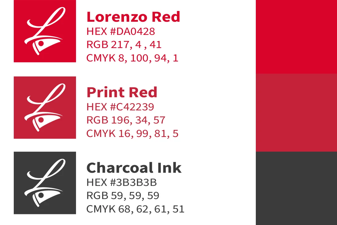
Lorenzo Red at #DA0428 is the hero. Print Red at #C42239 is how that red actually behaves on coated stock — a working variant, not a second brand color. White is the base and covers roughly two-thirds of every surface. A soft charcoal ink at #3B3B3B handles the small "Las Vegas Pizzeria" descriptor, and it's never true black.
Two colors plus ink. That restraint is the point.
Here's a warning I give every restaurant owner. Your photos will lie to you. The mockup shots of Lorenzo's boxes read warmer than spec because of the room lighting. That drift is photography, not permission to expand the palette. Hold your print vendor to the numbers, because a red that slides toward magenta makes your packaging look wrong on a shelf.
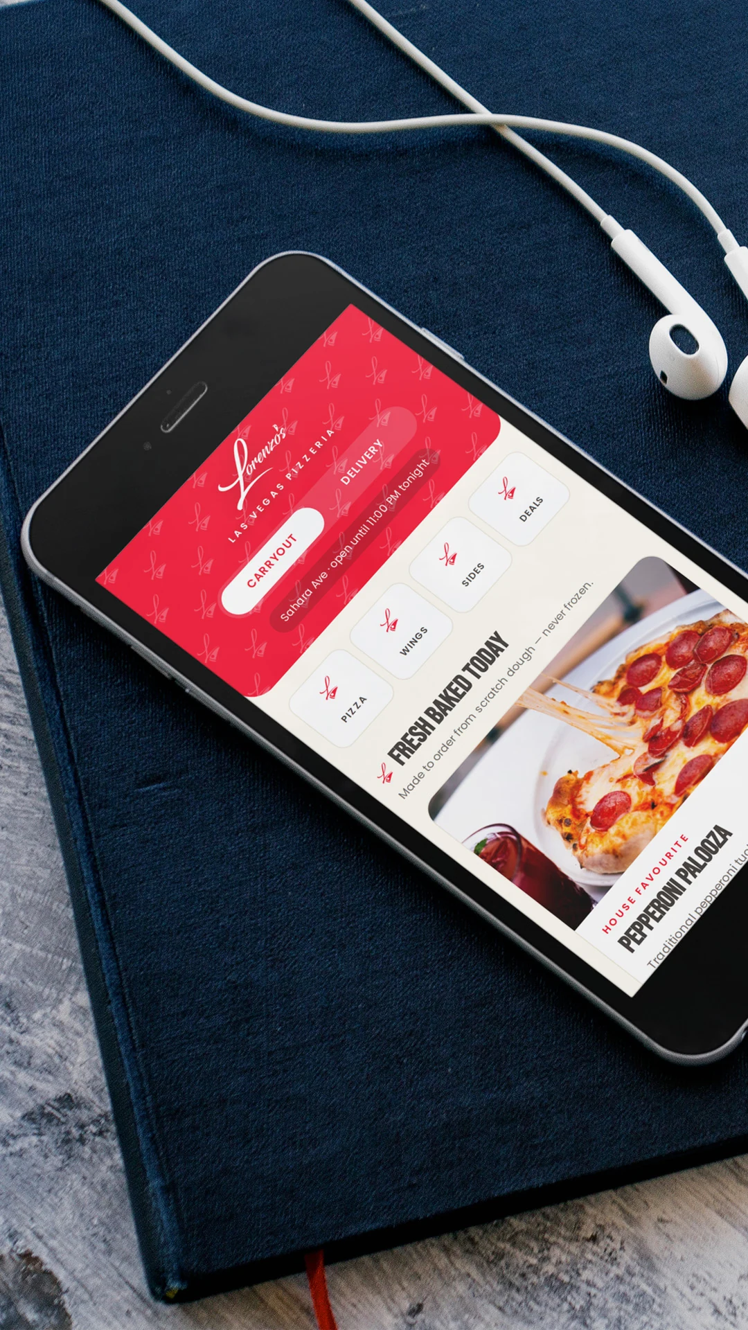
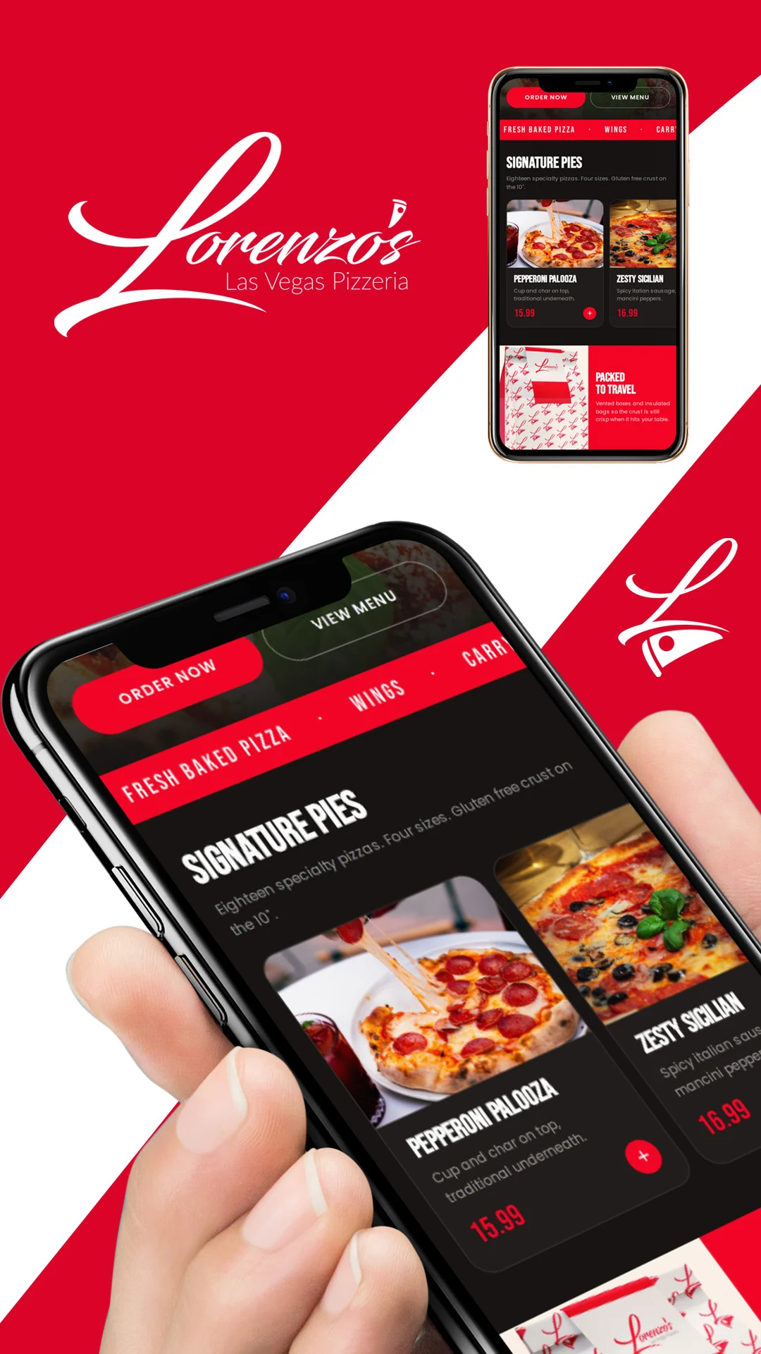
The pizza brand pattern that does the marketing for free
This is my favorite part of the whole project.
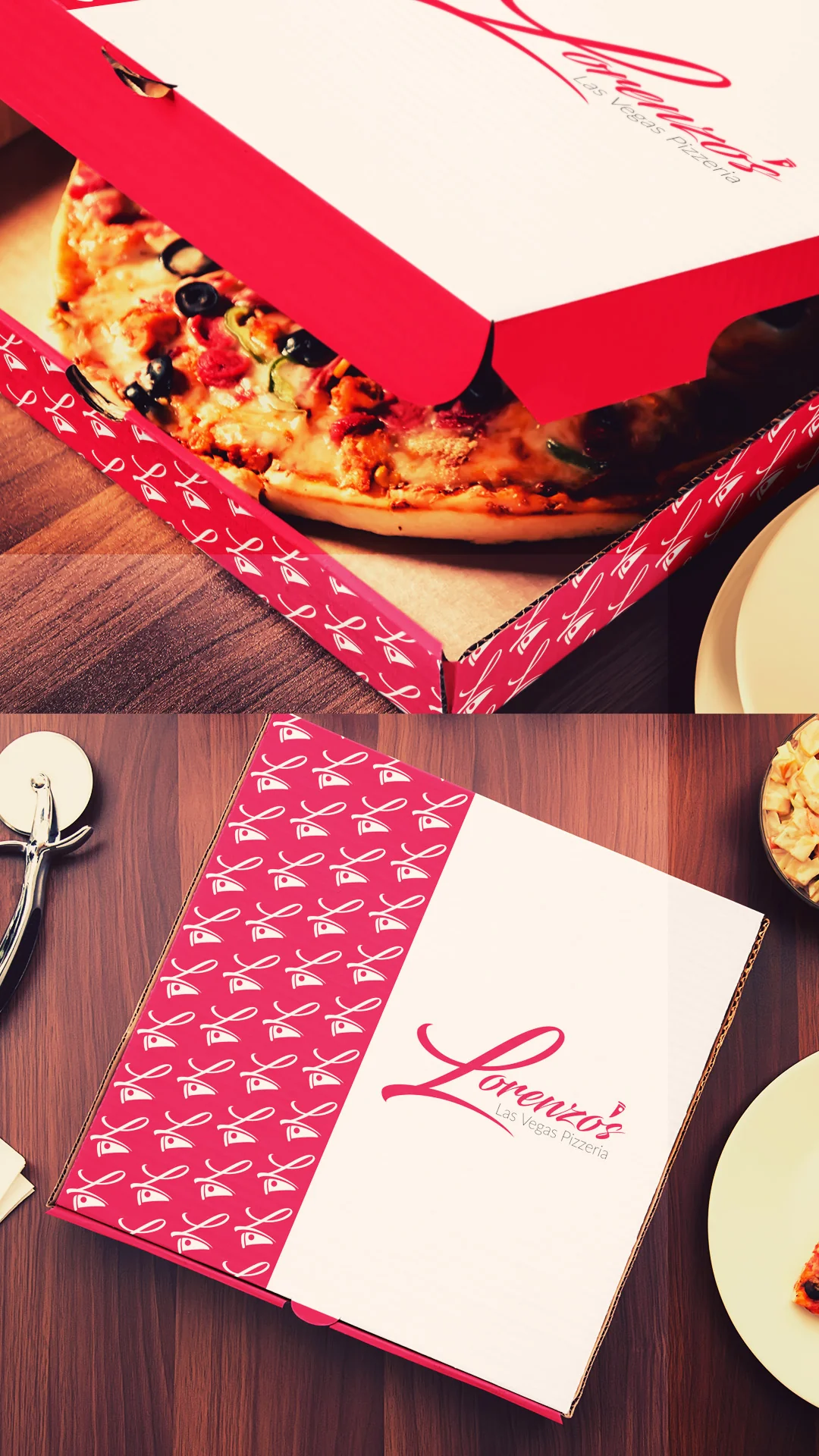
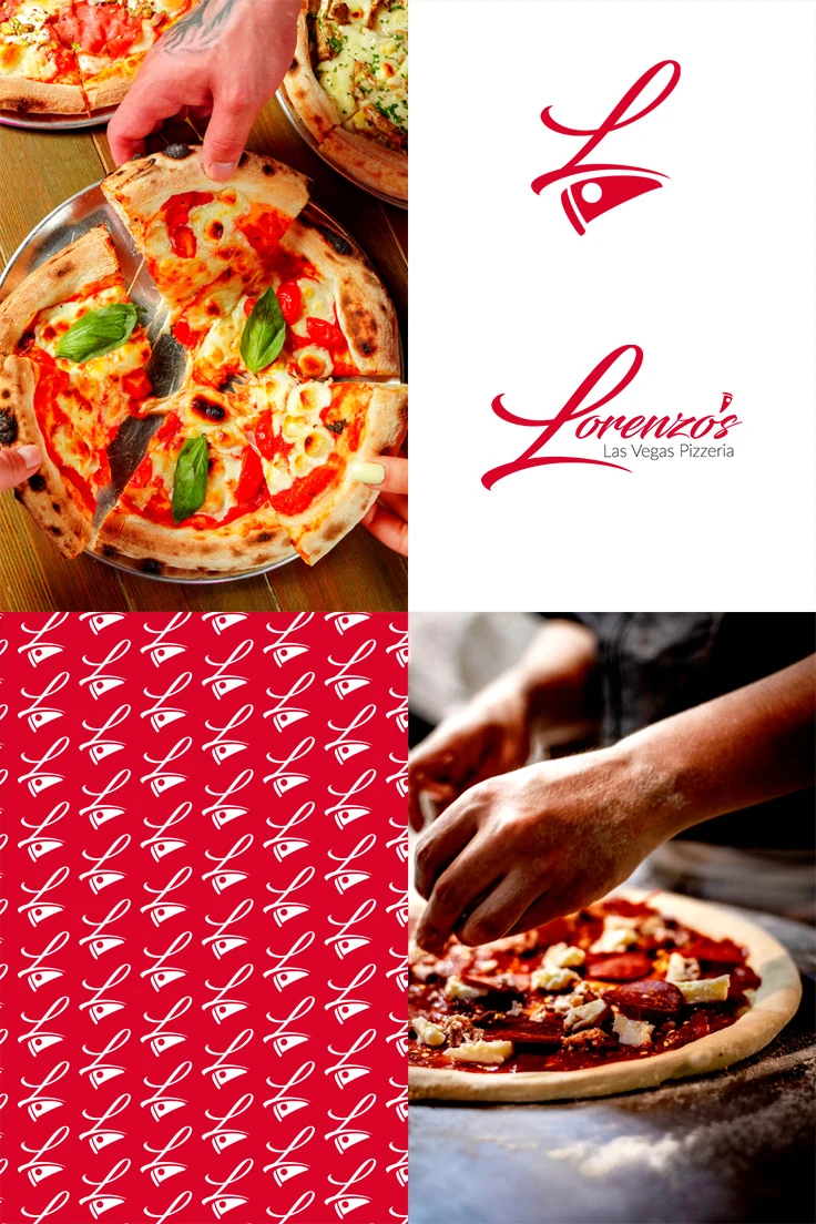
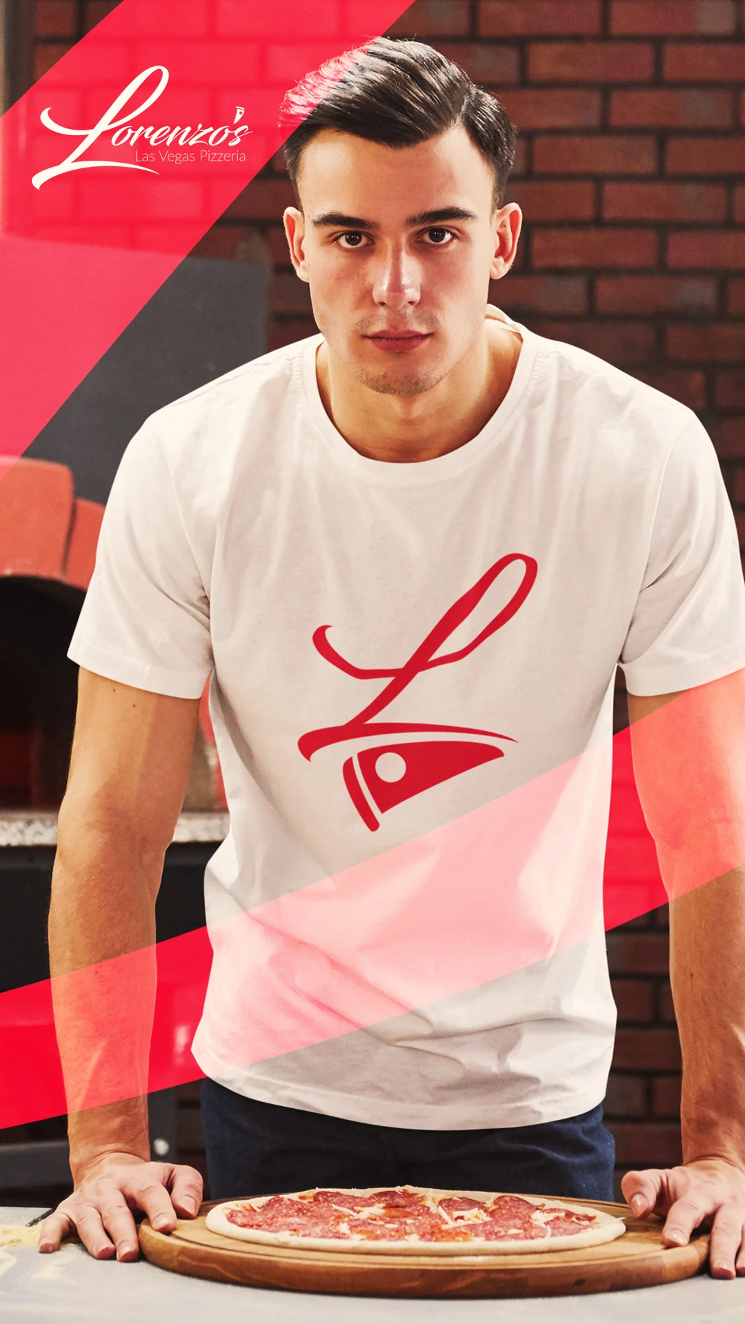
I took the L monogram and tiled it into a repeating pattern in two colorways. Red on white for takeout bags, menu interiors and wraps. White on red for box lids, apron panels and signage fields.
Think about the math. Every box that leaves that building is a moving billboard. Somebody carries it through a lobby. Somebody sets it on a break room table. Somebody posts it.
At fifty feet nobody can read the logotype. But they can absolutely read the pattern. The pattern became the highest-leverage asset in the entire system, and it costs nothing extra to print.
One rule though. Keep the tile at a consistent scale across every surface. A pattern that shrinks and grows between applications stops reading as a signature and starts reading as filler.
Pizza restaurant logo pattern in red and white for restaurant packaging
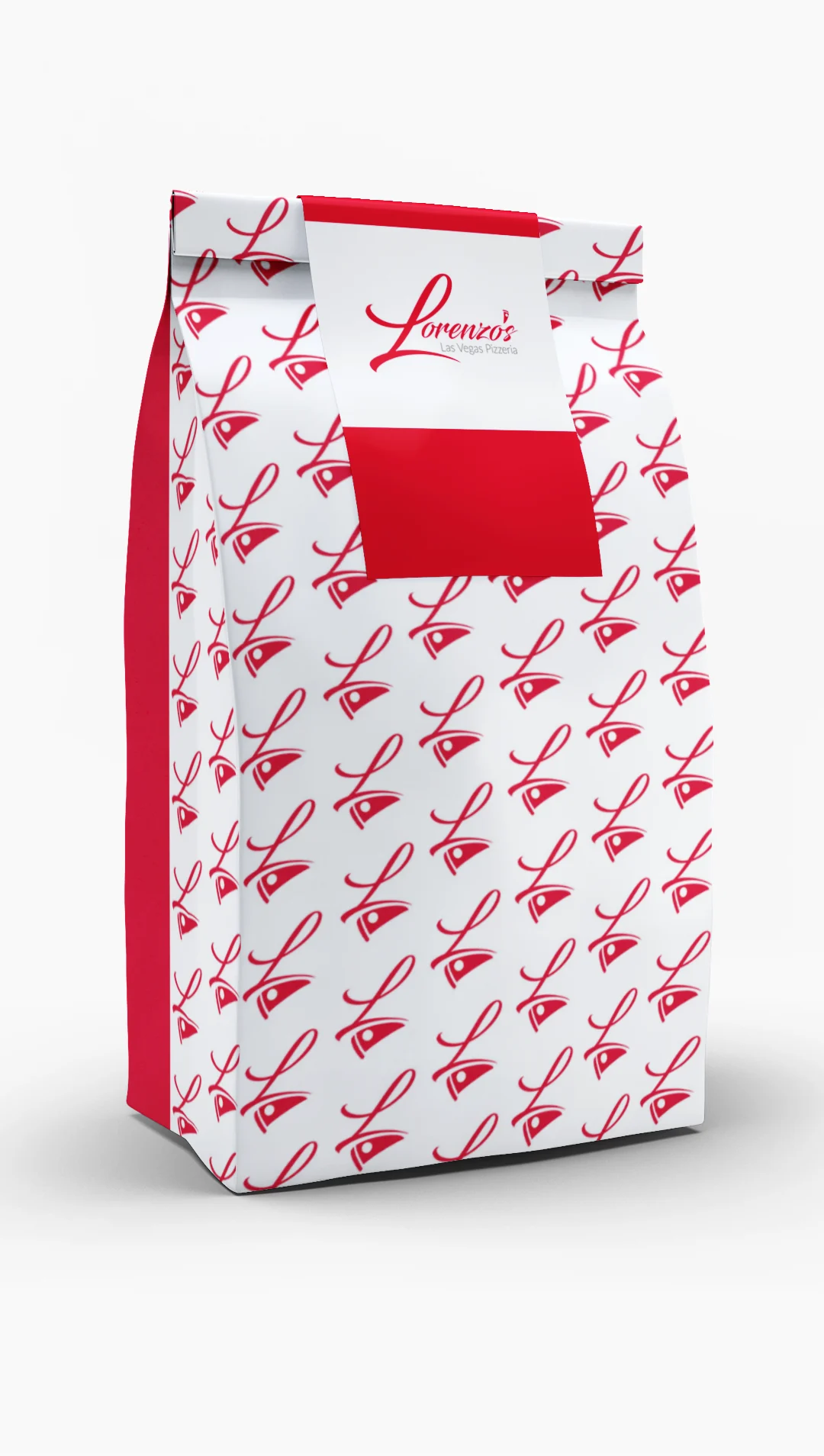

Brand package design across every surface
The brand package design covered the pieces a pizzeria actually touches every day.
Pizza boxes use a split-field build — a white logotype panel next to a red pattern panel. That split is now the recognizable shape of the business. Takeout bags run the red-on-white pattern with a white logotype band and a solid red seal block. Aprons carry a pattern-print bib on natural canvas, which means staff become part of the identity the moment they walk the floor.
Local restaurant branding apron design for a pizzeria owner
For the pizza brand menu design I went the opposite direction. White ground, logotype in the top right, and one sweeping red brushstroke lifted straight from the L swash running across the lower third. One gesture, nothing more. The food descriptions do the selling.
Pizza brand menu design for a Las Vegas pizzeria
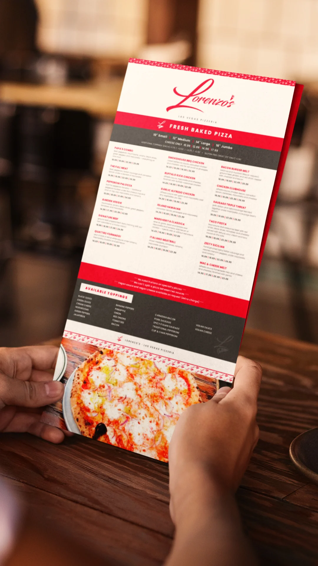
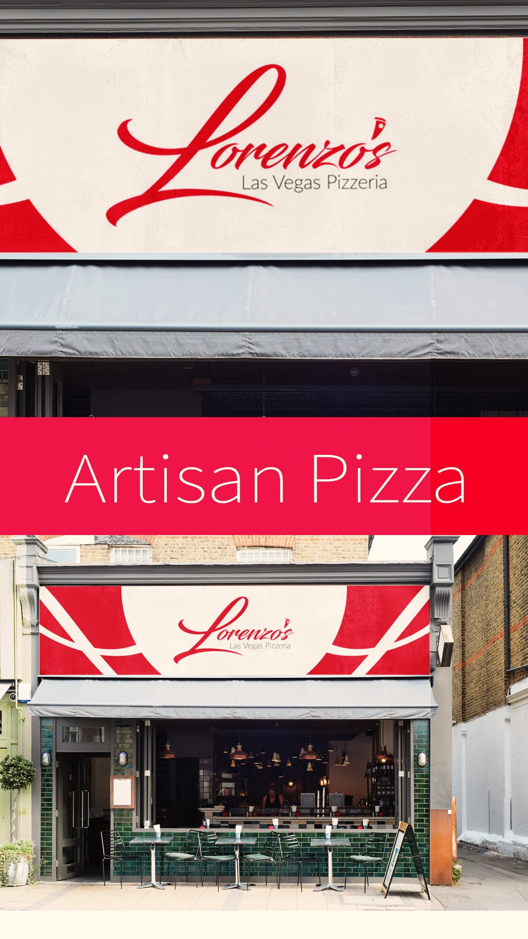
Where the restaurant logo design gets seen
Branding without placement is a painting in a closet. So I mapped where this specific brand has natural pull in Las Vegas.
UNLV brings students, faculty and staff — a young, high-frequency base well suited for campus catering and geo-targeted promotions. The Arts District buys craft and authenticity outright, so the handmade story needs zero translation there. Co-working spaces put the brand in front of founders and freelancers on a recurring weekly basis.
That's the difference between a logo and a strategy.
Client Praise & Testimonials
Time - 1:05 minutes
Time - 41 seconds
Time - 1:41 minutes
Time - 42 seconds
Case Study 2: Miami Seaside Café
Category: Coastal café — coffee, sushi, casual dining
Market: Miami, Florida
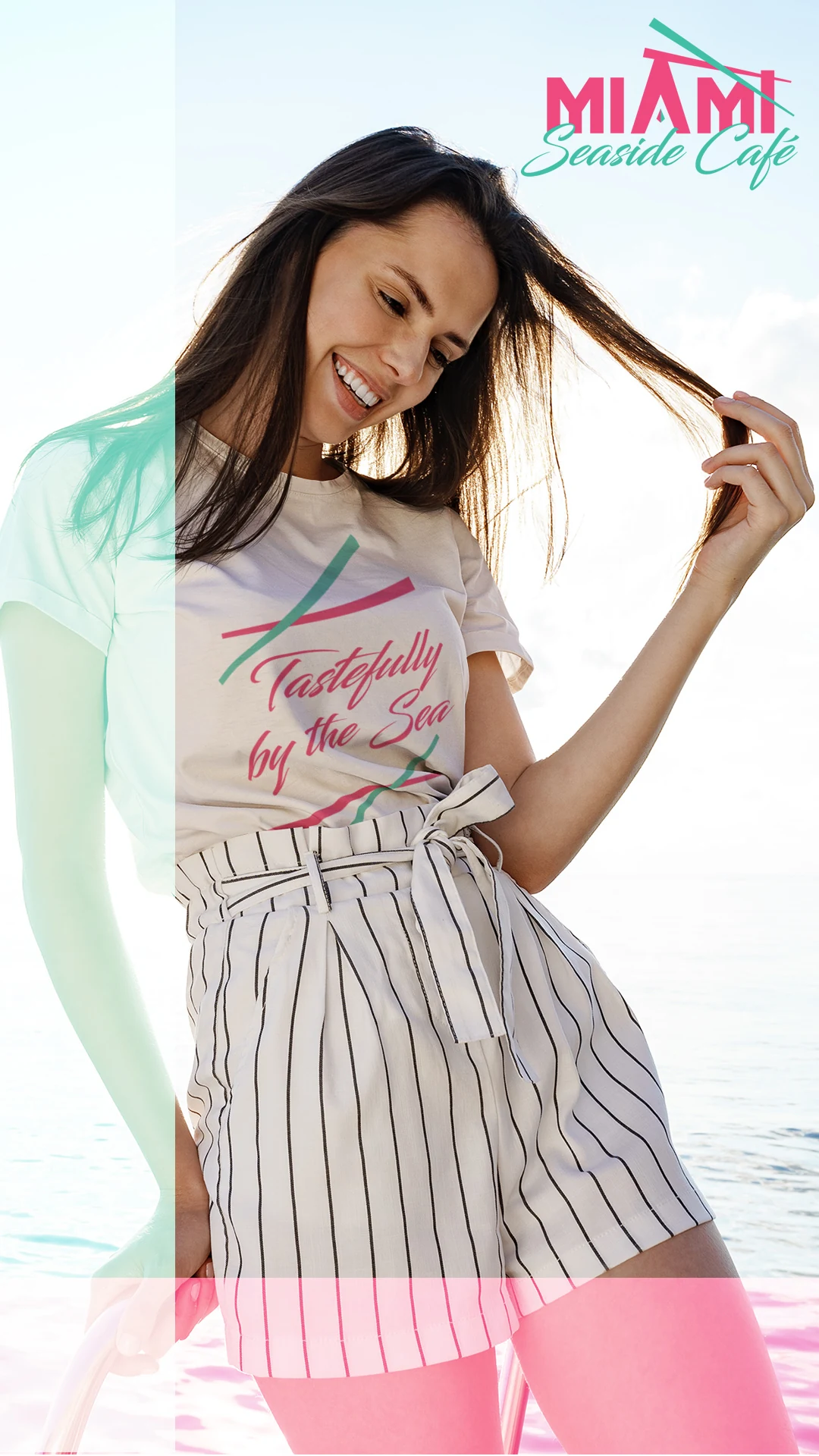
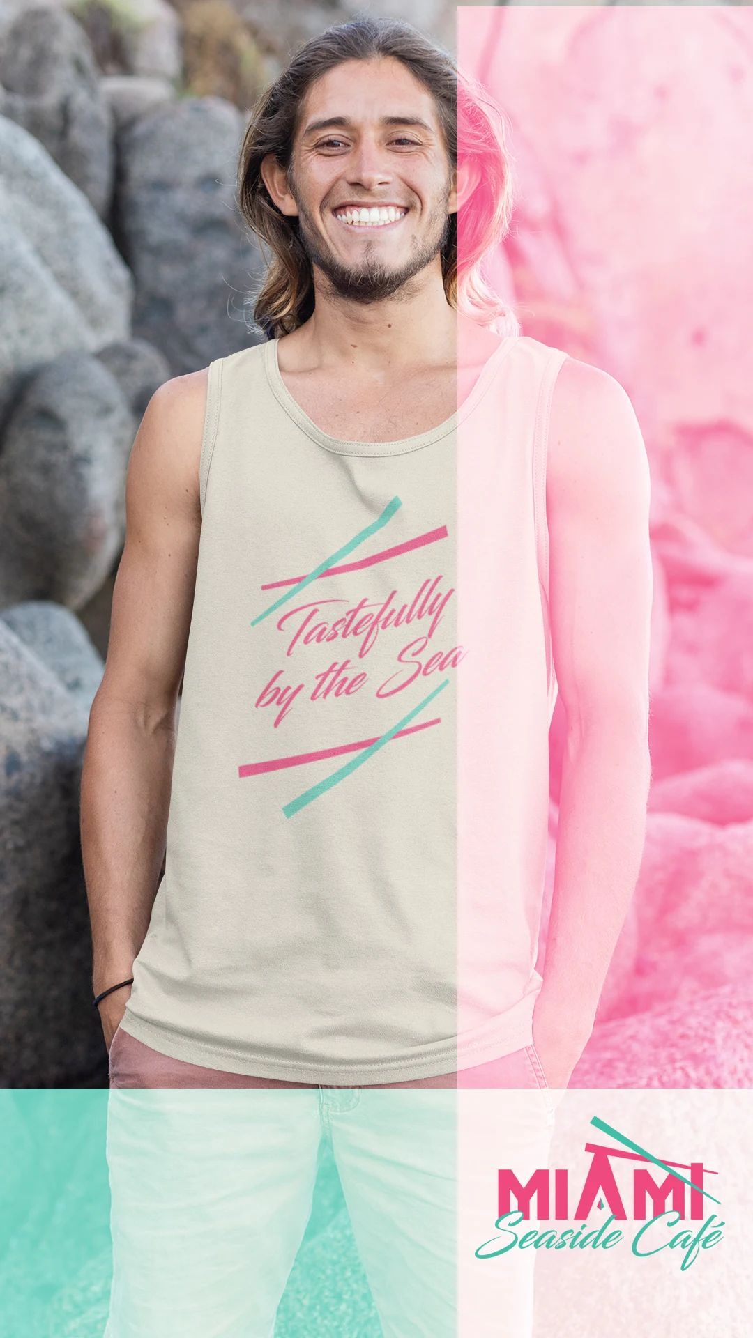
Tagline: A Tasteful Experience by the Beach & Tastefully by the Sea
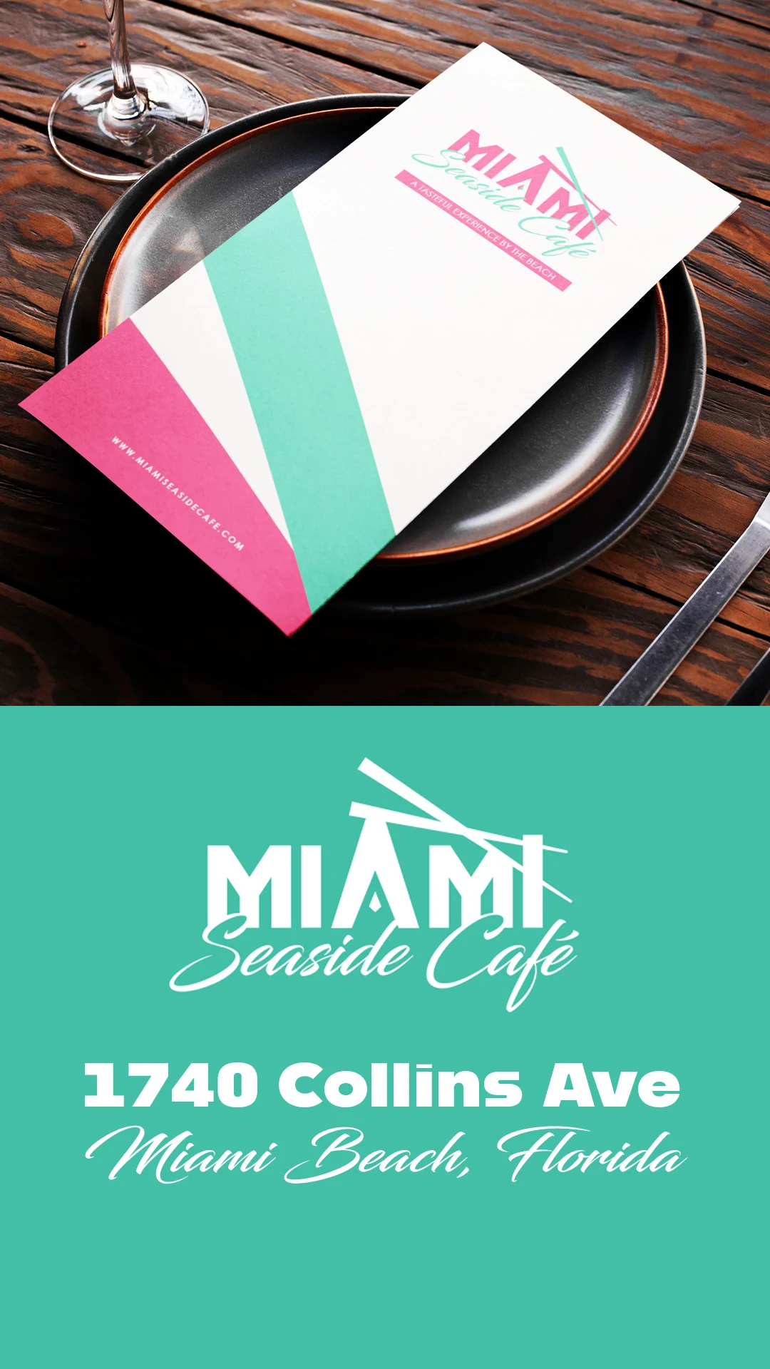
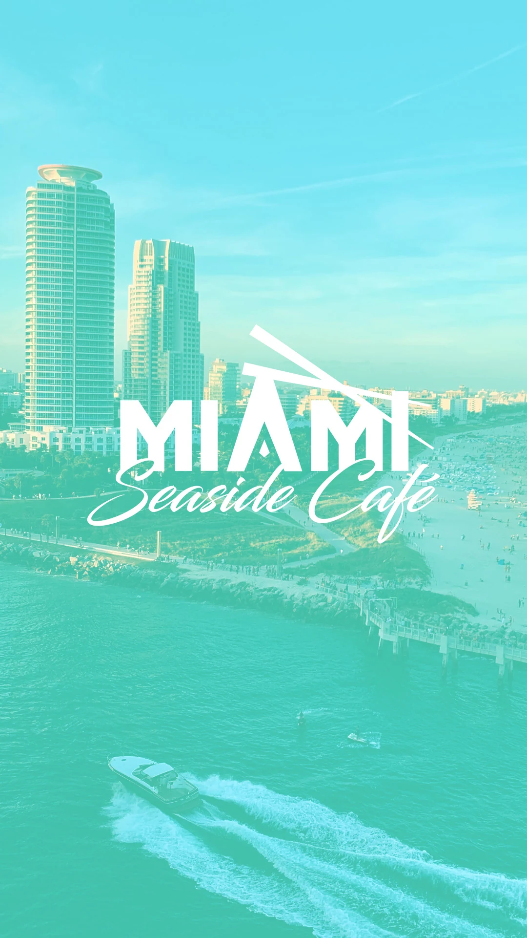
Restaurant brand design logo for a Miami seaside café
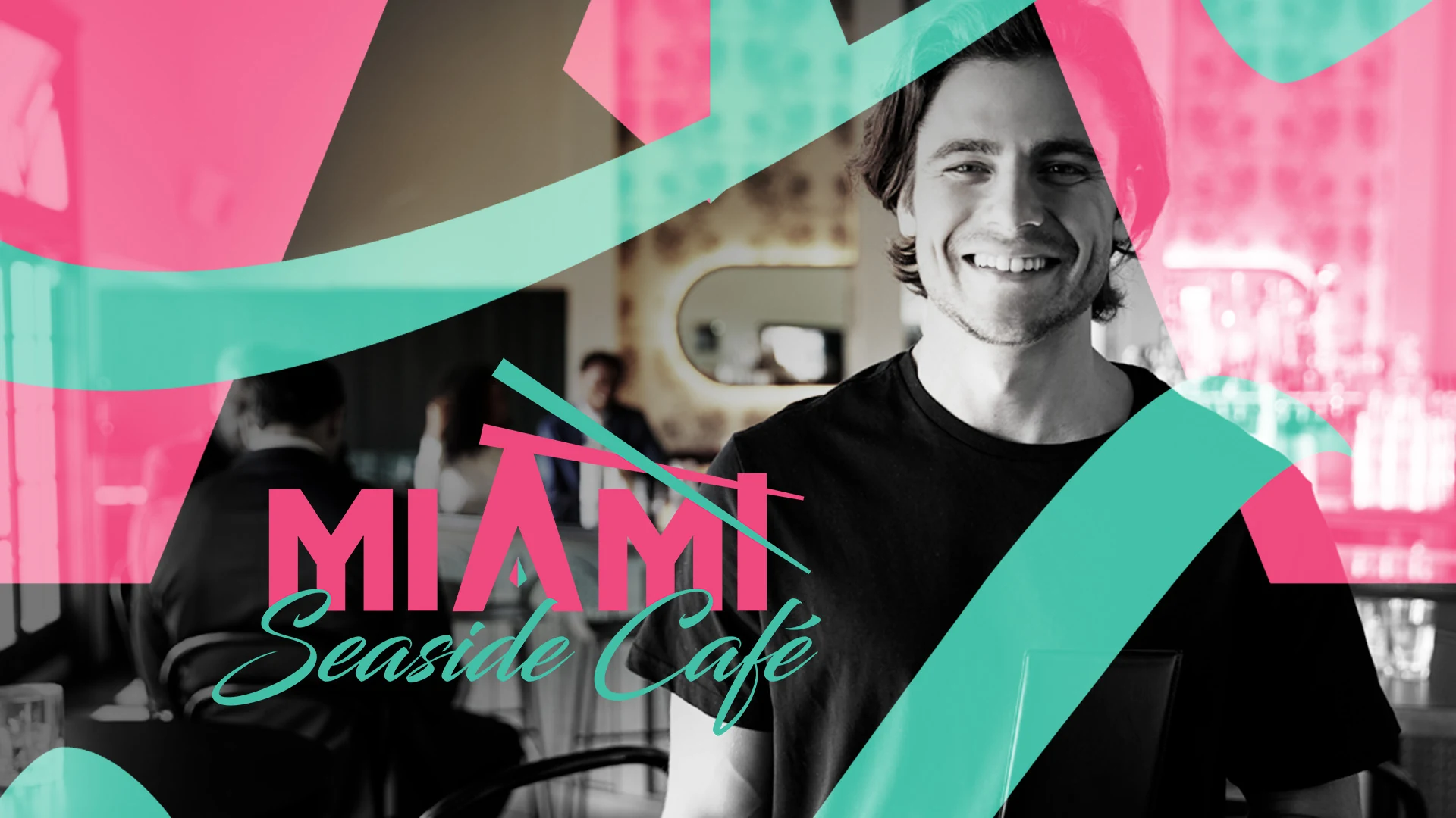
The problem: say Miami without saying Miami
The owners walked in with a reference and a rule.
The reference was Miami Vice. The rule was that locals had to love it. Not tourists. Locals. Nothing that felt like a souvenir shop.
That tension shaped the entire project. The easy route would have been full neon pastiche — palm silhouettes, sunset gradients, chrome type. That route sells one t-shirt and then disappears.
So I took the palette and the geometry from Miami's art deco vocabulary and threw away the nostalgia props.
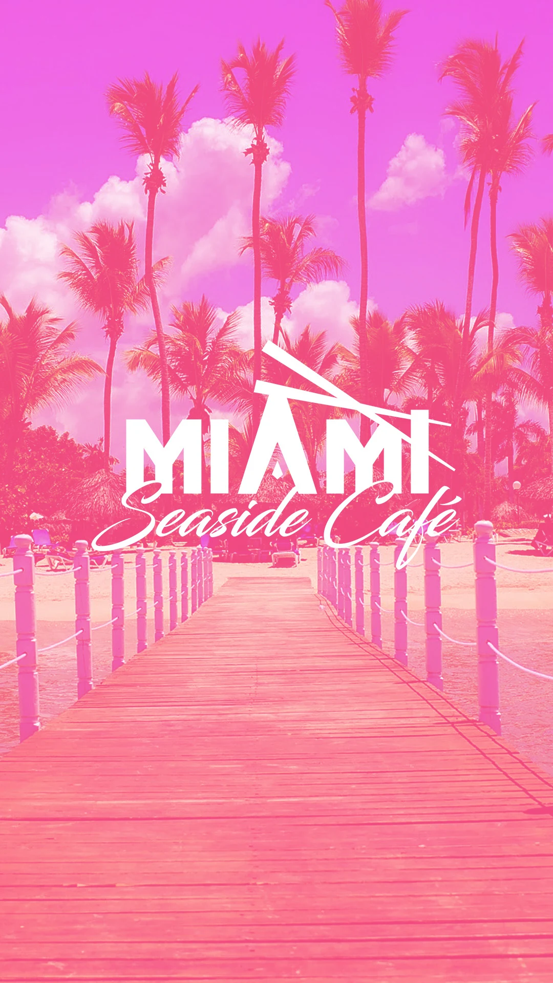
The result reads instantly as Miami without a single palm tree.
The mark: one shape doing two jobs
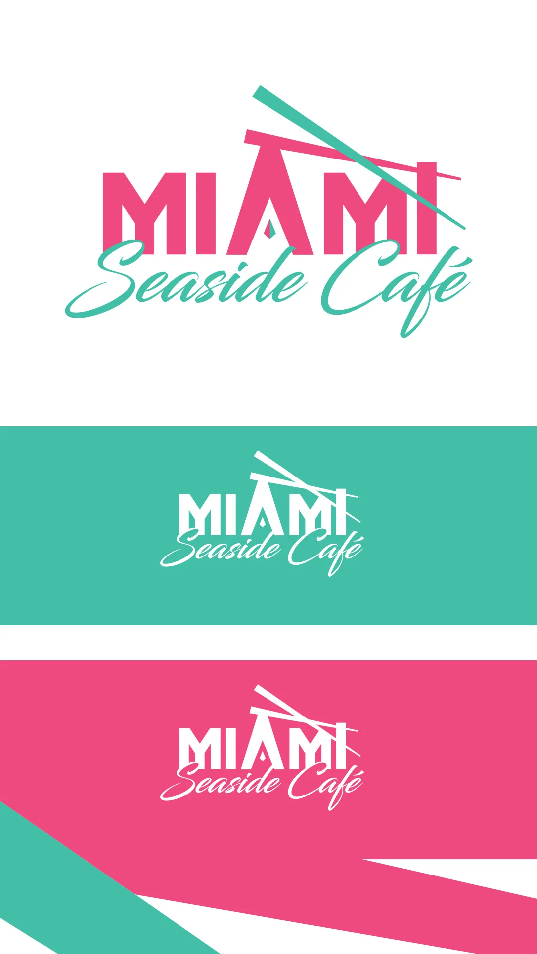
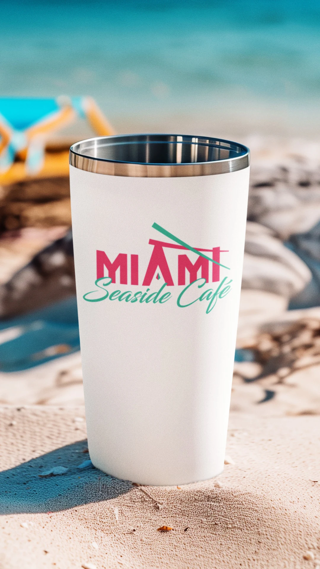
"MIAMI" is set in tall condensed deco caps. Look at the A. It has no crossbar. It's a solid triangle, and that triangle doubles as a roofline apex.
Then there are crossed beams running through the lockup. Read them one way and they're an awning or a beach shelter frame. Read them another way and they're chopsticks — the quiet nod to the sushi on the menu.
One graphic element doing location work and category work at the same time, without illustrating either one. That's the whole brief solved in a single gesture.
A two-hero color system
Most identities pick one hero color and one accent. This one refuses.
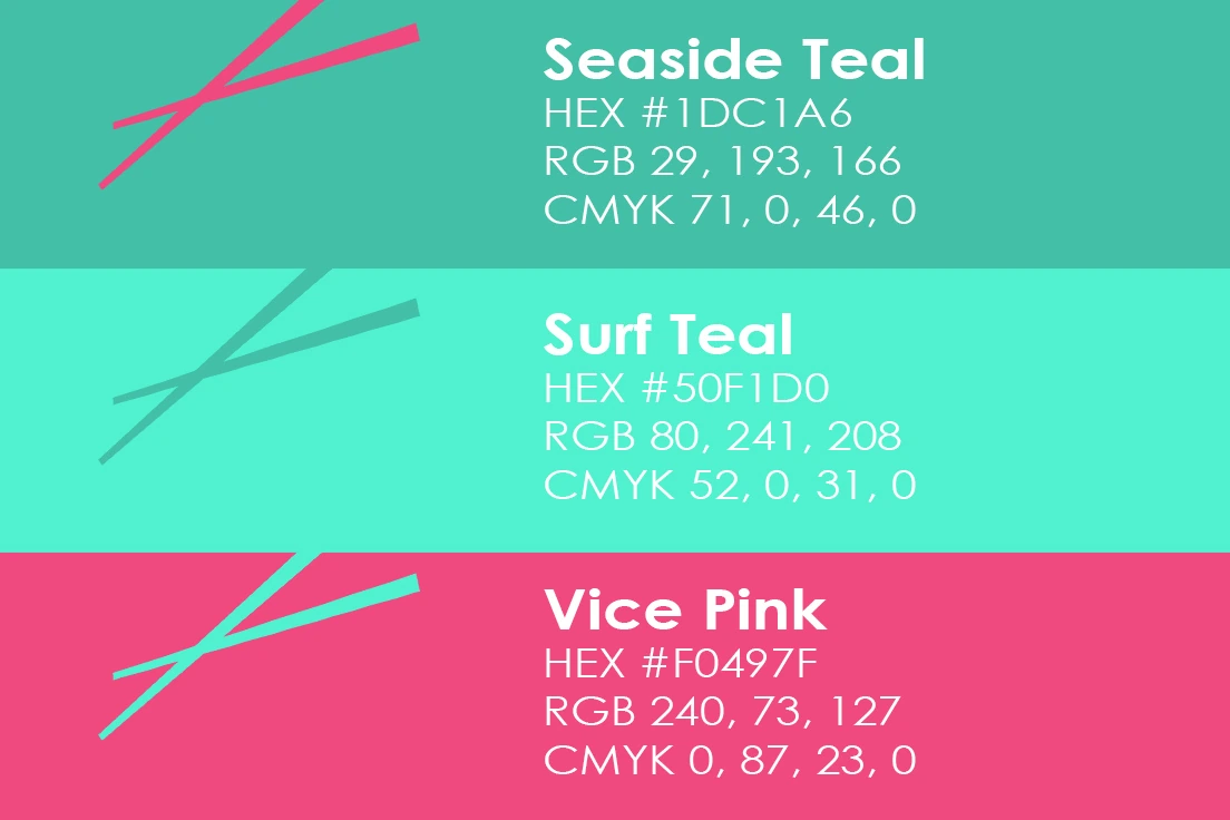
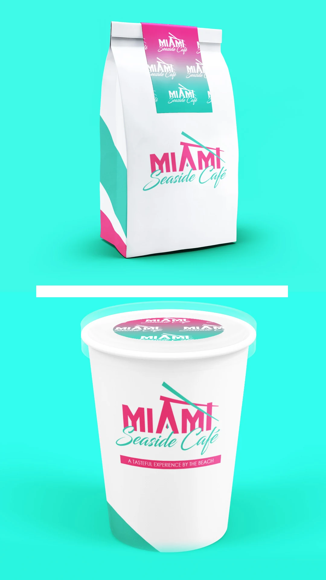
Vice Pink at #FF2C7D carries the wordmark, the tagline bar and the primary signage field. Seaside Teal at #1DC1A6 handles the "Seaside Café" script and the crossed beam, because it holds legibility at small sizes. Surf Teal at #50F1D0 is for big color fields and reversed applications only — never for type. White is the ground, and it covers two-thirds of everything, minimum.
The pink and teal sit at equal weight on purpose. That pairing is the Miami signal, so neither one can step back.
One watch-out. The two teals are close enough that they look like a printing mistake if they land next to each other at similar scale. Keep them separated by role and never stack them side by side.
Typography: architecture against water
The pairing logic here is simple. Rigid geometry against loose brushwork.
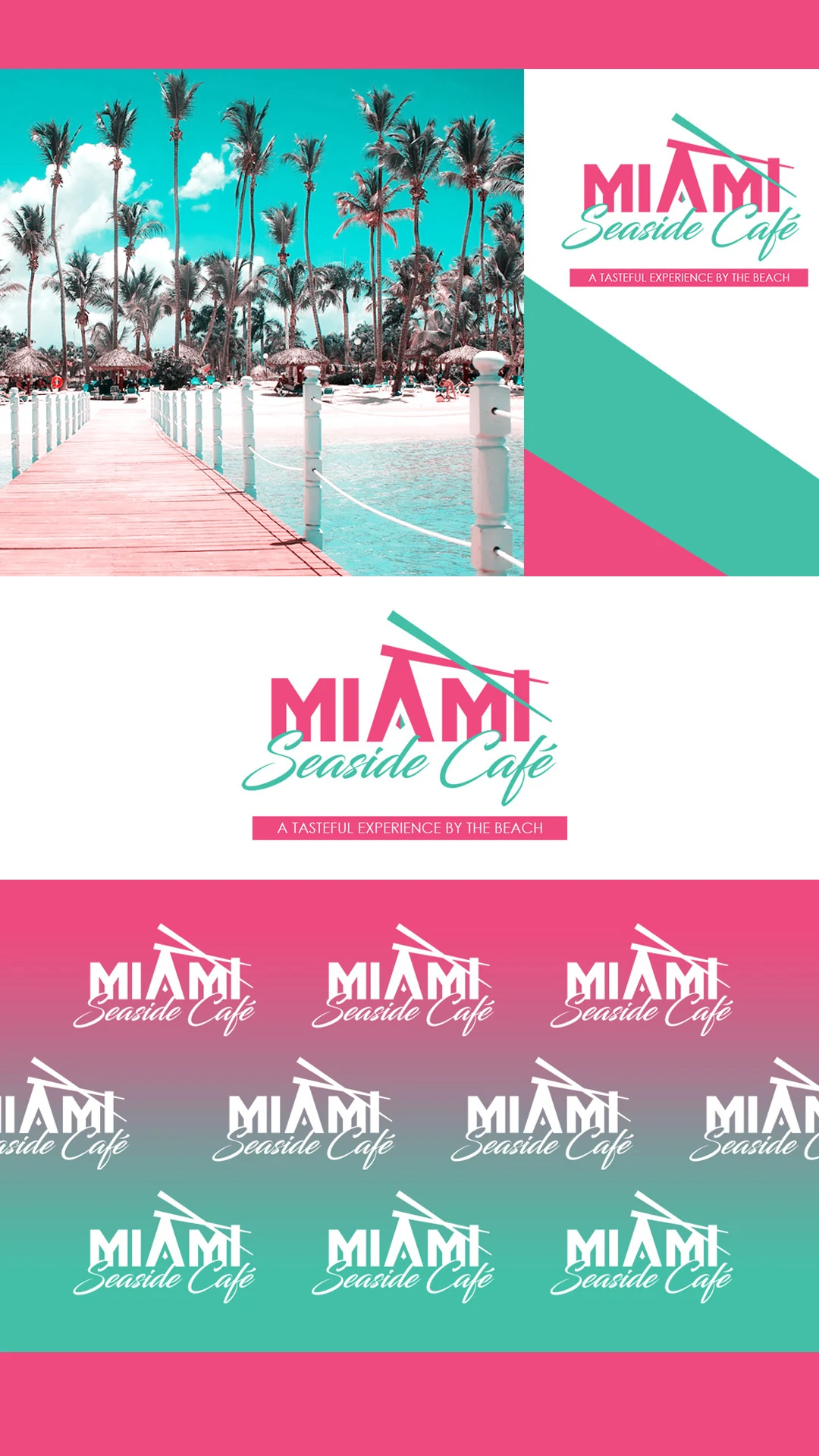
Deco condensed caps for the city. A fluid brush script for "Seaside Café." Small, widely tracked caps for the tagline, sitting inside a solid pink bar so the fine print still has presence. And a clean neutral sans for menus and body copy, because neither display face belongs in a paragraph.
I explored six typeface combinations before landing here. The rejects paired script with script, or caps with caps, and every one of them lost the tension.
Applications built for an open-air room
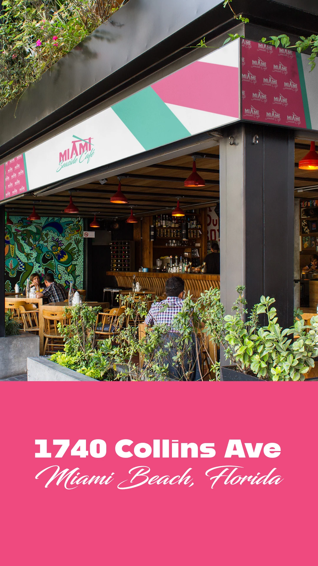
Restaurant branding storefront signage design for a Miami café
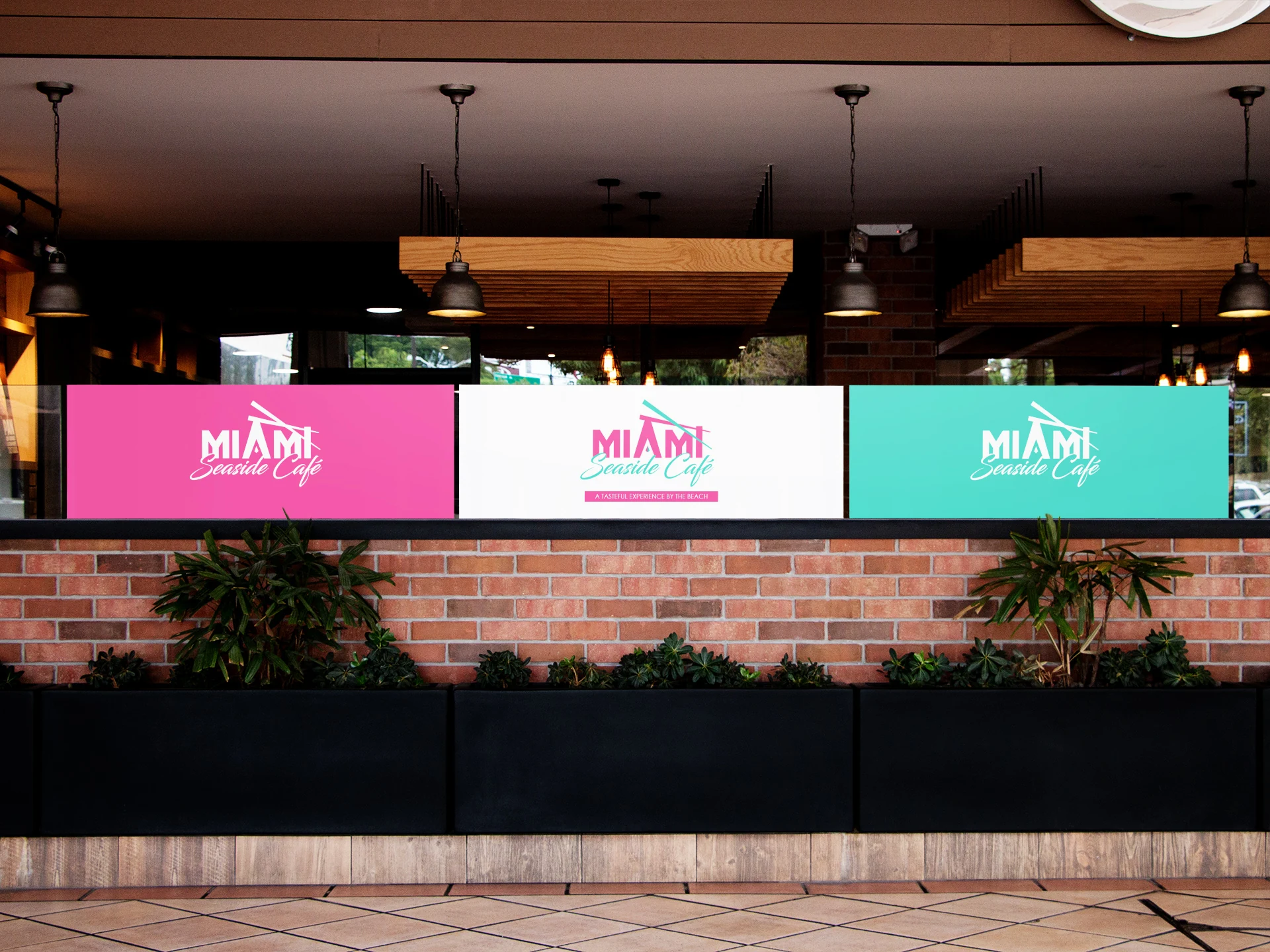
The storefront uses a deliberate three-panel treatment: pink, white, teal, side by side. The white center panel carries the full tagline lockup and the flanking panels carry reversed white lockups. From across the street the color blocking alone identifies the building.
The awning runs diagonal pink and teal blocking on white, with angles pulled straight from the beam motif. Menus sit on ivory stock with the lockup top-right and diagonal bands running off the lower-left corner. Cups get the tagline lockup centered with a tiled-logo gradient lid seal. Takeout paper bags carry the lockup alone for a softer daytime read.
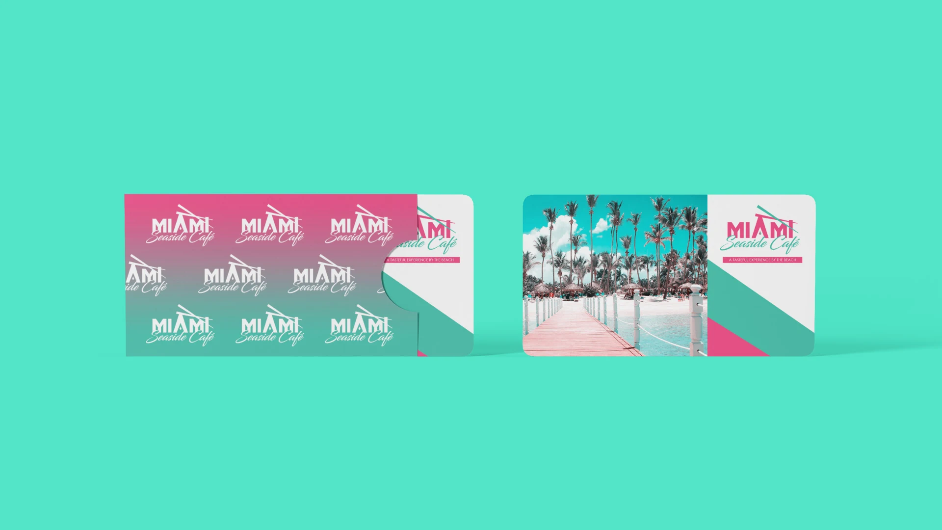
Gift cards are the one place Miami photography is allowed — pier, palms, boardwalk — inside a tiled-logo gradient sleeve.
What Both Restaurant Brand Designs Have in Common
Two totally different restaurants. Same blueprint underneath.
They each picked one idea and committed. Lorenzo's is "a name, not a logo." Miami Seaside is "deco geometry, ocean color." Neither brand tried to say five things at once.
They both let white space carry the weight. In both systems, white covers about two-thirds of every surface. Loud color only reads as confident when it's surrounded by quiet.
They both built something that repeats. A tiled pattern for one, a color-blocking angle for the other. Something has to travel across surfaces or your brand never compounds.
They both said no to the obvious. No checkered tablecloths and cartoon chefs for the pizzeria. No flamingos and neon tubes for the café. The obvious version is faster to produce. It's also invisible in a crowd.
They both planned the everyday surfaces. Boxes, bags, aprons, cups, seals. Those are the surfaces your customer actually holds, and they are where local restaurant branding either sticks or evaporates.
How to Choose a Restaurant Brand Designer or Branding Studio
Since you're probably comparing options right now, here's what I'd look at.
Ask what you receive, not just what they'll design.
A serious restaurant branding studio hands over a logo suite, a color spec with hex and print values, a type system, a pattern or layout device, application artwork, and written rules for using all of it.
Ask to see the everyday surfaces.
Anyone can show you a logo floating on a gray background. Ask to see a takeout bag. Ask to see a sign at street distance. Ask to see the menu.
Ask about print reality.
If a designer can't tell you how their red behaves on coated stock, your packaging is going to surprise you in the wrong way.
Ask about your specific market.
Ask who owns the files.
You want the vector artwork. Not a JPEG. Not a PDF preview. The actual source files.
The biggest signal is simpler than any of that. Ask them why they made a specific choice on a past project. A real restaurant brand designer will have a reason for every single move. Someone guessing will just tell you it looked nice.
What Restaurant Branding Should Include
If you take nothing else from this article, take this checklist.
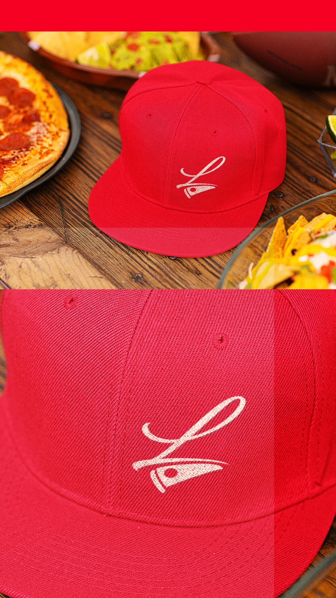
Your restaurant logo design should ship as a primary lockup, a compact monogram for avatars and seals, and a reversed version for colored fields. Your palette needs a hero color, a working print variant, and rules for how much of each surface it covers. Your type system needs a display voice and a reliable workhorse for body copy.
Then comes the part that actually earns attention. Packaging, menu, signage, apparel and a repeatable graphic device. Finally, written guardrails so the next vendor you hire doesn't undo the work.
That's a brand. Everything short of that is decoration.
Ready to Build a Restaurant Brand People Actually Remember?
Here's what I've learned after years of doing this work. The restaurants that grow aren't always the ones with the best food. They're the ones people can describe to a friend without pulling out their phone.
That's what restaurant branding buys you.
Let's talk about your vision for your brand. Use the calendar to book your free consultation call — you'll share your goals, get answers, and see whether we're the right fit for each other.
Frequently Asked Questions
A restaurant brand is more than a logo on the door. It's the sum of every signal a guest reads before they take a bite: your name, your logo and color palette, your menu design, your signage, and the restaurant design interior itself. When those pieces agree with each other, guests trust the food before they taste it. When they clash, a beautiful dining room can undercut a great menu, or a strong logo can get lost in a room telling a different story. I build restaurant identities around a few essentials: a mark that works on a sign at night and on a to-go cup, a color and typography system that carries from the menu to the walls, and a consistent tone across every touch point a guest sees. You can see how I approach that kind of brand identity work before we ever talk specifics.
Start with what you want a guest to feel before they read a single word about your food. A brand message isn't a tagline bolted on at the end. It's the throughline connecting your concept, your cuisine, and the people you want walking through the door. I get there by asking about your audience, your price point, your competition, and the actual reason you're opening this restaurant and not some other one. That discovery shapes the language on your menu, your website copy, and your social presence, so the message reads the same whether someone is scrolling your feed or sitting at your bar. Restaurant branding ideas that sound good on a moodboard but don't answer those questions rarely hold up once the doors open. This is the groundwork I walk through in branding packages built for small businesses.
A good restaurant name does three things at once: it's easy to say out loud, it hints at what you serve or how you want to be experienced, and it still works once you put it on a sign, a menu, and a to-go bag. Avoid a name that only makes sense with an explanation attached. Say it to a stranger and see if they can repeat it back after one hearing. I also check how a name looks in a wordmark before committing to it, since words that read well in conversation can fall apart visually or get awkward at small sizes on packaging. I'm not a trademark attorney, so I always recommend confirming legal availability with a qualified professional before you fall in love with a name. Once the name is set, I can build the logo and identity system around it, and that's where the design process starts.
Local customers notice consistency before they notice creativity. The best restaurant branding I've built for local businesses uses the same colors, type, and voice across the storefront, the menu, delivery packaging, and social media, so the restaurant reads as the same business no matter where someone encounters it. That consistency builds recognition faster than any single clever idea. Beyond visuals, I pay attention to how a brand fits its neighborhood: a family Italian spot near a stadium needs a different presence than a quiet fine-dining room downtown. Signage that reads clearly from the street, a menu that's easy to scan, and an interior guests want to photograph all support that local pull. If your current identity feels inconsistent across those touch points, a strategic brand refresh can bring it back into alignment, and you can read how past clients describe that process on my reviews page.
A logo concept built from scratch typically starts around $2,000. If you already have a composition or a rough concept you want refined rather than replaced, that work can begin around $1,000. Most restaurants need more than a standalone logo to launch or rebrand well: a full identity system with a logo, color palette, typography, and a brand guide is the scope my branding packages cover, and those commonly start at $5,000, ranging up to $12,000 or more depending on what's included, such as menu design, signage, packaging, or a restaurant design website. I quote every project after we talk through your specific scope, so you know the investment before any work begins. You can see the starting points for a full branding package here.
“Affordable” and “upscale” pull in different directions, so I'd reframe the question: the real cost driver is scope, not your restaurant's price point. A single-page menu redesign that already has your brand colors and type sorted out costs less than a full menu system built alongside a new identity from the ground up. For upscale dining specifically, menu design carries more weight than people expect: paper stock, layout, and how the typography breathes on the page all signal quality before a guest orders. I scope menu design as part of a full restaurant branding package or as a standalone project once your identity is in place, and I'll tell you honestly which approach gets you the better result for your budget. That conversation is part of my restaurant branding services, not an upsell after the fact.
Your concept and your story have to answer one question honestly: why does this restaurant need to exist? Not a generic answer about “great food and great service”; every restaurant claims that. Look at restaurant branding examples you admire and you'll notice they usually center on something specific: a family recipe, a chef's background, an ingredient sourced a certain way, a neighborhood they're committed to. That specificity is what a story needs to hold up once you translate it into a name, a logo, a menu, and an interior. I build every concept this way, starting with discovery conversations before a single sketch happens, so the visuals always trace back to a real reason instead of a trend. If you're ready to turn your concept into a brand guests remember, I'd like to hear about it.