TL;DR
- A realtor logo built on strategy rather than a stock template holds up across yard signs, business cards, digital ads, and embossed merchandise without compromise.
- Generic house icons and trend-chasing typography are the two fastest ways to make your logo invisible in a crowded market of agents who all look the same.
- A custom identity requires multiple logo variations, defined CMYK and RGB values, and vector source files to perform correctly across every surface where it appears.
- The interlocking JSC monogram I built for San Diego luxury agent Jennifer St. Clair shows what happens when every letterform, color, and typeface choice gets tested against real-world use before it ships.
- NAR’s trademark rules govern how the REALTOR® mark appears in your branding, and those rules are separate from your personal logo identity, which is the primary consumer-facing brand you actually own.
A realtor logo is either working for you or working against you. There is no neutral position. Every time a potential seller spots your yard sign, lands on your website, or picks up your business card, your logo is making a silent promise about the experience you deliver. The question is whether that promise matches the quality of your actual service.
After designing logos for over 15 years across nearly every industry, I have learned that the strongest marks are not the most elaborate. They are the most strategic. This post walks through what actually makes a real estate agent logo work, what separates a custom mark from a forgettable template, what the REALTOR® trademark rules mean for your branding, and what a real project looked like from first concept to finished file.
When Your Real Estate Agent Logo Loses Clients Before You Meet Them
A logo that looks like every other agent’s is not a neutral starting point. It is a liability. Sellers comparing agents in a competitive market make snap judgments based on perception, and a generic mark signals that you have not invested in your own brand. That makes it easy to wonder whether you invest in your clients either.
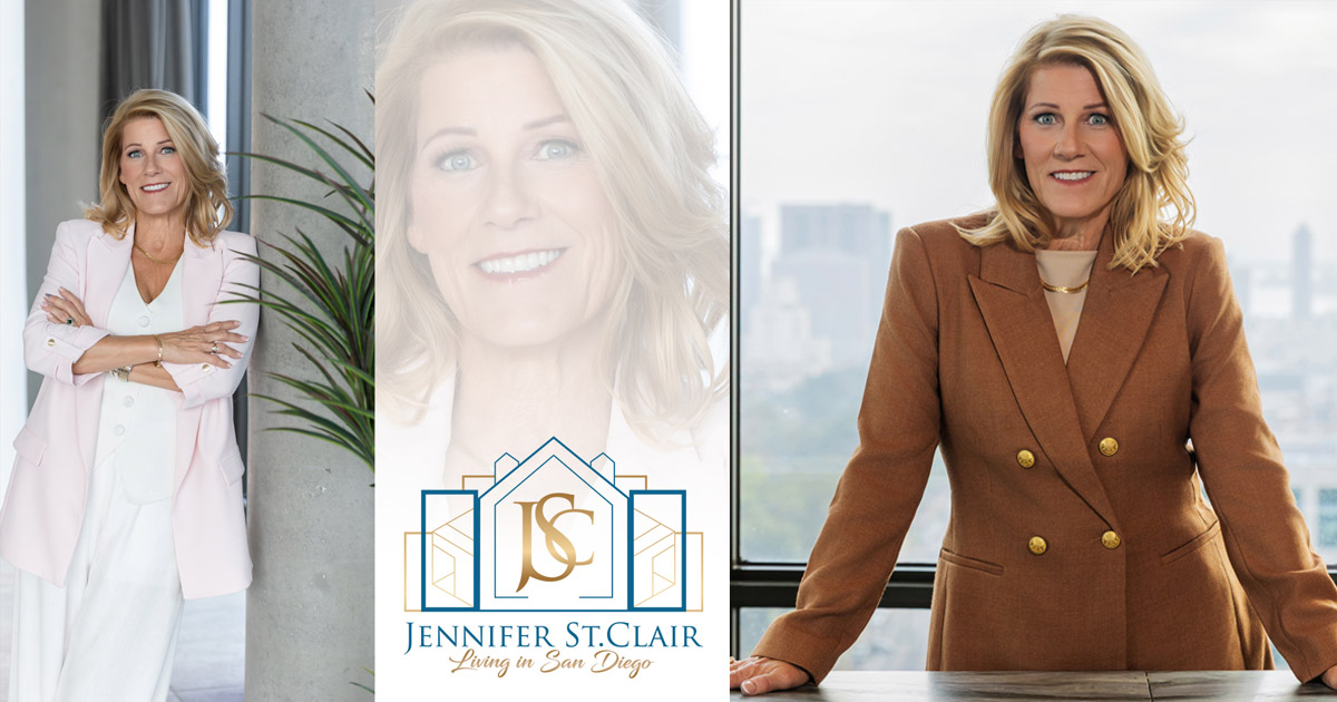
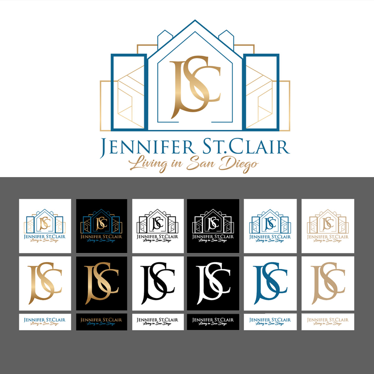
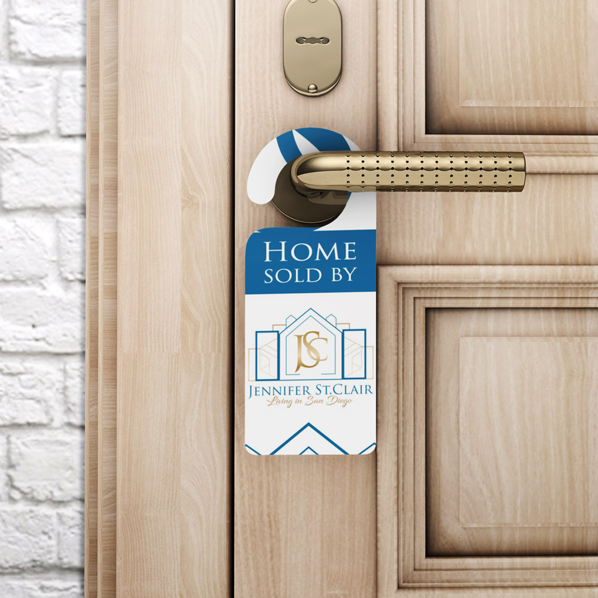
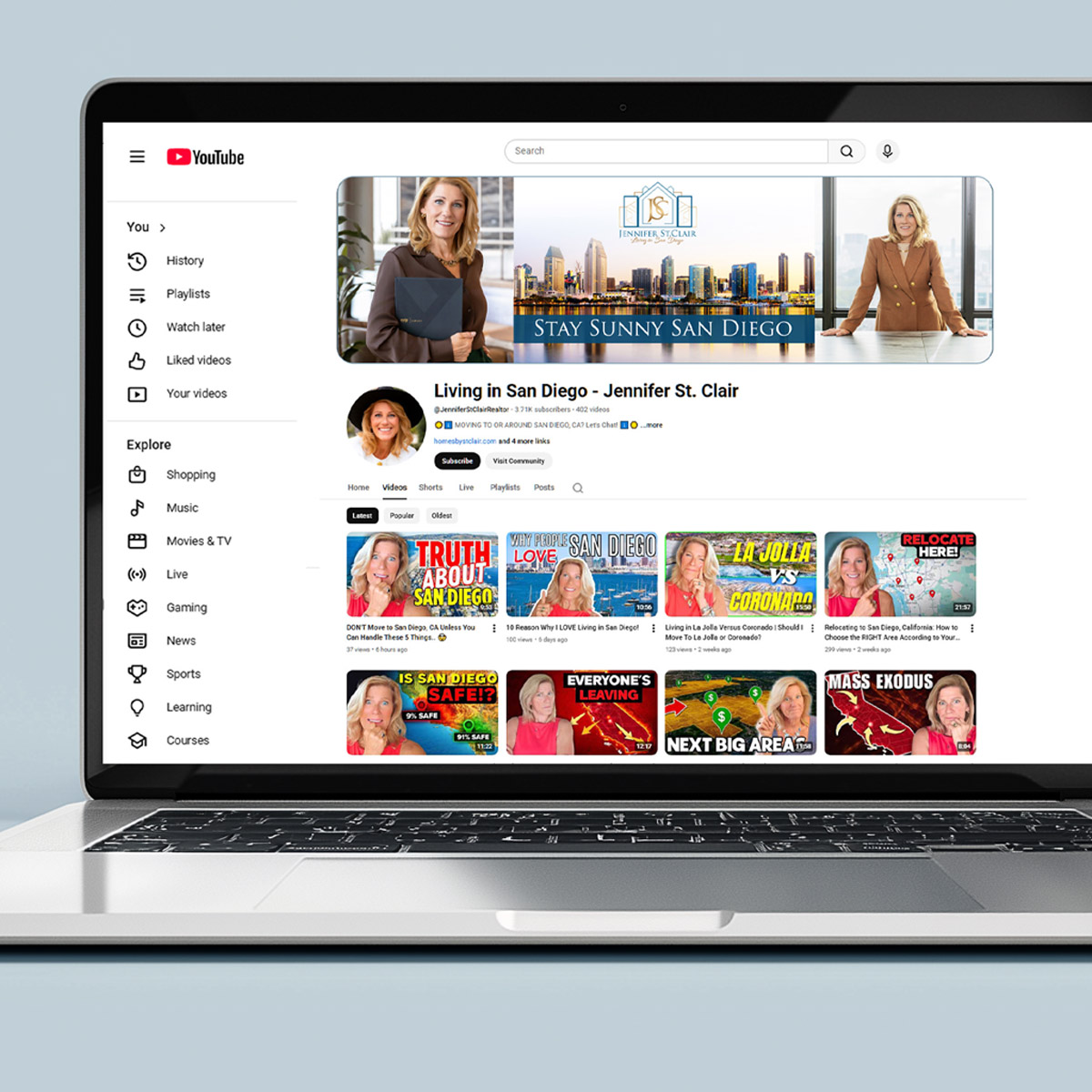
I recently designed a complete brand identity for Jennifer St. Clair, a luxury real estate agent in San Diego working with eXp Realty of California. The luxury real estate branding work centered on a custom JSC monogram, her initials interlocked in a way that feels deliberate and refined. Behind the letterforms sits a geometric house silhouette that communicates real estate without leaning on the tired roofline cliché that floods every stock logo library.
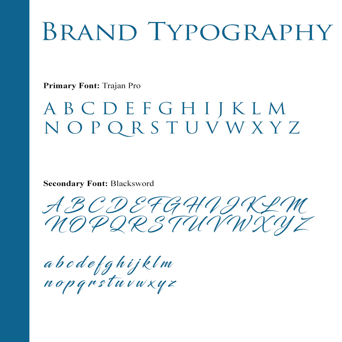
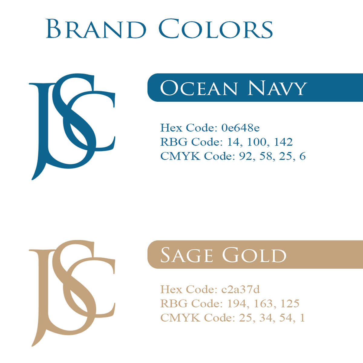
The colors drive the emotional response. Ocean Navy (#0e648e) builds trust and authority. Sage Gold (#c2a37d) introduces warmth and a sense of premium value. Together they feel coastal yet sophisticated, which is exactly right for the San Diego luxury market. Typography carries just as much weight. Trajan Pro has a classic, almost architectural presence. Blacksword, the script font used for the tagline, adds a personal flourish. That combination tells clients Jennifer is both established and approachable, and that balance is genuinely difficult to achieve.
What Makes a Custom Realtor Logo Different From a Template?
Template-based logos look finished on screen. The problem surfaces the moment you try to use them in the real world. A stock mark shared by dozens of other agents cannot build recognition because recognition depends on exclusivity. If someone has seen that shape before, even subconsciously, it does not stick to you.
Custom work starts from research, not a library. For Jennifer St. Clair’s project, I studied the competitive landscape first. Most agents fell into one of two camps: overly minimal logos that said nothing, or overly complicated designs that tried to say everything at once. The target was a mark that felt specific, memorable, and built to last.
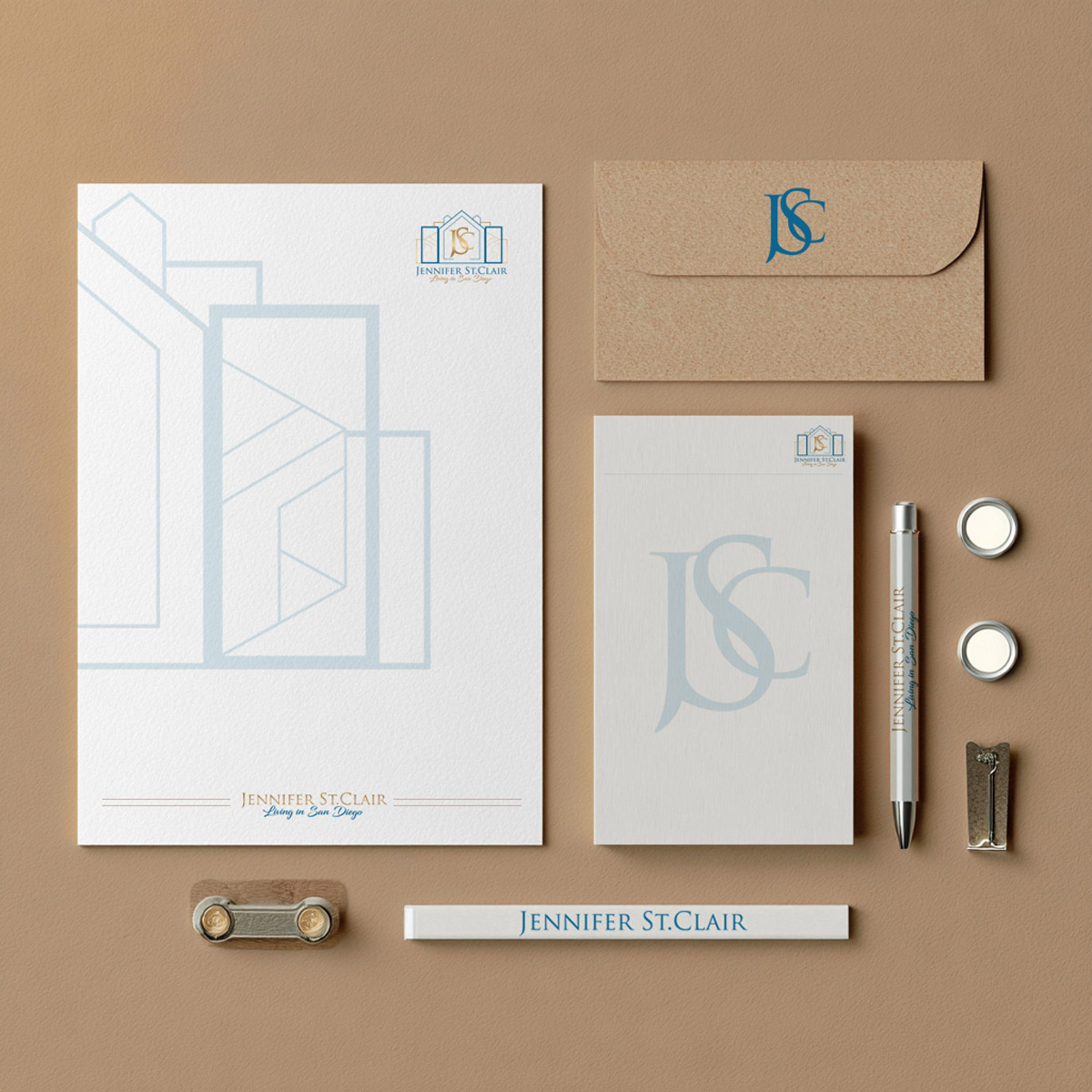
The monogram approach made clear sense for a personal brand. Initials carry identity. When designed well, they become a mark that clients associate with quality over time, not unlike the marks of respected fashion houses. Several rounds of exploration led to the final interlocking JSC mark. Then came rigorous testing: printing it small for keychains, scaling it large for wall graphics, reversing it on dark backgrounds, embossing it on gold coins. If it failed at any size or surface, it went back to the drawing board.
That testing process is what separates a logo built to be used from one built to look good in a presentation. The brand identity work I do at Branding Design Pro goes through the same pressure-testing before a client ever sees a final file.


Why a Monogram Solved the Real Problem in Jennifer St. Clair’s Branding
Jennifer came to me with an AI-generated logo that felt like a sticker rather than a durable personal-brand identity. It was not communicating the level of service behind a luxury listing, and it was not something she could confidently put on a medallion, a closing gift, or a wall graphic in her office.
What made the project interesting was that her direction shifted mid-engagement. She initially wanted a medallion-style marketing concept, then changed course after a brand photoshoot clarified a different visual path entirely. I worked through the pivot rather than forcing the original concept. That flexibility matters more than most clients expect going in.
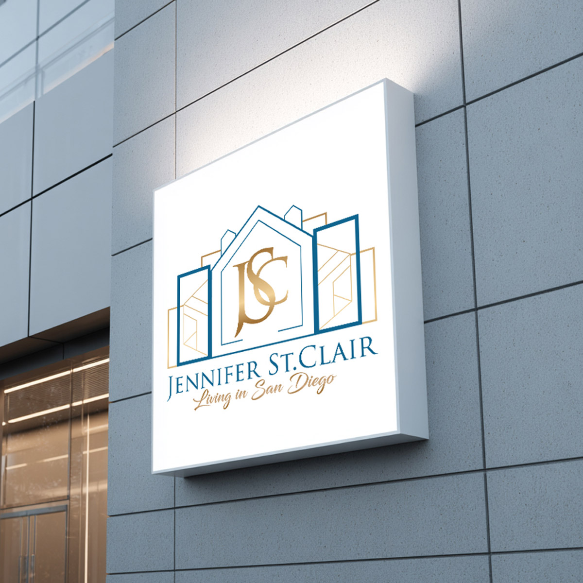
The interlocking JSC monogram solved the core problem by giving her a mark with real presence at any scale. It reads clearly as a single letterform from a distance on a yard sign, and it holds up as a fine detail when embossed on a medallion or struck into a metal coin used as a closing gift. That range, from a large exterior application down to a small dimensional object, is the actual test of whether a personal brand mark is built correctly. A logo that only works in one format is not a finished identity. It is a placeholder.
Jennifer left a 5/5 Google review after the project was complete, noting that the final logo reflected who she is and the brand she had been building. That is the outcome I am after on every project: a mark the client feels confident choosing, not just one that looks good in a presentation file.

The Design Decisions That Separate a Strong Logo From a Forgettable One
Most agents receive one version of their logo and try to force it into every situation. That leads to awkward placements, poor readability, and a less-than-professional appearance at the worst possible moments. A strong realtor logo is delivered as a system, not a single file.
At minimum, that system includes a full lockup, a simplified mark, and versions for both light and dark backgrounds. Ideally it also includes a single-color version for embossing, merchandise, and applications where color reproduction is not guaranteed. The Jennifer St. Clair project included all of these because every application was considered before the final mark was approved.
Color and print specifications
Colors behave differently on screens versus paper. A logo delivered without defined CMYK print values alongside RGB digital values will shift at the printer, and that shift can undermine the entire brand impression at the exact moment it matters most: on a yard sign in front of a listing. Every project I complete includes both sets of values so there are no surprises in production.
Typography as a positioning signal
Font choices are not decorative decisions. They carry meaning. A classic serif like Trajan Pro communicates permanence and authority. A geometric sans communicates clarity and modernity. A script adds warmth and personality. The wrong combination can make an agent look either stuffy or unserious, neither of which wins listings. Typography needs to match the market, the price point, and the personality of the agent, not just look appealing in isolation.
If you want to see how these decisions extend beyond the logo into a full visual system, the real estate branding work I do covers that broader scope in detail.
What Are the REALTOR® Trademark Rules That Affect Your Logo?
The REALTOR® mark is a membership identifier, not a general industry descriptor, and NAR’s rules govern exactly how it appears in your branding. Understanding those rules before you commission or refresh a logo prevents compliance problems after the work is done.
The most important distinction is this: your personal logo is the primary consumer-facing brand you own. The REALTOR® mark signals your NAR membership and sits alongside your logo, not inside it. NAR’s trademark framework treats these as two separate things, and your design should treat them that way too.
The REALTOR® block “R” and how it must appear
The block “R” logo is precisely defined. According to NAR, it consists of an “R” set in Futura typeface on a sharply contrasting rectangular background, with the term REALTOR® centered directly underneath, and both the rectangle and the term must be the same contrasting color. Members are not permitted to reconstruct or create their own version of this logo and are instructed to use only the downloadable files NAR provides. You cannot swap the typeface, rearrange the elements, or drop the word REALTOR® from beneath the block “R” and use the “R” alone.
Spacing matters too. NAR requires an area of isolation equal to at least half the width of the block “R” kept clear around all sides, separating the logo from typography, illustration, photography, borders, or edges. Place it too close to your own logo or a block of text and you are violating the guideline, regardless of how good it looks.
Descriptive wording and corporate names
Two of the most common mistakes I see agents make involve wording. First, pairing the REALTOR® mark with descriptive or promotional language, such as “Top REALTOR®,” “Luxury REALTOR®,” or “Your Local REALTOR®,” in a logo, username, or tagline violates NAR’s core trademark rules and can trigger enforcement. Second, NAR’s Membership Marks Manual prohibits members from incorporating the term REALTOR® or REALTORS® as part of the legal entity name of a firm. Neither of these is a gray area. Both are explicit prohibitions that local associations now commonly republish in their own guidance, which signals active, ongoing enforcement across markets.



Is a Professionally Designed Realtor Logo Worth the Investment?
Think about what one listing is worth to you in commission. Now think about the impression your logo makes when a potential seller is comparing you to the agent down the street. If your brand looks more intentional and more aligned with their expectations, that perception works in your favor before you ever say a word.
A professionally designed realtor logo is leverage. It supports stronger client perception, higher trust on first contact, and better brand recall over time. Agents spending on advertising while skipping brand design are pouring resources into a system where the first impression still works against them.
The logo design work I do at Branding Design Pro starts from discovery, not a template library. I hold a call to understand your market, your target buyer or seller profile, your personality, and your goals before a single concept is drawn. The research informs the direction. The direction informs the mark. And the mark gets tested across every real-world application before it is finalized. That process is why the work holds up.
I generally start rebrands from scratch, including when the prior mark was improvised, AI-generated, or made by a friend. If the foundation was never solid, patching it rarely produces a result worth putting on a yard sign. A fresh concept process, working through six to nine hand-drawn compositional sketches, then grayscale prototypes, then color, gives you a mark that was built for your brand rather than adapted from someone else’s.
Frequently Asked Questions
Can a real estate agent who is not a member of NAR use the term REALTOR® or the REALTOR® logo in their branding or logo?
No. The term REALTOR® and the block “R” logo are registered membership marks owned by NAR, and their use is licensed exclusively to members in good standing. An agent who is not a NAR member has no right to use either mark in any branding, logo, signage, username, or marketing material. Using them without membership is trademark infringement, not a gray area.
Is it allowed to include the word REALTOR® in the legal business name or corporate name of my brokerage or team?
No. NAR’s Membership Marks Manual explicitly prohibits members from incorporating the term REALTOR® or REALTORS® as part of the legal entity name of a firm. This applies to brokerages, teams, and any other formal business structure. Your personal logo and brand identity are the right vehicles for building your market presence, not the REALTOR® mark itself.
How should I correctly use the REALTOR® logo and wordmark on social media profiles, usernames, and domain names without violating NAR’s trademark rules?
NAR’s trademark rules explicitly prohibit using the REALTOR® marks in usernames, domain names, and social media handles. You also cannot pair the mark with descriptive or promotional wording such as “Top REALTOR®” or “Your REALTOR®” in any of those contexts. The mark belongs in proper membership-identification contexts, not embedded into your personal brand handles or web addresses.
Can I modify the design of the REALTOR® block “R” logo for my personal brand?
No. Members are not permitted to reconstruct or create their own version of the REALTOR® logo. That means you cannot change the typeface, alter the proportions, remove the word REALTOR® from beneath the block “R,” or add a tagline underneath. NAR instructs members to use only the downloadable logo files it provides, exactly as formatted. Any modification, however minor it seems, constitutes unauthorized use.
What is the difference between using the REALTOR® mark to indicate NAR membership and using my own real estate logo to represent my independent brand identity?
The REALTOR® mark tells the public you are a NAR member and bound by its Code of Ethics. It is a membership identifier, not a personal brand asset. Your own logo, whether a monogram, a wordmark, or an illustrative mark, is the primary consumer-facing identity you own and build equity in over time. In my experience, agents who conflate the two end up with neither working correctly. Keep them visually separate and give each the proper clear space and context it requires.
Are there special size, spacing, or color requirements I must follow when placing the REALTOR® logo next to my own logo on signage, business cards, or digital ads?
Yes. NAR requires an area of isolation equal to at least half the width of the block “R” kept clear around all sides of the REALTOR® logo, separating it from typography, illustration, photography, borders, and edges. The mark may be reproduced in any single color, but NAR recommends REALTOR® Blue (PMS 293) and requires adequate contrast with the background. On dark backgrounds, the logo should be fully reversed to maintain legibility. These are not suggestions; they are formatting requirements that apply to every surface where the mark appears.
Frequently Asked Questions
No. The term REALTOR® and the block “R” logo are registered membership marks owned by NAR, licensed exclusively to members in good standing. An agent who is not a NAR member has no right to use either mark in any branding, logo, signage, username, or marketing material. Using them without membership is trademark infringement, not a gray area.
No. NAR’s Membership Marks Manual explicitly prohibits members from incorporating the term REALTOR® or REALTORS® as part of the legal entity name of a firm. This applies to brokerages, teams, and any other formal business structure. Your personal logo and brand identity are the right vehicles for building your market presence, not the REALTOR® mark itself.
NAR’s trademark rules explicitly prohibit using the REALTOR® marks in usernames, domain names, and social media handles. You also cannot pair the mark with descriptive or promotional wording such as “Top REALTOR®” or “Your REALTOR®” in any of those contexts. The mark belongs in proper membership-identification contexts, not embedded into your personal brand handles or web addresses.
No. Members are not permitted to reconstruct or create their own version of the REALTOR® logo. You cannot change the typeface, alter the proportions, remove the word REALTOR® from beneath the block “R,” or add a tagline underneath. NAR instructs members to use only the downloadable logo files it provides, exactly as formatted. Any modification, however minor it seems, constitutes unauthorized use.
The REALTOR® mark tells the public you are a NAR member and bound by its Code of Ethics. It is a membership identifier, not a personal brand asset. Your own logo, whether a monogram, a wordmark, or an illustrative mark, is the primary consumer-facing identity you own and build equity in over time. Keep them visually separate and give each the proper clear space and context it requires.
Yes. NAR requires an area of isolation equal to at least half the width of the block “R” kept clear around all sides, separating it from typography, illustration, photography, borders, and edges. The mark may be reproduced in any single color, but NAR recommends REALTOR® Blue (PMS 293) and requires adequate contrast with the background. On dark backgrounds the logo should be fully reversed to maintain legibility. These are formatting requirements, not suggestions.
If you want to understand what a complete brand identity looks like beyond the logo itself, that context helps clarify what you are actually building toward and what a single logo file cannot do on its own.
What I care about in this work is building something that holds up: a mark that still looks right on a yard sign three years from now and still feels like you on a business card a decade from now. If your current logo is not doing that, I am ready to talk through what a custom identity could look like for your market. Reach out and start that conversation.