TL;DR
- Branding identity design services cover far more than a logo: color systems, typography, brand guidelines, packaging, templates, and application assets all form part of a complete identity.
- A full identity project typically runs four to six weeks from discovery call to final files, though packaging and website scopes extend that timeline.
- Research-backed strategy, not aesthetic preference alone, drives every visual decision: audience, archetype, market position, and real-world application all shape the work.
- Established brands face real risk when they change too much too fast; strong visual continuity protects the recognition equity already built with existing customers.
- The right time to invest is when your product is validated, your current visuals no longer match your quality, or you have a real launch or repositioning on the horizon.

The screen shows a mark in grayscale. No color yet. I am looking at the weight of the letterform, how the symbol relates to the type, whether the whole thing holds together at the size of a business card and again at the size of a storefront sign. This is where branding identity design services actually live: not in the concept presentation, but in the decision being made right now about whether this mark is strong enough to carry a business for the next decade.
Most business owners never see that moment. They see the finished logo. What they do not see is the research, the hand-drawn sketches, the grayscale prototypes, and the deliberate choices about shape, weight, and proportion that made the final result feel inevitable.
This post is about what that process produces, from the simplest clean mark through to a complete identity system with packaging, animation guidelines, and a brand guide thick enough to govern every designer who ever touches the brand after me.
What Branding Identity Design Services Actually Include
Most founders come in expecting a logo. What they leave with is a complete visual language. The logo is the anchor, but the identity is the system built around it, and that system is what does the real work across every surface where the business shows up.
Think of it the way you would think of building a house. Designing only the front door and calling it finished would be absurd. Every room has to connect, and every connection has to feel intentional. Branding works exactly the same way.
The Logo System
A professional logo is not one file. It is a coordinated set of variations, each built for a specific context. A primary mark handles most applications. A horizontal version fits website headers and email signatures. A stacked version works in square formats like social media profile images. A simplified submark or icon holds up at small sizes where the full mark would become unreadable.
Each variation has to look sharp at thumbnail scale and at the scale of a printed banner. That range is not an accident. It is the result of decisions made early in the process about geometry, weight, and negative space.
Color Systems Built for Every Medium
Color selection is a technical decision as much as a creative one. A complete palette includes HEX codes for digital use, RGB values for screens, CMYK specifications for print, and Pantone references for specialty applications like packaging and branded merchandise. Skip any of those and the brand starts looking subtly different in every context. That inconsistency erodes trust in ways most people cannot name but everyone notices.
Typography That Carries Personality
A serious identity includes two or three complementary font families: one for headlines, one for body copy, sometimes one for accent use. These are strategic choices, not aesthetic ones. The typefaces have to carry the brand’s personality while remaining readable at every size and in every medium. They also have to work together without competing.
Brand Patterns and Supporting Visual Elements
Custom patterns and graphic elements add depth without clutter. Look at any well-built brand and you will find subtle background textures, repeating motifs, and secondary graphic devices that create recognition even when the logo is not present. Those are deliberate signals of quality, built into the system from the start.
Application Templates for Daily Use
Templates take the identity off the concept board and into the real world. Business cards, letterhead, email signatures, social media post formats across Instagram, Pinterest, Facebook, and LinkedIn. These keep the brand consistent regardless of who is creating content or how much design experience they have.
The Brand Guidelines Document
The brand guidelines document is the piece most business owners overlook until they wish they had it. It covers logo usage rules, color specifications, typography hierarchy, spacing requirements, and what never to do with the mark. Without it, every designer, printer, and marketer who touches the brand invents their own rules. With it, the identity stays intact no matter how many hands it passes through.
Larger branding packages can include narrated video guides or presentation slides that walk the client through the brand, so the rationale behind every decision is documented alongside the rules.


How Does a Brand Identity Project Actually Work?
Every project starts the same way: with a signed agreement, a deposit, and a discovery call. That conversation is where the real design work begins, long before any software opens.
On the discovery call, I ask about the target audience’s age range, psychographics, and motivations. I ask about the client’s vision, any existing concept or tagline, the competitive landscape, and the specific assets and collateral the brand will need on day one. If the client does not have a concept yet, we build one together during that conversation.
From there, I conduct research and build inspiration boards before drawing anything. I usually present six to nine hand-drawn rough compositional sketches to test structures and learn what the client responds to. Sketches surface directions that software never would, because they are fast and loose enough to explore without committing. Once a direction shows promise, I move into grayscale prototyping before any color enters the picture. Color is the last decision, not the first.
The logo becomes the foundation for the broader identity when a full branding package is selected. Every subsequent decision, color, type, pattern, template, and guideline, traces back to the logic established in that original mark.
I work through a feedback loop of conversations, visual options, and revisions until the client has a final direction they feel genuinely confident choosing. That is not a vague promise. It is the structure of how every project runs.


What Does a Full Identity System Look Like in Practice?
A complete brand identity system is not a single deliverable. It is a set of coordinated tools that cover every surface where the business appears, from a business card to a retail environment to a social media profile.
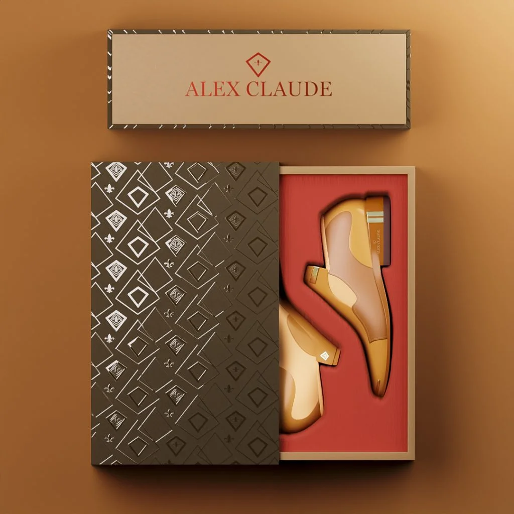
The core foundation includes the primary logo, secondary logo variations, the submark or icon, a primary and secondary color palette with full technical specifications, a typography system, and custom brand patterns or textures. That foundation is what everything else is built on.
Extended applications carry those elements into the real world. Business cards, letterhead, email signatures, social media templates, website design, and environmental signage concepts all need to feel like they came from the same place. When they do, recognition compounds over time. When they do not, the brand looks like a collection of separate decisions rather than a single coherent identity.
Core Brand Identity Elements
- Primary logo and secondary logo variations
- Submark or icon for small-scale use
- Color palette with HEX, RGB, CMYK, and Pantone specifications
- Typography system with headline, body, and accent typefaces
- Brand patterns and supporting graphic elements
- Brand guidelines document covering usage rules and restrictions
Extended Brand Applications
- Business cards and stationery
- Email signatures
- Social media post templates
- Website design or design system
- Packaging and label design
- Environmental and signage concepts
Working across categories, from restaurant branding to real estate to skincare, has shown me how much consistency matters regardless of industry. A yard sign and a digital listing are very different surfaces. A cohesive identity makes both of them work for the brand rather than against it.

What Are the Five Types of Brand Identity?
When I talk through a new project with a client, one of the first conversations is about which identity type fits the business. The answer shapes every decision that follows.
Corporate identity
Professional, trustworthy, and established. Conservative palettes, serif typography, and minimal ornamentation communicate stability and expertise. Think IBM or Goldman Sachs.
Retail identity
Accessible, engaging, and customer-focused. Bold colors and approachable imagery invite interaction while building trust across a wide audience. Think Target or Starbucks.
Luxury identity
Exclusive, refined, and premium. Minimal design, restrained palettes, and sophisticated typography communicate superior value. Every touchpoint reinforces the premium position. Think Chanel or Rolex.
Innovative identity
Forward-thinking, bold, and category-challenging. Clean lines, unexpected design solutions, and future-focused imagery set the brand apart from traditional competitors. Think Apple or Tesla.
Playful identity
Energetic, personality-driven, and emotionally engaging. Bright colors, custom illustration, and a distinctive voice build loyalty that goes beyond the product itself. Think Mailchimp or Ben & Jerry’s.
Knowing which archetype fits the business is not a creative preference. It is a strategic decision that determines how the audience perceives the brand before they read a single word. My brand designer portfolio shows how these identity types translate into real work across different industries and markets.


What Happens When Rebranding Goes Wrong?
Rebranding without a clear strategic reason is one of the most common and costly mistakes a business can make. 57% of marketers say the primary reason for a rebrand is to update the brand identity, making identity work the most common driver of rebranding activity. But wanting a refresh and having a sound reason for one are two different things.
Making drastic changes to a familiar logo or core visual elements carries real risk. Research published in the Journal of Product and Brand Management found that highly committed customers are more likely to evaluate redesigned logos negatively when the logo shape changes substantially, which in turn lowers overall brand attitude. A separate 2024 thesis on logo redesign found that brand image before rebranding was perceived more positively than after, and that brand image fully mediates the relationship between logo redesign and purchase intention.
The lesson is not that rebranding is dangerous. It is that rebranding without continuity is dangerous. Overhauling every aspect of an identity without preserving recognizable elements of the brand’s visual DNA can erase hard-won recognition equity. Customers who already trust the brand need a thread to follow.
There is also the communication problem. Failing to explain why a rebrand is happening leaves customers to fill in the gap themselves, and they rarely fill it in your favor. A rebrand that looks arbitrary from the outside reads as instability, not evolution.
Rushing the process compounds all of this. Skipping upfront research into audience perceptions and existing brand equity means designing in the dark. The identity that results may look polished in isolation and still land badly in the market.
Brand product animation is one area where this plays out visibly. A motion treatment that does not connect to the existing visual language feels like a different brand entirely, not an extension of one.
Branding Package Examples
Here are a few examples of the branding packages I have built, and what made each one work.

Real Client Work
Case Study 1: Milk N Honey Skincare
The challenge was launching a premium natural skincare line into a crowded market. I built a brand identity rooted in the product’s core ingredients, honey and botanicals, and made those ingredients visible in every design decision.
The warm gold palette communicated natural richness while holding its own on a retail shelf. I developed a cohesive packaging system across more than 30 products. The retail environment design extended the brand into physical spaces, so the in-store experience felt like a continuation of the identity rather than an afterthought.


What made this identity work was how directly the visuals communicated the product. The symbolic elements, the color story, the contrast between the elegant script and the clean sans-serif: every choice reinforced what the brand was about. Customers did not need to read a label to understand the promise.
When I work with skincare clients, I focus on building a brand that earns both emotional and sensory trust. Milk N Honey needed to feel natural and credible at the same time. That balance is what convinces a customer to put a product on their skin.

Case Study 2: Deeper Than Roots Haircare
One project that comes to mind when I think about the power of a refined identity is Deeper Than Roots, a Virginia haircare brand led by entrepreneur Angel. She had lost contact with a prior designer and came to me through a referral from a chemist. The brand needed a refined identity, product labels, and launch visuals before a convention date that was already on the calendar.
I refined the logo direction with a more classic but edgy serif typeface, replacing a literal side portrait with an abstract seed symbol surrounded by forms that suggest roots or hair roots flowing upward. I retained the client’s preference for green while offering refined green-tone alternatives that gave the palette more depth and shelf presence. Then I developed product labels and created 3D product renders for pre-launch promotion and pre-orders.
The brand launched at the convention with the updated identity, collateral, and product visuals in place. That is what a complete identity system does: it gives a brand the tools to show up confidently in a real-world setting, not just on a mood board.
Case Study 3: Diamond Blue Real Estate
Diamond Blue needed to stand out in a market where most real estate brands look interchangeable. Professional real estate branding gave them immediate visual credibility through deliberate color psychology and symbolic design.
The diamond-shaped cityscape logo communicated premium value and local expertise in a single mark. Consistent application across signage, stationery, and digital platforms made sure that credibility showed up everywhere a prospect might encounter the brand.


How My Approach to Branding Differs
With 15 years designing for business clients and 25 years of drawing and visual-art experience, I have built a process that starts with strategy and ends with a system that is genuinely usable, not just visually impressive on a presentation slide.
After the discovery call, I conduct research before sketching anything. That research shapes the inspiration boards, which shape the sketches, which shape the prototypes. By the time color enters the picture, every decision has a rationale rooted in the audience, the archetype, and the competitive landscape.
Working directly with me means no agency layers, no handoffs to a junior designer, and no communication gaps between the person who heard your brief and the person executing it. The designer you speak to on the first call is the designer who draws every sketch and makes every decision.
In my experience, the projects that produce the strongest results are the ones where the client brings real business context, not just visual preferences. Knowing who the customer is, what they value, and where the brand needs to show up makes every design decision more precise. That is why the discovery call is not a formality. It is where the work actually starts.
You can see how this process translates across different industries and scopes on the design case studies page, or explore the full range of what is available through brand design services.
Frequently Asked Questions
What is included in branding identity design services when a brand undertakes a rebrand?
A full rebrand typically includes a new or refined logo system, updated color palette with complete technical specifications, a revised typography system, brand guidelines, and application templates for print, digital, and packaging. Depending on the scope, it can also include packaging redesign, website design, social media templates, and motion or animation guidelines. The same Bynder study that found identity updates are the most common rebranding driver also reported that a typical rebrand involves updating an average of 215 brand assets, which gives you a sense of how comprehensive the real scope can be.
How long does a typical brand identity project take from strategy to final files?
Most full identity projects run four to six weeks from the discovery call to final files. Scopes that include packaging design, website design, or animation extend that timeline, sometimes significantly. I discuss timeline expectations during the scoping conversation so there are no surprises once work begins.
How does rebranding a visual identity affect customer loyalty and brand perception for established brands?
For lesser-known brands, research published in the Journal of Retailing and Consumer Services found that visual identity redesign positively impacted consumer perception and brand loyalty. For well-established brands, the same research found potential negative impacts on both perception and loyalty after a redesign, particularly when the changes were substantial. This is why continuity matters: preserving recognizable elements of the existing identity protects the equity already built with current customers.
How many brand assets typically need updating during a brand identity redesign?
According to Bynder’s 2023 rebranding study, a typical rebrand lasts seven months and involves updating an average of 215 brand assets. That number covers packaging, signage, digital templates, print materials, website elements, and more. The exact count depends on how many surfaces the brand currently occupies and how thoroughly those surfaces need to be updated.
How often should a brand refresh or redesign its visual identity?
Design Bridge and Partners report that consumer brands need a brand refresh roughly every six years on average, based on data from two decades of brand refresh projects. Academic work on rebranding suggests a major identity redesign roughly every seven to ten years for most businesses. Minor refinements can happen more frequently without the disruption of a full overhaul. The right timing depends on how much the market has shifted, how much the business has grown, and whether the current identity still accurately reflects what the brand actually is.
Genuine Branding Reviews From
Business Owners I've Helped
Time - 1:05 minutes
Time - 41 seconds
Time - 1:41 minutes
Time - 42 seconds
Need a Professional Brand Designer to bring your vision to life?
Schedule a time to speak.
Let’s build brand designs that reflect what your business is really worth.
The screen I described at the start of this post, the mark in grayscale, the decision about whether it is strong enough to carry a business, that moment is where the work either earns its place or does not. If you are ready to have that conversation about your brand, I would like to hear what you are building. Book a call and we can talk through where your identity stands and what it needs to get where you want to go.