TL;DR
- A women owned business logo needs to signal credibility, not just identity. The wrong visual language costs you the sale before a customer reads a word.
- Official certification marks from bodies like WBENC are separate from your primary logo. Using a self-made seal that resembles an official mark can create compliance problems in procurement.
- Defaulting to pink, cursive scripts, or clichéd motifs can undermine your credibility with corporate and enterprise buyers. Strategic design choices earn trust across every audience.
- Your “women owned” identifier works best as a supporting mark within a coherent brand system, not as a standalone visual or a replacement for a strong primary logo.
- A custom logo design built on research and brand strategy holds up across packaging, proposals, websites, and retail, where a template or trend-chasing mark does not.
Most women-owned businesses get the order wrong. They spend time on the certification badge, the Instagram aesthetic, or the color palette before they have a primary brand mark that can carry any of it. The women owned business logo itself ends up treated as an afterthought, something to patch together before launch rather than something to build the entire visual system around. That sequence is what this post addresses directly.
According to recent data, women-owned businesses now represent 39.2% of all U.S. businesses and generate $3.3 trillion in annual revenue. That is not a niche market. It is a competitive one. And in a competitive market, a weak visual identity is not just an aesthetic problem. It is a business problem.

What a Strong Primary Logo Actually Has to Do
Before any certification badge, any packaging label, or any social template gets built, you need a primary mark that holds its own. That mark has to work at small sizes on a product label, at large sizes on a banner, in black and white on a proposal, and in color on a website header. It has to read clearly at a glance and carry meaning without explanation.
I have seen this with clients who came to me after trying to build a brand around a mark that was too complex, too generic, or too tied to a single trend. The packaging looked fine in isolation. The website looked fine in isolation. But nothing felt like the same brand, because the logo was never strong enough to anchor the system.
A women owned business logo that works is not just recognizable. It is specific. It tells the right person, in a fraction of a second, that this brand was built with her in mind. That specificity comes from strategy, not from aesthetic preference.
Are You at the Right Stage to Invest in Brand Identity?
Strong brand identity is not for every stage. It is for founders who have validated their product, know their customer, and are ready to compete professionally, in retail, online, or both. The clearest sign you are ready: your current logo embarrasses you when you hand someone a card or show them your packaging. Your product is good. Your brand does not say so yet.
That gap is exactly what custom brand design closes.


What Range Does This Work Actually Cover?
The range is wider than most people expect. A women owned business logo can be minimal and typographic, built entirely from a refined wordmark with considered spacing and a single accent color. Or it can carry a full illustrated mark, a custom icon, a layered symbol that works as a standalone stamp on packaging and as part of a larger lockup on signage. Both approaches can be right, depending on the business and the audience.
One project that comes to mind is Yzadore Vincent, a luxury jewelry brand. The visual direction called for restraint: deep tones, precise letterforms, and a mark that felt expensive before the customer ever touched the product. The logo had to hold up on black gift boxes, on shopping bags with a patterned background, and beside a diamond ring in a lifestyle photograph. That kind of range demands a mark built with intention, not assembled from a template.
Compare that to The Brow Bee, a women-owned beauty brand where the brief called for energy and personality. Bold yellow and pink. A crown-and-bee icon that read clearly on a small amber dropper bottle and just as clearly on a hexagon-patterned tin. The mark had to feel distinctive on a crowded beauty shelf, which meant the icon had to be strong enough to carry the brand without the wordmark beside it.
Then there is Home Birth Pro, a natural birth resource brand. The logo concepts there moved through several rounds of hand-drawn sketches before landing on a minimal baby icon nested inside a leaf form. Soft, purposeful, and immediately legible to the target audience. Nothing extraneous.
Three very different visual outcomes. The same underlying process: research, strategy, hand-drawn sketches, grayscale prototyping, then color. The logo becomes the foundation every other asset is built on. From standalone logo work to complete startup branding packages, every project is built around one goal: making the brand impossible to ignore by the people it is trying to reach.


Does Feminine Design Mean Pink and Cursive?
No. That assumption is one of the most common mistakes I see, and it is one of the most damaging ones for credibility with enterprise and corporate buyers. Defaulting to pink, script fonts, or clichéd botanical motifs signals that a brand is following a trend rather than communicating a genuine point of view. It can also make a professionally run business look less serious to procurement teams and retail buyers who evaluate hundreds of brands.
Strong feminine branding carries both elegance and authority. Those two things are not in conflict. The visual language that works is the one that reflects the founder’s actual positioning and speaks directly to the target audience, not the one that looks generically “feminine” on a mood board.
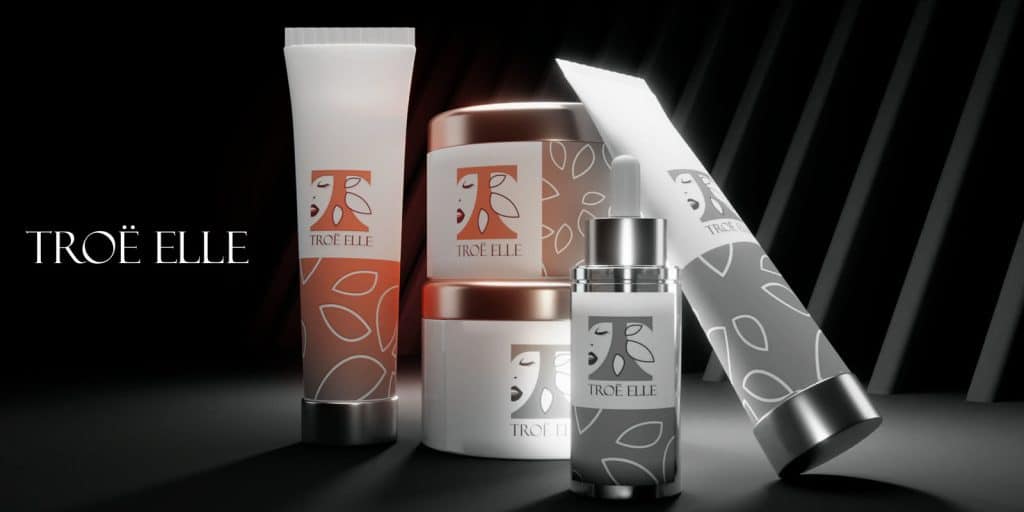
For product-based businesses in beauty, wellness, and personal care, the signals matter enormously. Soft curves read as approachable. Organic forms suggest care and naturalness. Considered typography conveys intelligence without coldness. These are strategic choices, not decorative ones. The wrong combination costs you the sale before a customer reads a single word on the label.
The brands I have worked with in this space, including Milk N Honey and The Brow Bee, share one thing: the visual direction was built around what the customer needed to feel at first glance, not around what looked appealing in isolation. That discipline is what separates a brand that holds up over years from one that needs a redesign every 18 months.
A useful reference from the 2025 Women Business Ownership Fact Sheet notes that women-owned businesses have grown 26% since 2012, outpacing overall business growth of 19%. In a market that competitive, a clear and professional identity is a differentiator. A generic one is not.


How the Certification Badge Fits Into the Brand System
The certification badge is not your logo. This distinction matters more than most founders realize when they start thinking about how to signal that their business is women-owned.
Official certification marks, such as those issued by WBENC, are earned through a formal application and verification process. They signal to corporate procurement teams and government buyers that your business meets specific ownership and control criteria. Using a self-created seal that resembles an official mark, or claiming certification status you have not been granted, can mislead buyers and create real compliance problems when bidding for contracts.
The practical question is where the badge lives in your layout, not whether you should use it. A certification mark works as a supporting element, placed where it reinforces trust without competing with your primary logo for attention. On a website, that typically means the footer or an “about” section. On a proposal, it belongs near your contact information or credentials block. On packaging, it can appear on the back panel with other compliance and brand information.
Overloading brand materials with multiple certification logos, women-owned, minority-owned, and others, without clear layout rules creates visual clutter and weakens the primary mark. The rule is simple: your logo leads. Everything else supports it. Inconsistency in how the identifier appears across your website, proposals, and packaging also reduces trust, because procurement teams need to verify status quickly and a fragmented presentation makes that harder.
The brand design services I provide include guidance on how supporting marks integrate with the primary identity system, so nothing competes and nothing gets lost.


How I Build a Brand Identity From the Ground Up
Every project starts after an agreement is signed and a deposit is received. Then I hold a discovery call. I ask about the target audience’s age range, psychographics, and motivations. I ask about the founder’s vision, any existing concept or tagline, and the specific assets needed at launch. If there is no concept yet, we build one together during that call.
From there, I conduct research and build inspiration boards before drawing anything. I typically present six to nine hand-drawn compositional sketches to test structures and learn what the client responds to. This step matters because it surfaces what the client actually connects with, not just what they thought they wanted when they described it in words.
After a direction is selected, I move into grayscale prototyping before color is introduced. Color is tested last because it carries the strongest emotional charge and can mask structural weaknesses in a mark. A logo that only works in one colorway is not a finished logo.
The final deliverables include source files, a brand guide covering typeface names, color codes, logo-use guidance, and application notes. Larger branding packages for small business can include expanded guides, narrated video presentations, social templates, packaging, and website design. Every asset is built to reinforce the same story as the primary mark.
I work with roughly four to six clients per month. That volume is intentional. It means every project gets the attention it requires, not a production line.


Common Questions About Women Owned Business Logo Design
What qualifies a company to be officially recognized as a women-owned business?
In the U.S., a business is generally considered women-owned when at least 51% of it is owned, controlled, and operated by one or more women. For informal marketing purposes, self-identification is common. For formal certification, the ownership and control requirements are verified by a certifying body, and the specifics vary depending on which program you are applying to.
How does a business get certified through WBENC or similar bodies?
WBENC certification requires an application, documentation of ownership and control, and a site visit or review process. Other certifying bodies, including the Small Business Administration’s WOSB program, have their own requirements. The process takes time, and the certification is not permanent. It requires renewal. I recommend researching the specific program that aligns with your procurement goals before starting the application.
Do corporate and government buyers actively seek certified women-owned businesses?
Yes, many do. Corporate supplier diversity programs and federal contracting set-asides specifically target certified women-owned businesses. Research from WIPP shows that women-owned employer firms grew at nearly double the rate of men-owned firms between 2019 and 2023, partly because access to these procurement channels has expanded. Certification does not guarantee a contract, but it opens doors that are otherwise closed to uncertified businesses.
How should a “women owned” badge be used without overwhelming the primary brand?
Treat it as a supporting mark, not a headline element. On a website, it belongs in the footer or a credentials section. On proposals, place it near your contact block. On packaging, use the back panel. The primary logo always leads. The badge confirms a fact; it does not replace the brand.
What is the difference between a generic icon and an official certification mark?
A generic “women owned” icon is a graphic you create or license to signal ownership informally. An official certification mark, such as the WBENC seal, is issued by a certifying organization and may only be used by businesses that have completed the certification process. Using a seal that resembles an official mark without holding the certification can mislead procurement teams and create compliance problems. If you have not been certified, use language rather than a seal that mimics an official mark.
Does a women owned business logo need to look different from any other logo?
No. A women owned business logo is a primary brand mark first. Its job is to represent the business clearly and credibly across every touchpoint. Whether or how the business signals its ownership in marketing is a separate strategic decision. The logo itself should be built around the business’s audience, positioning, and market, not around a generic visual shorthand for gender.
About Branding Design Pro

I am Kenal Louis, founder of Branding Design Pro. I have more than 25 years of drawing and visual art experience and over 15 years of professional brand design work for business clients. I started Branding Design Pro in 2018 and work with clients nationally from my studio in Omaha, Nebraska.
My focus areas include beauty, hair care, skincare, wellness, and product-based businesses. These are categories where visual identity does real commercial work, and where a logo has to perform on packaging, in retail, and online at the same time. I have worked with women founders at every stage, from pre-launch to established brands preparing for retail expansion.
Every project I take on is a custom engagement built around the founder’s actual goals. I offer logo design and full identity systems, and I work with a limited number of clients each month to make sure every one gets the attention it requires.
I understand what women business owners are up against when building credibility in a crowded category. That understanding shapes every design decision I make. I am not here to hand you something that looks good on a screen. I am here to build something that holds up in the market.
That is what separates this studio from a one-on-one custom design process versus a crowdsourced concept marketplace. I am a strategic partner. My job is to make sure your brand reflects the real quality of what you sell, and to give you a logo designer for hire relationship built on craft and trust.
Women Entrepreneurs Share Their Experience
Time - 4:55 minutes
Time - 1:31 minutes
Time - 41 seconds
Your Women Owned Business Logo Should Work as Hard as You Do
If your current brand no longer reflects the quality of your product, that is the signal. Start by auditing how your logo reads across every surface where it appears: packaging, website, proposals, and social. If it holds up on all of them, you are in good shape. If it does not, you know where the gap is.
When you are ready to close that gap properly, reach out and we can start with a conversation about where your business is and exactly what it needs to get to the next stage.